Tip
Stop writing unnecessary, heavy, thread-blocking JavaScript — Una Kravets
Tip
With all the new web features right on their way (view-transitions, @starting-style, calc-size(), speculation rules, style and container queries, relative color syntax, ... the list goes on and on), it's time to face it... 🫣👇 — Stefan Judis

Note
IMO, the dialog element has reached the tipping point of generally being the better option for web developers who need to implement dialogs in their web pages. The number of accessibility requirements a developer needs to be aware of, and the level of effort to implement custom ARIA dialogs is now largely taken care of by browsers. — Scott O'Hara
- 2022-04-13 — Building a dialog component
- 2022-03-08 — A look at the dialog element's super powers
- 2022-02-08 — Replace JavaScript Dialogs With the New HTML Dialog Element
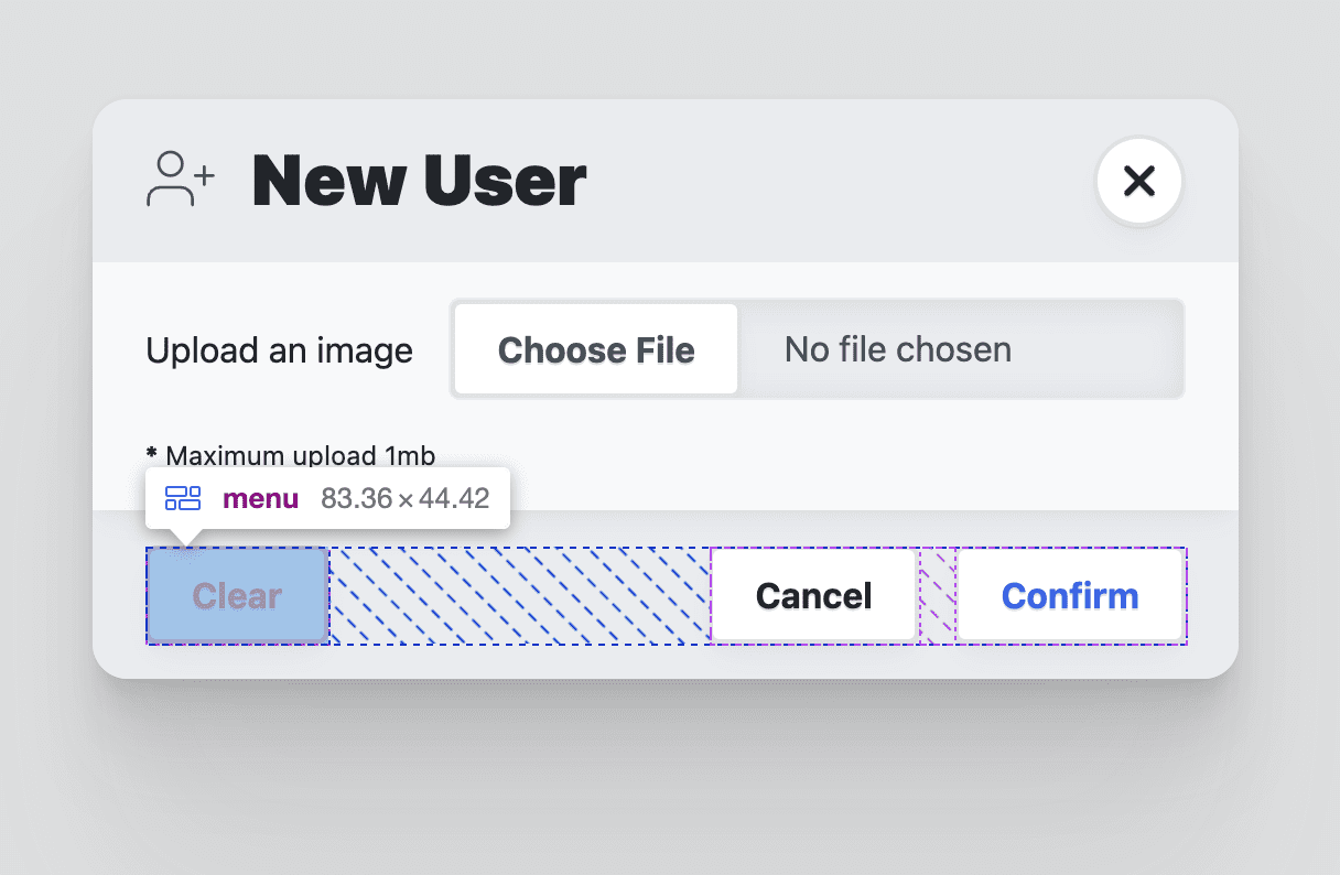
<dialog open>
  <!-- This form will close its dialog when submitted -->
  <form method="dialog">
    <header>
      <h3>Dialog title</h3>
      <button onclick="this.closest('dialog').close('close')">✗</button>
    </header>
    <article>…</article>
    <footer>
      <menu>
        <button autofocus type="reset" onclick="this.closest('dialog').close('cancel')">Cancel</button>
        <button type="submit" value="confirm">Confirm</button>
      </menu>
    </footer>
  </form>
</dialog>dialog::backdrop {
/* Styles and animations for the backdrop */
}- (Invokers Proposal) Add InvokeElement & InvokeEvent IDLs & invocation steps for Dialog & Popover
- Bikeshed a name for "light dismiss for dialog"
- Consider preventing page scroll when modal dialog is visible
- Entry/Exit animation 2024
Exclusive Accordion:
<details name="my-accordion">
  <summary>Summary 1</summary>
  <p>Lorem ipsum dolor sit amet, consectetur adipisicing elit.</p>
</details>

<details name="my-accordion" open>
  <summary>Summary 2</summary>
  <p>Lorem ipsum dolor sit amet, consectetur adipisicing elit.</p>
</details>
The <details> elements that are part of an exclusive accordion don't necessarily need to be siblings. They can be scattered across the document.
Note
Built-in accessibility via keyboard behavior, tab focus management, top-layer support, and (optional) light-dismiss
The Popover API helps you build menus, selection, and tooltips. It supports:
- Promotion to the top layer. Popovers will appear on a separate layer above the rest of the page, so you don't have to play around with z-index.
- Light-dismiss functionality. Clicking outside of the popover area will close the popover and return focus.
- Default focus management. Opening the popover makes the next tab stop inside the popover.
- Accessible keyboard bindings. Hitting the esc key or double toggling will close the popover and return focus.
- Accessible component bindings. Connecting a popover element to a popover trigger semantically.

<button invoketarget="actions">Actions</button>
<div role="menu" id="actions" popover>
  <button role="menuitem" tabindex=-1 autofocus>Edit</button>
  <button role="menuitem" tabindex=-1>Hide</button>
  <button role="menuitem" tabindex=-1>Delete</button>
</div>
Progressively-enhanced entry/exit animation to your popovers or dialogs:
/* Transition to these styles on entry, and from these styles on exit */
[popover]:popover-open {
  opacity: 1;
  rotate: 0turn;
  transition: rotate .5s, opacity .5s, display .5s allow-discrete, overlay .5s allow-discrete;
}

/* Entry transition starts with these styles */
@starting-style {
  [popover]:popover-open {
    opacity: 0;
    rotate: 1turn;
  }
}

/* Exit transition ends with these styles */
[popover]:not(:popover-open) {
  scale: 0;
  transition: scale .3s, display .3s allow-discrete, overlay .3s allow-discrete;
}- Living Standard
- Popover API Demo
- 2024 Dropdown Menu with Popover and Anchor Pos (Floating UI fallback)
- 2024-03-21 — On popover accessibility: what the browser does and doesn’t do
- 2024-03-04 — The Popover API, invokers, anchor positioning and @starting-style ✨
<button invoketarget="my-dialog">This opens a dialog</button>
<dialog id="my-dialog">This is the dialog</dialog>
Adding invoketarget and invokeaction attributes to <button> and <input type="button"> / <input type="reset"> elements would allow authors to assign behaviour to buttons in a more accessible and declarative way, while reducing bugs and simplifying the amount of JavaScript pages are required to ship for interactivity. Buttons with invoketarget will - when clicked, touched, or enacted via keypress - dispatch an InvokeEvent on the element referenced by invoketarget, with some default behaviours.
- Can I use HTML attribute: invokeaction
- Explainer
- Invokers Proposal
- Intent to Prototype: Invokers (Chrome)
- Ship Invokers proposal to all major browsers (Nov 2023)
- 2014-03-24 — I love invokers and you should too

"Close requests" are a new concept that encompasses user requests to close something currently open, using the Esc key on desktop or the back gesture/button on Android.
const watcher = new CloseWatcher();

// This fires when the user sends a close request, e.g. by pressing Esc on
// desktop or by pressing Android's back button.
watcher.onclose = () => {
  myModal.close();
};

// You should destroy watchers which are no longer needed, e.g. if the
// modal closes normally. This will prevent future events on this watcher.
myModalCloseButton.onclick = () => {
  watcher.destroy();
  myModal.close();
};<style> .special { accent-color: papayawhip } </style>
<input type="checkbox" switch checked>
<input type="checkbox" switch checked class="special">

- whatwg: Stylable
<select>element - Open UI's explainer
- Open UI's design decisions
- Open UI's issues
- Open UI's
<selectlist>demos - 2023-06-01 — Advanced Form Control Styling With Selectmenu And Anchoring API
<select class="my-custom-select">
  <div slot="button">
    <span behavior="selected-value" slot="selected-value"></span>
    <button behavior="button"></button>
  </div>
  <div slot="listbox">
    <div popover="auto" behavior="listbox">
       <option value="one">one</option>
       <option value="two">two</option>
    </div>
  </div>
</select>
<select>
  <button class="action-btn" type="button">
    <selectedoption>
      <span class="preview-heading">Create a merge commit</span>
      <span class="action-heading">Merge Pull Request</span>
      <span class="description">All commits from this branch will be added to the base branch via a merge commit.</span>
    </selectedoption>
  </button>
  <button class="open-list-btn" type="selectlist">
    <span class="arrow">
      <figure>↓</figure> <!-- should be image, using this for demo shortcut only -->
    </span>
  </button>
  <listbox>
    <option value="merge-commit">
      <span class="preview-heading">Create a merge commit</span>
      <span class="action-heading">Merge Pull Request</span>
      <span class="description">All commits from this branch will be added to the base branch via a merge commit.</span>
    </option>
    <option value="squash-merge">
      <span class="preview-heading">Squash and merge</span>
      <span class="action-heading">Squash and merge</span>
      <span class="description">The 1 commit from this branch will be added to the base branch.</span>
    </option>
    <option value="rebase-merge">
      <span class="preview-heading">Rebase and merge</span>
      <span class="action-heading">Rebase and merge</span>
      <span class="description">The 1 commit from this branch will be rebased and added to the base branch.</span>
    </option>
  </listbox>
</select>- Document element (1):
<html> - Document metadata (6):
<head>,<title>,<base>,<link>,<meta>,<style>, - Sections (15):
<body>,<article>,<section>,<nav>,<aside>,<h1-6>,<hgroup>,<header>,<footer>,<address> - Grouping content (16):
<p>,<hr>,<pre>,<blockquote>,<ol>,<ul>,<menu>,<li>,<dl>,<dt>,<dd>,<figure>,<figcaption>,<main>,<search>,<div> - Text-level semantics (29):
<a>,<em>,<strong>,<small>,<s>,<cite>,<q>,<dfn>,<abbr>,<ruby>,<rt>,<rp>,<data>,<time>,<code>,<var>,<samp>,<kbd>,<sub>,<sup>,<i>,<b>,<u>,<mark>,<bdi>,<bdo>,<span>,<br>,<wbr> - Edits (2):
<ins>,<del> - Embedded content (13):
<picture>,<source>,<img>,<iframe>,<embed>,<object>,<video>,<audio>,<track>,<map>,<area>,<math>,<svg> - Tabular data (10):
<table>,<caption>,<colgroup>,<col>,<tbody>,<thead>,<tfoot>,<tr>,<td>,<th> - Forms (14):
<form>,<label>,<input>,<button>,<select>,<datalist>,<optgroup>,<option>,<textarea>,<output>,<progress>,<meter>,<fieldset>,<legend> - Interactive elements (3):
<details>,<summary>,<dialog> - Custom elements (2):
<template>,<slot> - Scripting (3):
<script>,<noscript>,<canvas> - Experimental (1):
<portal> - Proposed (-):
<selectedoption>
Note
These last element landed in the HTML spec was the <search> element, at March 24th 2023.

- 2021-03-06 — First Proposal by Melanie Richards (Microsoft)
- 2023-03-15 — Future CSS: Anchor Positioning
- 2023-06-29 — First Working Draft
- 2023-12-14 — Anchor Positioning ⭐
- 2024-02-09 — Editor’s Draft
- 2024-04-12 — Chromium Intent to Ship: CSS Anchor Positioning
- Una's anchor-tool
- Una's bunch of demos
inset-areademo exploration- csswg-drafts > css-anchor-position-1
- Chromium tracking bug
- Mozilla tracking bug
- Explainer: CSS Anchor Positioning
- #9663 Better handle an inset-area edge case
- Tracking bug for implementation of Anchor Positioning feature
- WebKit Position
- Mozilla Position
- Tether elements to each other with CSS anchor positioning by Jhey Tompkins (one of the spec editors)
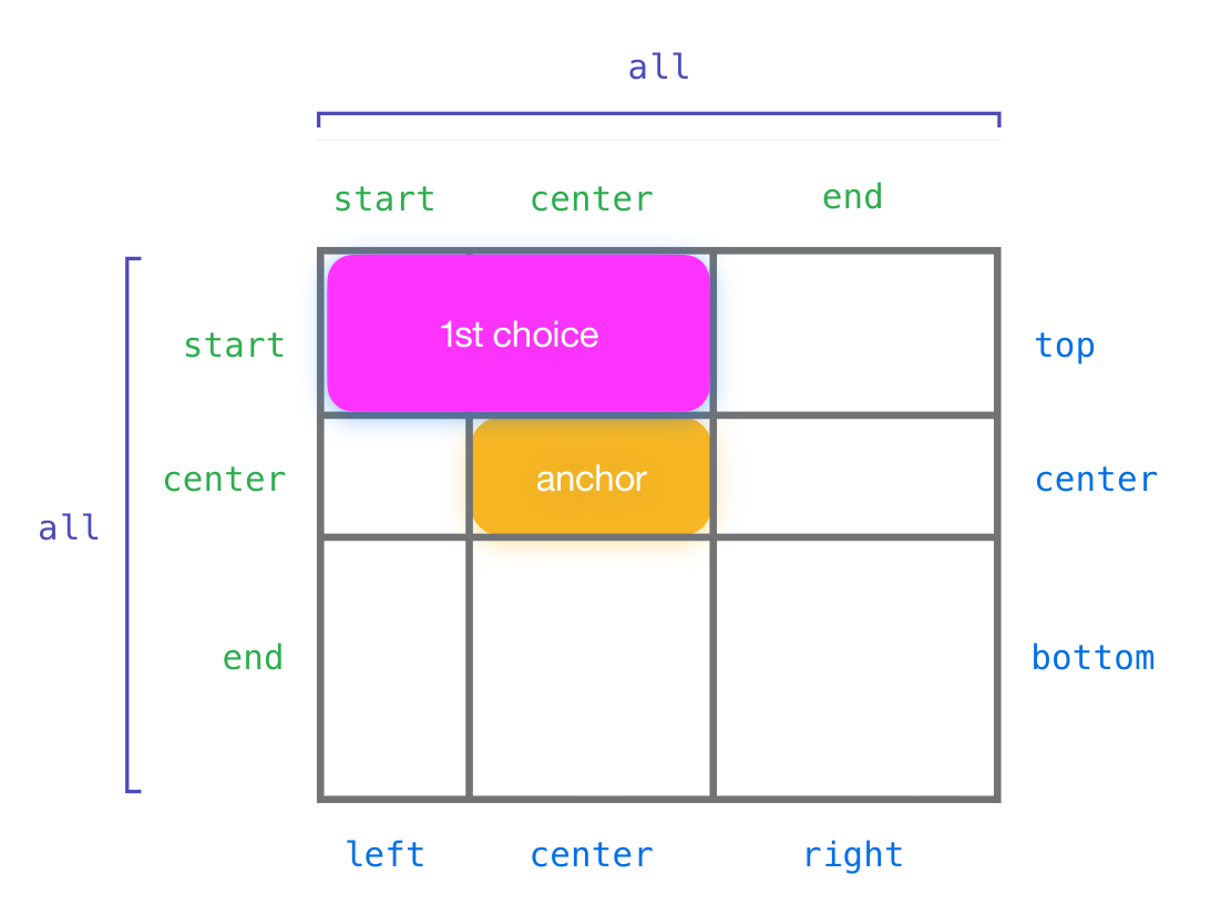
.anchor {
  anchor-name: --my-anchor;
}

.tooltip {
  /* Fixpos means we don’t need to worry about
     containing block relationships;
     the tooltip can live anywhere in the DOM. */
  position: fixed;

  /* All the anchoring behavior will default to
     referring to the --tooltip anchor. */
  position-anchor: --tooltip;

  /* Align the tooltip’s bottom to the top of the anchor;
     this also defaults to horizontally center-aligning
     the tooltip and the anchor (in horizontal writing modes). */
  inset-area: block-start;

  /* Automatically swap if this overflows the window
    so the tooltip’s top aligns to the anchor’s bottom
    instead. */
  position-try: flip-block;

  /* Prevent getting too wide */
  max-inline-size: 20em;
}
Update April 2024: here is all the code you need to get a basic anchor now:
#my-tooltip {
  /*  Set the bottom of the anchored element (tooltip) to the top of the anchoring element  */
  bottom: calc(anchor(top));
  /*  If can't fit it in the screen anymore, flip the anchored element in the block direction */
  position-try-options: flip-block;
  /*  Center the anchor with justification  */
  justify-self: anchor-center;
}[popover] {
top: anchor(top);
left: anchor(right);
position-try-options: flip-block, flip-inline;
}- CSS Scroll-triggered Animations with Style Queries
- Scroll-Driven Animations: You want overflow: clip, not overflow: hidden
- Demo: show off Scroll-driven Animations
- Demo: CSS-Only Sticky CTA
- Real World examples
@keyframes slide-left {
    from { transform: scale(0.7); }
    to   { transform: scale(1); }
}
.scroll-animate-slide-left {
    transform-origin: top right;
    animation: slide-left ease-out both;
    animation-timeline: view(block -64px);
    animation-range: entry 0% entry 50%;
}::highlight(example) {
color: hotpink;
}Ability to animate discrete animations, such as animating to and from display: none.
.card {
  transition: opacity 0.25s, display 0.25s;
  transition-behavior: allow-discrete; /* Note: be sure to write this after the shorthand */
}

.card.fade-out {
  opacity: 0;
  display: none;
}- :any-link
- :empty
- :first-child
- :focus-visible
- :focus-within
- accent-color
- aspect-ratio
- backdrop-filter
- border-image
- caret-color
- columns
- drop-shadow()
- fit-content()
- gap
- inset
- list-style
- matrix3d()
- object-fit
- overscroll-behavior
- scroll-margin
- scroll-snap
- @supports (hover)
.container {
  display: flex;
  flex-direction: column;
  align-items: safe center;
  width: 38%;
}.overlay {
border-image: fill 0 linear-gradient(#0003, #000);
}- 12 Days of Web
- Interop 2024 Dashboard
- CSS Wrapped 2023
- New to the web platform
- Better, Faster, Stronger Web UI by Una Kravets
- Modern CSS patterns in Campfire
- Write better CSS with modern CSS
- The latest in Web UI (Google I/O ‘24)
- Adam Argyle blog
<dialog>: modal content, sidebars<details>: accordions, disclosurespopover: menus, custom toast notifications, content pickersanchor: tooltips