| name | description | author |
|---|---|---|
Make your own Heat Map |
Created amazing graph with the help of Python |
@shivesh01 |
We use data everywhere. Your smartphone for instance, and the satellite navigation system in your car are a couple of examples. Which is essential for us to continue discovering new things and keep ourselves connected.


Click here to see a working demo of today's project
In this workshop, you will use the Python language and its libraries to create a stunning heat map from scratch. Even if you don’t know the Python language, no worries my project will help you and keep you interested. You will learn about heat map.
You need to set up a repl account. you can run this program on your Python idle too. It requires some basic knowledge for the programming. I have designed this workshop sweet and simple for you. It will just take 15-20 minutes to complete the workshop.
- Repl is an online and instant development environment to learn, build, collaborate, and host your project. Show you don’t have to waste time while setting up a development environment. Creating an account on repl is super easy.
-
create a repl by clicking + New repl and choose programming language PYTHON and named it as you want and click create repl
-
Download the datasets from a simple click and Drag and drop them to the folder in which you are working on repl.
flights and tips -
Rename the file as flights and tips in the repl folder in which you are working.
-
Setup is completed ✅.
Advantage of working on repl
when we program in repl it automatically imports the libraries and dependencies with the simple command. So, You just need a repl account or any python idle to get started.

Pandas is a popular Python-based toolkit. It presents a diverse range of utilities like converting an entire data table into a NumPy matrix array and much more. This makes pandas a trusted ally in data science and machine learning.
NumPy is a library used for working with arrays. It is used to perform a large set of mathematical operations on an array. An array is a data structure consisting of a collection of elements, each identified by at least one array index or key.
SciPy is an open-source Python library that is used to solve scientific and mathematical problems. It is built on the NumPy extension and allows the user to manipulate and visualize data with a wide range of high-level commands.
Statsmodels is a Python package that allows users to explore data, estimate statistical models, and perform statistical tests.
A picture is worth a thousand words, and with Python’s matplotlib library, fortunately, takes far less than a thousand words of code to create a production-quality graphic.
Seaborn library is one of the rarest earth metals. If you are a science student you will get...😄. Seaborn, provides a variety of visualization patterns. It uses fewer syntax and has interesting default themes. Great Right!😲
A Relplot function of Seaborn library is a figure-level function for visualizing statistical relationships using two common approaches: scatter plots and line plots. Let create our own relplot by following the steps given below
Data-set required flights
First, we need to Import the required libraries as namely NumPy, Pandas, Matplotlib & Seaborn and loading the dataset in a variable named flights. You can do it too.
import numpy as np
import pandas as pd
import matplotlib.pyplot as plt
import seaborn as sns
we need to load the data-set in a variable flights
flights = sns.load_dataset("flights")Relp-plot is one minimalist plot I have discovered and I know you will like it too. We will use relp graph plot with the label as x-axis as passengers, labeling y-axis as month, hue represents as color appearance parameters
sns.relplot(x="passengers", y="month", hue="year", data=flights)As usual displaying the graph, we will be using this function.
plt.show() Wow! You have created your relp plot 🥳👏🏻
Output


Violin plot allows to visualize the distribution of a numeric variable for one or several groups. Each violin represents a group or a variable. The shape represents the density estimate of the variable: the more data points in a specific range, the larger the violin is for that range.
Data-set required tips
Here, we need two libraries, namely Matplotlib and Seaborn, and you know how to import the library.
import matplotlib.pyplot as plt
import seaborn as sns
Now simply loading tips dataset in tips variable (you can load datasets in any variable but make sure you use rename them reach places too.
tips = sns.load_dataset("tips")Plotting catplot, labelling the axis, kind is the parameter which is for which kind of graph plot and tips used to load the datasets
sns.catplot(x="day", y="total_bill", kind="violin", data=tips)As usual displaying the graph, we will be using this function.
plt.show()Output
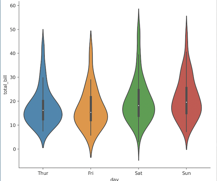
Fantastic! You have created your violin plot 👏
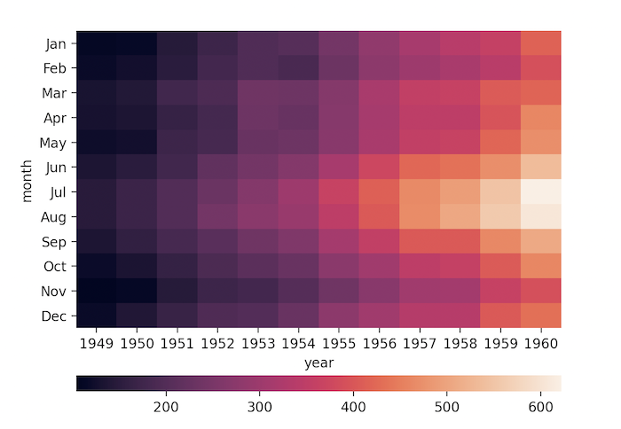
A heatmap is a graphical representation of data that uses colour-coding to represent different values. Heatmaps are used in various forms of analytics but are most commonly used to show user data like growth of the object during the time. Example: pollution graph and region climate etc
Data-set required flights
Plotting the heatmap one of the most amazing feelings I had and you can have it too!. First we have to import the libraries namely numpy, matplotlib & seaborn, Now this super easy task for you!
import numpy as np
import matplotlib.pyplot as plt
import seaborn as sns
Secondly we need to load the dataset in a variable flights to use them later.*
flights = sns.load_dataset("flights")Now, we will use pivot to handle duplicate values for one index/column pair and label the x-axis as months, y-axis as the year, and passengers will represent the intensity of the heat map. For simplicity we use this convention more the number of passengers increases in the intensity of the color.
flights = flights.pivot("month", "year", "passengers")Third variable, Now we will enhance look and fill to the plot by using some more parameters like annot, fmt, linewidth, and cmap. some technical terms we are going to use such as annot: the value will show on each cell of the heatmap, fmt: adding annotations, linewidth: width between each box, cmap: cmap is a color template that we have used.
ax = sns.heatmap(flights, annot=True, fmt="d", linewidths=5, cmap="YlGnBu")- As usual, displaying the graph, we will be using this*
plt.show()Output

Congratulations!✌️ you have completed the workshop. Share it with your friends and family. Share with everyone🤗✌️🥳👏🏅🌇🎊

You can create a lot of variety of heat maps as I have created below.
import matplotlib.pyplot as plt
import seaborn as sns
import numpy as np

flights = sns.load_dataset("flights")
flights = flights.pivot("month", "year", "passengers")
corr = np.corrcoef(np.random.randn(10, 200))
mask = np.zeros_like(corr)
mask[np.triu_indices_from(mask)] = True
with sns.axes_style("white"):
f, ax = plt.subplots(figsize=(7, 5))
ax = sns.heatmap(corr, mask=mask, vmax=.3, square=True)
plt.show()
import matplotlib.pyplot as plt
import seaborn as sns
import numpy as np

flights = sns.load_dataset("flights")
flights = flights.pivot("month", "year", "passengers")
grid_kws = {"height_ratios": (.9, .05), "hspace": .3}
f, (ax, cbar_ax) = plt.subplots(2, gridspec_kw=grid_kws)
ax = sns.heatmap(flights, ax=ax,
cbar_ax=cbar_ax,
cbar_kws={"orientation": "horizontal"})
plt.show()
import numpy as np
import matplotlib.pyplot as plt
import matplotlib.animation as animation

def animate(data, im):
    im.set_data(data)

def step():
    while True:
        data = np.random.rand(100, 100)
        yield data

fig, ax = plt.subplots()
im = ax.imshow(np.random.rand(100, 100), interpolation='nearest')
ani = animation.FuncAnimation(
    fig, animate, step, interval=100, repeat=True, fargs=(im, ))
plt.show()