Angular numberpicker component based on Angular Material.
To install this library (component), run:
Using npm:
$ npm install @retailify/ngx-mat-numberpicker --saveUsing yarn:
$ yarn add @retailify/ngx-mat-numberpickerYou can import this library (component) in any Angular application by running:
Using npm:
$ npm install @retailify/ngx-mat-numberpickerUsing yarn:
$ yarn add @retailify/ngx-mat-numberpickerand then from your Angular AppModule:
import { BrowserModule } from '@angular/platform-browser';
import { NgModule } from '@angular/core';

import { AppComponent } from './app.component';

// Import this library
import { NumberPickerModule } from '@retailify/ngx-mat-numberpicker';

@NgModule({
  declarations: [
    AppComponent
  ],
  imports: [
    BrowserModule,

    // Specify this library as an import
    NumberPickerModule,
  ],
  providers: [],
  bootstrap: [AppComponent]
})
export class AppModule { }
Once this library is imported, you can use this component in your Angular application:
<h1>
{{title}}
</h1>
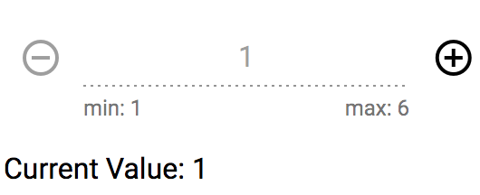
<ngx-mat-numberpicker [min]="1" [max]="6" [default]="1"
[starttext]="'min: 1'" [endtext]="'max: 6'"
[disabled]="true" (onChange)="onValueChanged($event)"></ngx-mat-numberpicker>class YourClass {
currentValue: number = 1;
onValueChanged(value: number): void {
this.currentValue = value;
}
}| Attribute | Type | Required | Description |
|---|---|---|---|
| min | [input] Number | No | limit the minimal number to the given value; 0 by default |
| max | [input] Number | No | limit the maximum number to the given value; 50 by default |
| default | [input] Number | No | default start value for the number picker; 0 by default |
| starttext | [input] String | No | value for the left hint of the inputfield; empty by default |
| endtext | [input] String | No | value for the right hint of the inputfield; empty by default |
| disabled | [input] Boolean | No | enable / disable the input field; false by default |
| onChange | (output) Number | No | emits the value of the number picker, every time the user clicks the - or + button |
To generate all *.js, *.d.ts and *.metadata.json files:
$ npm run buildTo lint all *.ts files:
$ npm run lintTo run demo:
$ npm run playgroundMIT © Retailify GmbH