


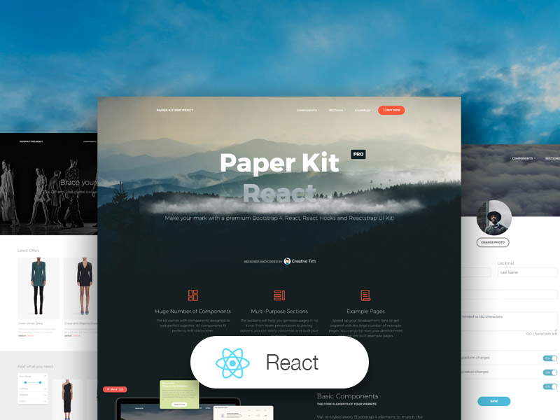
Paper Kit PRO React is a Premium Bootstrap 4, Reactstrap, React, React Hooks and Paper Design UI Kit with pale colors, beautiful typography and thoughtful drawings. We've created it having paper and drawings in mind.
Any elements that is vital to code a web project is already here, fully coded. All components are fully responsive and look great on every screen size. Transitions, shadows, colors, they all resemble the flow you would have using pieces of paper.
We have created the UI Kit kit having pastel colors and paper in mind. It feels light, fresh and easy to go through. It features beautiful typography, font icons and thoughtful layouts.
If you like bright and fresh colors, you will love this Premium Bootstrap 4 and Reactstrap UI Kit! It features a huge number of components that can help you create amazing websites.
Getting Started
- Install NodeJs from NodeJs Official Page
- Go to creative tim website and login into your account
- Go to the downloads section of your account (be sure to be logged into your account)
- Press the download button near Paper Kit PRO React product (this will download onto your computer a zip file)
- Unzip the downloaded file to a folder in your computer
- Open Terminal
- Go to your file project (where you've unzipped the product)
- Run in terminal
npm install - Then run
npm start - Or you can simply run
npm run install:cleanwhich will installnode_modulesand also will start your project. - Navigate to https://localhost:3000
- More information → react
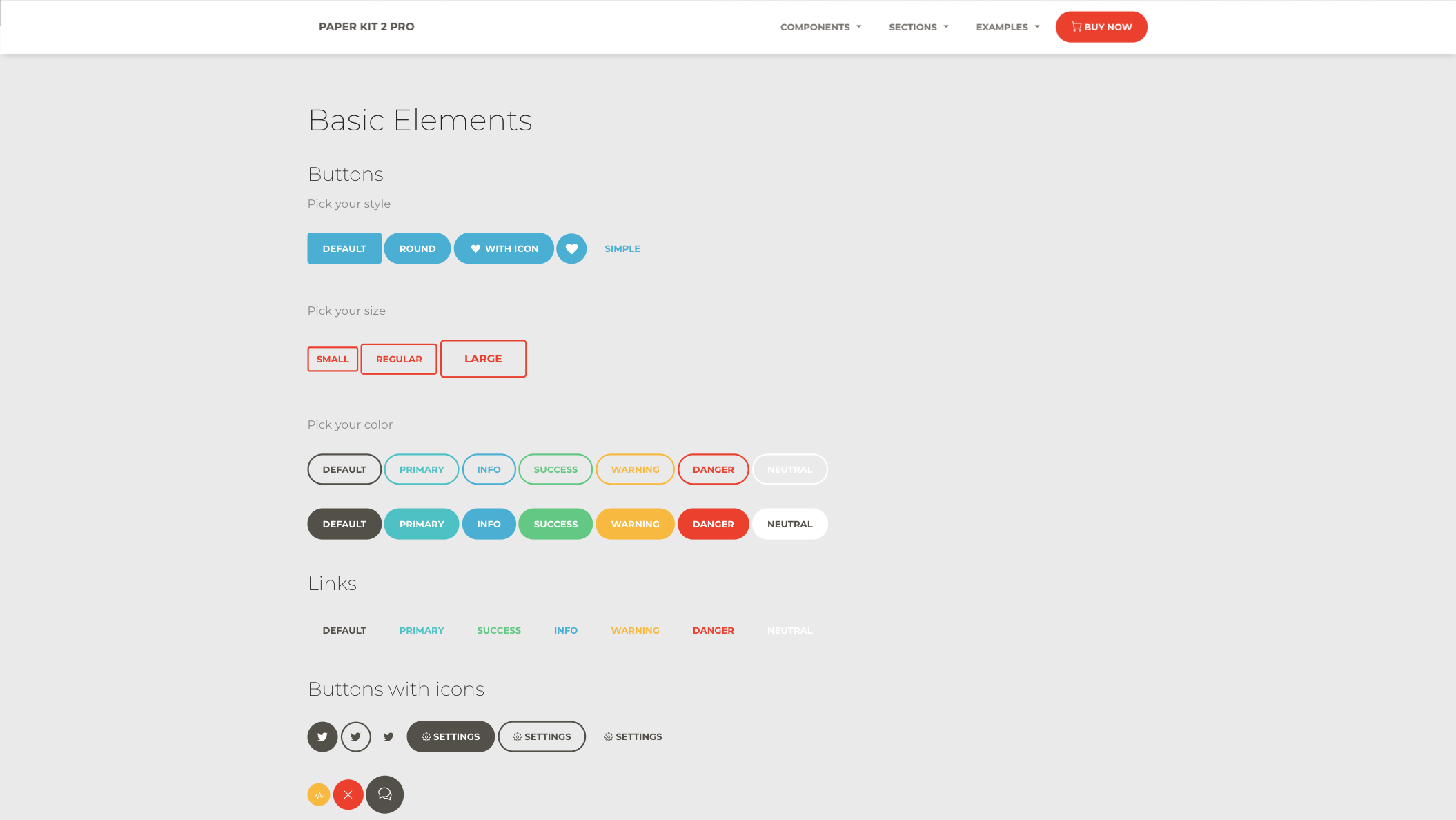
Fully Coded Components
Paper Kit PRO React is built with over frontend 1000 individual components, giving you the freedom of choosing and combining. All components can take variations in colour, that you can easily modify using SASS files and classes.
You will save a lot of time going from prototyping to full-functional code, because all elements are implemented. This Premium Bootstrap 4 and Reactstrap UI Kit is coming with prebuilt examples, so the development process is seamless, switching from our pages to the real website is very easy to be done.
Every element has multiple states for colors, styles, hover, focus, that you can easily access and use.
View all components here.
COMPLEX DOCUMENTATION
Each element is well presented in a very complex documentation. You can read more about the idea behind this design system here. You can check the components here and the colors/typography/columns/elements here.
Example Pages
If you want to get inspiration or just show something directly to your clients, you can jump start your development with our pre-built example pages. You will be able to quickly set up the basic structure for your web project.
View example pages here.
Reacr Hooks support
Paper Kit React is built on top of Bootstrap 4 using React and Reactstrap, so it fully supports React Hooks.
React Hooks support
Paper Kit React is built on top of Bootstrap 4 using React and Reactstrap, so it fully supports them. Most of the elements from the framework are re-designed to resemble sheets of paper and color pastels. If the are elements that we have not touched, they will gracefully fall back to the Bootstrap 4 default.
HELPFUL LINKS
-
View Github Repository
-
Check FAQ Page
Tutorial and components
Once you download the archive, you will be able find a tutorial page inside it explaining how to start using it. You can also check the documentation online.
- Versions
- Demo
- Quick Start
- Documentation
- File Structure
- Browser Support
- Resources
- Reporting Issues
- Licensing
- Useful Links
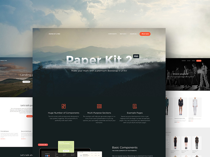
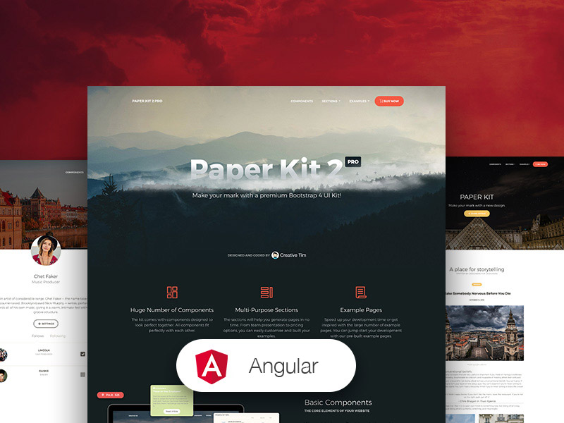
| HTML | Angular | React |
|---|---|---|
 |
 |
|
| Buttons | Navigation | JS Components |
|---|---|---|
 |
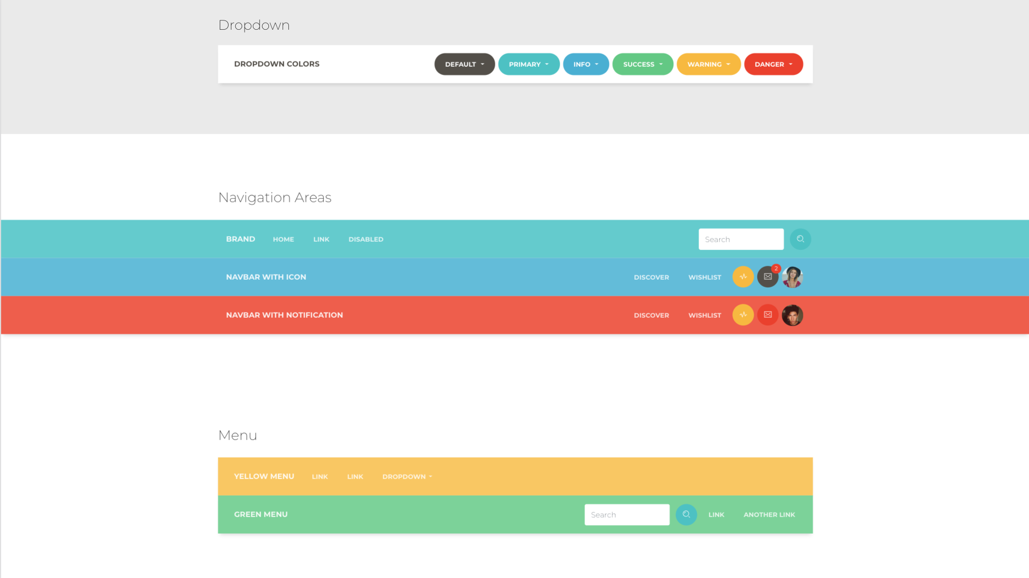 |
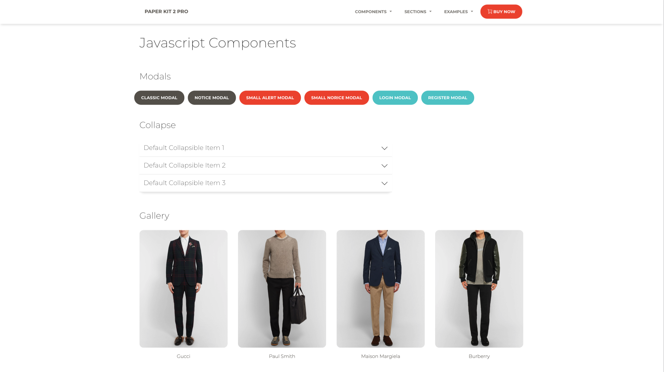 |
| Register Page | Landing Page | Profile Page |
|---|---|---|
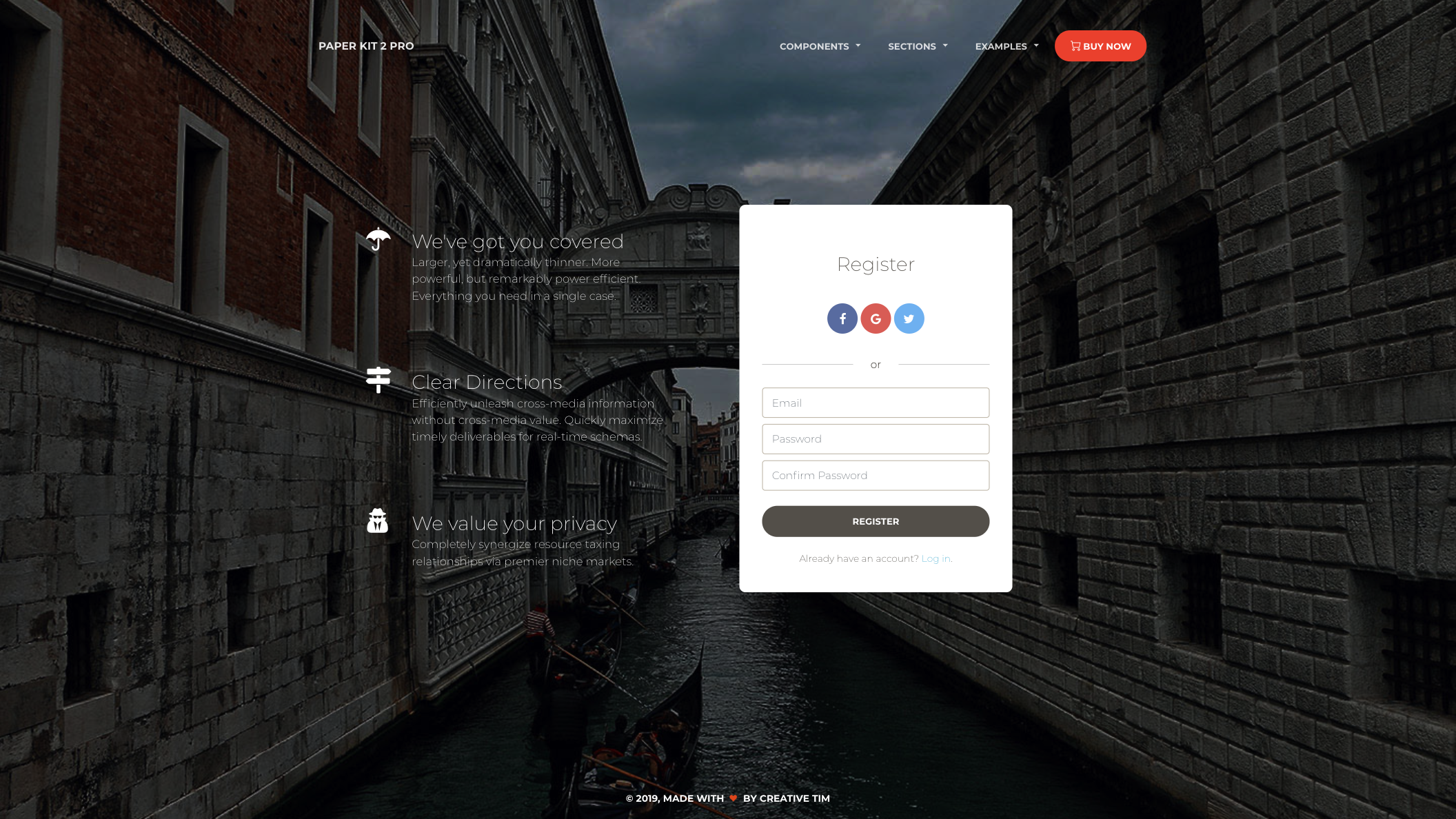 |
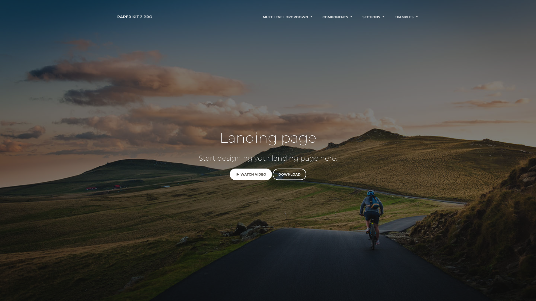 |
 |
- Download the project's zip
- Make sure you have node.js (https://nodejs.org/en/) installed
- Type
npm installin terminal/console in the source folder wherepackage.jsonis located - You will find all the branding colors inside
src/assets/scss/paper-kit/_variables.scss. You can change them with aHEXvalue or with other predefined variables. - Run in terminal
npm start.
The documentation for the Paper Kit PRO React is hosted at our website.
Within the download you'll find the following directories and files:
paper-kit-pro-react
.
├── CHANGELOG.md
├── ISSUE_TEMPLATE.md
├── README.md
├── jsconfig.json
├── package.json
├── Documentation
│   └── documentation.html
├── public
│   ├── favicon.ico
│   ├── index.html
│   └── manifest.json
└── src
    ├── assets
    │   ├── css
    │   │   ├── bootstrap.min.css
    │   │   ├── bootstrap.min.css.map
    │   │   ├── paper-kit.css
    │   │   ├── paper-kit.css.map
    │   │   └── paper-kit.min.css
    │   ├── demo
    │   │   ├── demo.css
    │   │   └── react-demo.css
    │   ├── fonts
    │   │   ├── nucleo-icons.eot
    │   │   ├── nucleo-icons.ttf
    │   │   ├── nucleo-icons.woff
    │   │   └── nucleo-icons.woff2
    │   ├── img
    │   │   ├── demo
    │   │   ├── ecommerce
    │   │   ├── faces
    │   │   ├── gallery
    │   │   ├── photo_swipe
    │   │   ├── presentation-page
    │   │   │   ├── examples
    │   │   │   ├── screenshots
    │   │   │   └── try
    │   │   ├── sections
    │   │   └── tables
    │   ├── scss
    │   │   ├── paper-kit
    │   │   │   ├── cards
    │   │   │   ├── mixins
    │   │   │   ├── plugins
    │   │   │   │   └── photo-swipe
    │   │   │   └── sections
    │   │   ├── react
    │   │   │    ├── paper-kit
    │   │   │    ├── plugins
    │   │   │    └── react-differences.scss
    │   │   └── paper-kit.scss
    │   └── video
    │       └── fireworks.mp4
    ├── components
    │   ├── CustomUpload
    │   │   └── ImageUpload.js
    │   ├── Footers
    │   │   ├── FooterAboutUs.js
    │   │   ├── FooterBlack.js
    │   │   ├── FooterEcommerce.js
    │   │   ├── FooterGray.js
    │   │   └── FooterWhite.js
    │   ├── Headers
    │   │   ├── AboutUsHeader.js
    │   │   ├── BlogPostHeader.js
    │   │   ├── EcommerceHeader.js
    │   │   ├── IndexHeader.js
    │   │   ├── LandingPageHeader.js
    │   │   ├── PresentationHeader.js
    │   │   ├── ProductPageHeader.js
    │   │   ├── ProfilePageHeader.js
    │   │   ├── SettingsHeader.js
    │   │   └── TwitterRedesignHeader.js
    │   └── Navbars
    │       ├── ColorNavbar.js
    │       ├── DangerNavbar.js
    │       ├── InfoNavbar.js
    │       ├── MultiDropdownNavbar.js
    │       └── WhiteNavbar.js
    ├── index.js
    └── views
        ├── Index.js
        ├── NucleoIcons.js
        ├── Presentation.js
        ├── Sections.js
        ├── examples
        │   ├── AboutUs.js
        │   ├── AddProduct.js
        │   ├── BlogPost.js
        │   ├── BlogPosts.js
        │   ├── ContactUs.js
        │   ├── Discover.js
        │   ├── Ecommerce.js
        │   ├── Error404.js
        │   ├── Error422.js
        │   ├── Error500.js
        │   ├── LandingPage.js
        │   ├── LoginPage.js
        │   ├── ProductPage.js
        │   ├── ProfilePage.js
        │   ├── RegisterPage.js
        │   ├── SearchWithSidebar.js
        │   ├── Settings.js
        │   └── TwitterRedesign.js
        ├── index-sections
        │   ├── SectionButtons.js
        │   ├── SectionCards.js
        │   ├── SectionComments.js
        │   ├── SectionCommentsAreaSmall.js
        │   ├── SectionDescriptionAreas.js
        │   ├── SectionFooterAreas.js
        │   ├── SectionJavaScript.js
        │   ├── SectionNavbars.js
        │   ├── SectionNavigation.js
        │   ├── SectionNotification.js
        │   ├── SectionPreFooterAreas.js
        │   ├── SectionTables.js
        │   └── SectionTypography.js
        ├── presentation-sections
        │   ├── SectionCards.js
        │   ├── SectionComponents.js
        │   ├── SectionContent.js
        │   ├── SectionExamples.js
        │   ├── SectionFreeDemo.js
        │   ├── SectionIcons.js
        │   ├── SectionOverview.js
        │   ├── SectionResponsive.js
        │   ├── SectionSections.js
        │   ├── SectionSharing.js
        │   ├── SectionSummary.js
        │   └── SectionTestimonials.js
        └── sections-sections
            ├── SectionBlog.js
            ├── SectionContactUs.js
            ├── SectionFeature.js
            ├── SectionHeader.js
            ├── SectionPricing.js
            ├── SectionProject.js
            ├── SectionTeam.js
            └── SectionTestimonials.js
At present, we officially aim to support the last two versions of the following browsers:
- Demo: http://demos.creative-tim.com/paper-kit-pro-react/#/presentation?ref=pkpr-github-readme
- Download Page: https://www.creative-tim.com/product/paper-kit-pro-react?ref=pkpr-github-readme
- Documentation: https://demos.creative-tim.com/paper-kit-pro-react/#/documentation/introduction?ref=pkpr-github-readme
- License Agreement: https://www.creative-tim.com/license?ref=pkpr-github-readme
- Support: https://www.creative-tim.com/contact-us?ref=pkpr-github-readme
- Issues: Github Issues Page
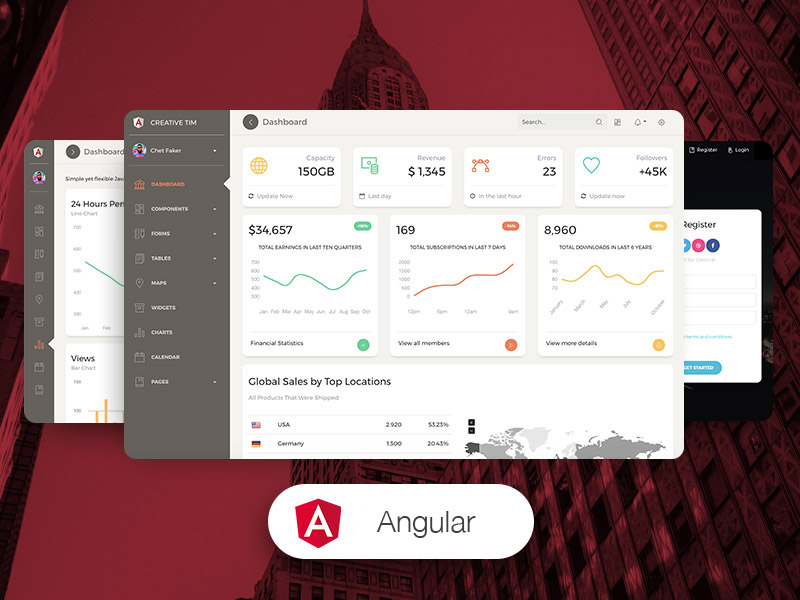
Dashboards:
| HTML | React | Vue | Angular |
|---|---|---|---|
 |
 |
 |
 |
We use GitHub Issues as the official bug tracker for the Paper Kit 2. Here are some advices for our users that want to report an issue:
- Make sure that you are using the latest version of the Paper Kit PRO React. Check the CHANGELOG from your dashboard on our website.
- Providing us reproducible steps for the issue will shorten the time it takes for it to be fixed.
- Some issues may be browser specific, so specifying in what browser you encountered the issue might help.
- Copyright 2023 Creative Tim (https://www.creative-tim.com/?ref=pkpr-github-readme)
- Tutorials
- Affiliate Program (earn money)
- Blog Creative Tim
- Free Products from Creative Tim
- Premium Products from Creative Tim
- React Products from Creative Tim
- Angular Products from Creative Tim
- VueJS Products from Creative Tim
- More products from Creative Tim
- Check our Bundles here
Twitter: https://twitter.com/CreativeTim
Facebook: https://www.facebook.com/CreativeTim
Dribbble: https://dribbble.com/creativetim