This package provides a single lightweight widget called SpeedDialBuilder which allows you to build custom speed dial buttons of all kinds of styles.
It offers full control over the appearance, layout and animations of the sub-buttons and secondary widgets like button labels.
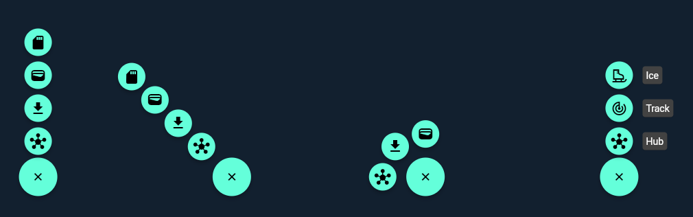
Try the live demo or run the example project to see some example layouts and animations.
The starting point of every speed dial button is the main toggle button. Use the buttonBuilder to create your own custom toggle button. You can use any combination of widgets there. The only important thing is, that one of the widgets must call the controller.toggle function provided by the builder on your desired user interaction.
To reflect the state of the speed dial you can alter your widget based on the controller.isActive, controller.status or controller.animation parameter using a transition widget or something like an AnimatedBuilder. Either listen to the controller for status changes or to the controller.animation to animate together with the speed dial.
Basic example code:
SpeedDialBuilder(
  ...
  buttonBuilder: (context, controller) => FloatingActionButton(
    onPressed: controller.toggle,
    child: ListenableBuilder(
      listenable: controller,
      builder: (BuildContext context, Widget? child) {
        return Icon( controller.isActive ? Icons.close : Icons.add );
      }
    )
  )
)The items of the speed dial must be passed to the items property. There you have the option to either directly pass your widgets or any other data type like a custom container class. The passed items will be available in the itemBuilder where you can further specify their appearance, layout and animation.
For now lets focus on a simple example where we directly pass two items as small FloatingActionButton widgets.
SpeedDialBuilder(
  ...
  items: [
    FloatingActionButton.small(
      onPressed: () {},
      child: const Icon(Icons.hub),
    ),
    FloatingActionButton.small(
      onPressed: () {},
      child: const Icon(Icons.file_download),
    )
  ]
)
In the itemBuilder we position our items vertically using the supplied item index and the FractionalTranslation widget.
Additionally we wrap every item in a ScaleTransition and pass it the provided animation object in order to get a nice in and out transition for every item. You can further control the animation with the animationOverlap, reverse, duration, reverseDuration, curve and reverseCurve properties of the SpeedDialBuilder.
SpeedDialBuilder(
  ...
  buttonAnchor: Alignment.topCenter,
  itemAnchor: Alignment.bottomCenter,
  itemBuilder: (context, Widget item, i, animation, controller) => FractionalTranslation(
    translation: Offset(0, -i.toDouble()),
    child: ScaleTransition(
      scale: animation,
      child: item
    )
  )
)
You may have noticed that two additional properties buttonAnchor and itemAnchor slipped in. These only control the initial item position before they get translated in the itemBuilder. In this case they are placed right above the main button.
Think of it as defining two points, one on the main button that is fixed and one for every item. Both points are then brought together by repositioning the item.
SpeedDialBuilder(
  buttonAnchor: Alignment.topCenter,
  itemAnchor: Alignment.bottomCenter,
  buttonBuilder: (context, controller) => FloatingActionButton(
    onPressed: controller.toggle,
    child: ListenableBuilder(
      listenable: controller,
      builder: (BuildContext context, Widget? child) {
        return Icon( controller.isActive ? Icons.close : Icons.add );
      }
    )
  ),
  itemBuilder: (context, Widget item, i, animation, controller) => FractionalTranslation(
    translation: Offset(0, -i.toDouble()),
    child: ScaleTransition(
      scale: animation,
      child: item
    )
  ),
  items: [
    FloatingActionButton.small(
      onPressed: () {},
      child: const Icon(Icons.hub),
    ),
    FloatingActionButton.small(
      onPressed: () {},
      child: const Icon(Icons.file_download),
    )
  ]
)To freely display labels beneath every item you can use the secondaryItemBuilder. In this case you need to pass data objects describing your buttons and labels instead of a single widget to the items property. The construction of your widgets (buttons and labels) should then be performed inside the builder methods.
Alternatively you can also directly include the label in the itemBuilder for example using a row. However this approach might make aligning the items a bit harder.
The below example uses the secondaryItemBuilder in combination with Flutters CompositedTransformTarget and CompositedTransformFollower widgets to show a label beneath every item.
SpeedDialBuilder(
  buttonAnchor: Alignment.topCenter,
  itemAnchor: Alignment.bottomCenter,
  buttonBuilder: (context, controller) => FloatingActionButton(
    onPressed: controller.toggle,
    child: ListenableBuilder(
      listenable: controller,
      builder: (BuildContext context, Widget? child) {
        return Icon( controller.isActive ? Icons.close : Icons.add );
      }
    )
  ),
  itemBuilder: (context, (IconData, String, LayerLink) item, i, animation, controller) {
    return FractionalTranslation(
      translation: Offset(0, -i.toDouble()),
      child: CompositedTransformTarget(
        link: item.$3,
        child: ScaleTransition(
          scale: animation,
          child: FloatingActionButton.small(
            onPressed: () {},
            child: Icon(item.$1),
          ),
        )
      )
    );
  },
  secondaryItemBuilder: (context, (IconData, String, LayerLink) item, i, animation, controller) {
    return CompositedTransformFollower(
      link: item.$3,
      targetAnchor: Alignment.centerRight,
      followerAnchor: Alignment.centerLeft,
      child: FadeTransition(
        opacity: animation,
        child: Card(
          margin: const EdgeInsets.only( left: 10 ),
          child: Padding(
            padding: const EdgeInsets.all(5),
            child: Text(item.$2),
          )
        )
      )
    );
  },
  items: [
    (Icons.hub, 'Hub', LayerLink()),
    (Icons.track_changes, 'Track', LayerLink())
  ]
)