.NET 8 support. Nuget here
Use package 8.0.0 and above if you are building against .NET 8.
Use package 2.3.4-pre2 if you are building against .NET 7.
Use package 2.0.0 if you are building against .NET 6.
If you're having trouble with the MAUI TabbedPage or FlyoutPage see below
- A fully virtualising list-view that doesn't leak memory or enforce arbitrary item spacing.
- Very high performance
- All rendering uses cross-platform code
If you can use a CollectionView or a ListView you will have no trouble with a ListViewZero
TODO: Sample image
| Property | Type | Bindable | Purpose |
|---|---|---|---|
| ItemContainerStyle | Style | Yes | An optional Style that can be applied to the ListItemZero instances that represent each node. This can be used to modify how selected-items are rendered. |
| ItemHeight | float | Yes | The height of each row in the list-view |
| ItemsSource | object | Yes | Set this to the IEnumerable (usually found in your view-model) that contains your items |
| ItemTemplate | DataTemplate | Yes | Used to draw the data for each node. Set this to a DataTemplate or a DataTemplateSelector. See below. |
| ScrollOffset | float | YES! | This is the absolute offset and can bound to. |
| SelectedItem | object | Yes | Set to the currently selected item, i.e. an instance of your ViewModel data, or null |
| SelectedItems | IList | Yes | All currently selected items. Default is an ObservableCollection<object>. You can bind to it or set your own collection, and if it supports INotifyCollectionChanged the ListViewZero will track it. |
| SelectionMode | SelectionMode | Yes | Allows a SelectionMode of None, Single or Multiple. |
| RemainingItems | int | Yes | This tracks the number of items in the ItemsSource that are below the bottom of the ListViewZero. |
| RemainingItemsChangedCommand | ICommand | Yes | This is raised whenever RemainingItems changes. The command parameter is set to RemainingItems. |
Given a collection of items
public IEnumerable<Person> ListData { get; }Add the namespace:
xmlns:cz="clr-namespace:FunctionZero.Maui.Controls;assembly=FunctionZero.Maui.Controls"Then declare a ListViewZero like this:
<!--Tip: A generous ItemHeight ensures the items aren't too small to tap with your finger-->
<cz:ListViewZero
    ItemsSource="{Binding SampleListData}"
    ItemHeight="40"

    ... the rest are optional ...

    SelectedItem="{Binding SelectedItem}"
    SelectedItems="{Binding SelectedItems}"
    SelectionMode="Multiple"
    >
    <cz:ListViewZero.ItemTemplate>
        <DataTemplate>
            <Label Text="{Binding Name}" />
        </DataTemplate>
    </cz:ListViewZero.ItemTemplate>
</cz:ListViewZero>If the ItemsSource supports INotifyCollectionChanged, the list-view will track all changes automatically. E.g.
public ObservableCollection<Person> ListData { get; }If the properties on your items support INotifyPropertyChanged then they too will be tracked.
For example, ListViewZero will track changes to Name property on the following node:
public class Person : BaseClassWithInpc
{
   private string _name;
   public string Name
   {
      get => _name;
      set => SetProperty(ref _name, value);
   }
}Similar to the CollectionView, allowed values are None, Single or Multiple. You can change this property at runtime, e.g. via Binding
SelectedItem tracks the currently selected item, and can be databound to your ViewModel
SelectedItems defaults to an ObservableCollection and tracks all items whose IsSelected property is true. The default BindingMode is TwoWay
In your view-model you can bind to the default collection (BindingMode OneWayToSource) or replace it with your own collection (BindingMode OneWay or TwoWay)
The ListViewZero will maintain the contents of the collection for you, and you can modify the collection from your view-model to programatically select items
You can replace this styling by setting the ItemContainerStyle property on your ListViewZero
Selected items are rendered using a VisualStateManager and 3 of the 4 CommonStates
Selected items are rendered using a VisualStateManager and the following states
| Common State | Description | IsSelected | IsPrimary | SelectionMode |
|---|---|---|---|---|
| Normal | The ListViewItem is not selected | False | False | Any |
| ItemFocused | The ListViewItem is the primary-selection | True | True | Single or Multiple |
| Selected | The ListViewItem is selected but not the primary | True | False | Multiple |
| Disabled | Not used | n/a | n/a | n/a |
This is the default Style used to modify the BackgroundColor of selected items, and can serve as a baseline for your own
<Style x:Key="testItemStyle" TargetType="cz:ListItemZero">
    <Setter Property="VisualStateManager.VisualStateGroups" >
        <VisualStateGroupList>
            <VisualStateGroup x:Name="CommonStates">

                <!-- BackgroundColor must have a value set or the other states cannot 'put back' the original color -->
                <!-- I *think* this is due to a bug in MAUI because unappyling a Setter ought to revert to the original value or default -->
                <VisualState x:Name="Normal" >
                    <VisualState.Setters>
                 <Setter Property="BackgroundColor" Value="Transparent" />
                    </VisualState.Setters>
                </VisualState>

                <VisualState x:Name="ItemFocused">
                    <VisualState.Setters>
                        <Setter Property="BackgroundColor" Value="Cyan" />
                    </VisualState.Setters>
                </VisualState>

                <VisualState x:Name="Selected">
                    <VisualState.Setters>
                        <Setter Property="BackgroundColor" Value="AliceBlue" />
                    </VisualState.Setters>
                </VisualState>

            </VisualStateGroup>
        </VisualStateGroupList>
    </Setter>
</Style>
And set it like this:
<cz:ListViewZero
    SelectionMode="Multiple"
    ItemContainerStyle="{StaticResource testItemStyle}"
    ...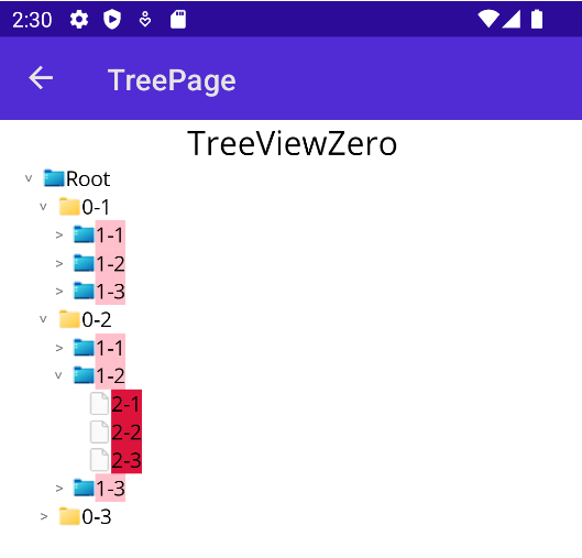
This control allows you to visualise a tree of any data. Each trunk node must provide its children using a public property that supports the IEnumerable interface.
If the children are in a collection that supports INotifyCollectionChanged the control will track changes to the underlying tree data.
Children are lazy-loaded and the UI is virtualised.
| Property | Type | Bindable | Purpose |
|---|---|---|---|
| IndentMultiplier | double | Yes (OneTime) | How far the TreeNode should be indented for each nest level. Default is 15.0 |
| IsRootVisible | bool | Yes | Specifies whether the root node should be shown or omitted. |
| ItemContainerStyle | Style | Yes | An optional Style that can be applied to the ListItemZero instances that represent each node. This can be used to modify how selected-items are rendered. |
| ItemHeight | float | Yes | The height of each row in the tree-view |
| ItemsSource | object | Yes | Set this to your root node |
| ScrollOffset | float | YES! | This is the absolute offset and can bound to |
| SelectedItem | object | Yes | Set to the currently selected item, i.e. an instance of your ViewModel data, or null |
| SelectedItems | IList | Yes | All currently selected items. Default is an ObservableCollection<object>. You can bind to it or set your own collection, and if it supports INotifyCollectionChanged the TreeViewZero will track it. |
| SelectionMode | SelectionMode | Yes | Alloows a SelectionMode of None, Single or Multiple. |
| TreeChildren | IEnumerable | No | This is exposed for future capabilities and exposes all items potentially visible in the viewport. |
| TreeItemControlTemplate | ControlTemplate | Yes | Alows you to replace the default ControlTemplate used to render each node |
| TreeItemTemplate | TemplateProvider | Yes | Used to draw the data for each node. Set this to a TreeItemDataTemplate or a TreeItemDataTemplateSelector. See below. |
TreeItemDataTemplate tells a tree-node how to draw its content, how to get its children and whether it should bind IsExpanded to the underlying data.
It declares the following properties:
| Property | Type | Purpose |
|---|---|---|
| ChildrenPropertyName | string | The name of the property used to find the node children |
| IsExpandedPropertyName | string | The name of the property used to store whether the node is expanded |
| ItemTemplate | DataTemplate | The DataTemplate used to draw this node |
| TargetType | Type | When used in a TreeItemDataTemplateSelector, identifies the least-derived nodes the ItemTemplate can be applied to. |
Given a hierarchy of MyNode
public class MyNode
{
   public string Name { get; set;}
   public IEnumerable<MyNode> MyNodeChildren { get; set; }
}
Add the namespace:
xmlns:cz="clr-namespace:FunctionZero.Maui.Controls;assembly=FunctionZero.Maui.Controls"Then declare a TreeViewZero like this:
<!--Tip: A generous ItemHeight ensures the chevrons aren't too small to tap with your finger-->
<cz:TreeViewZero ItemsSource="{Binding RootNode}" ItemHeight="100">
    <cz:TreeViewZero.TreeItemTemplate>
        <cz:TreeItemDataTemplate ChildrenPropertyName="MyNodeChildren">
            <DataTemplate>
                <Label Text="{Binding Name}" />
            </DataTemplate>
        </cz:TreeItemDataTemplate>
    </cz:TreeViewZero.TreeItemTemplate>
</cz:TreeViewZero>If the children of a node support INotifyCollectionChanged, the TreeView will track all changes automatically.
If the properties on your node support INotifyPropertyChanged then they too will be tracked.
For example, TreeViewZero will track changes to Name, IsExpanded and any
modifications to the Children collection on the following node:
public class MyObservableNode : BaseClassWithInpc
{
   private string _name;
   public string Name
   {
      get => _name;
      set => SetProperty(ref _name, value);
   }

   private bool _isMyNodeExpanded;
   public bool IsMyNodeExpanded
   {
      get => _isMyNodeExpanded;
      set => SetProperty(ref _isMyNodeExpanded, value);
   }

   public ObservableCollection<MyObservableNode> Children {get; set;}
}
This is how to bind the IsMyNodeExpanded from our data, to IsExpanded on the TreeNode ...
<cz:TreeViewZero.TreeItemTemplate>
    <cz:TreeItemDataTemplate ChildrenPropertyName="Children" IsExpandedPropertyName="IsMyNodeExpanded">
        <DataTemplate>
            ...
        </DataTemplate>
    </cz:TreeItemDataTemplate>
</cz:TreeViewZero.TreeItemTemplate>The TreeViewZero allows selection modes None, Single or Multiple.
Please see the ListViewZero docs for how to use the SelectionMode property.
Use this to style each tree-node, e.g. to change how selected items are rendered.
See Styling SelectedItems on the ListViewZero for details, or use the following as a guide:
<Style x:Key="testItemStyle" TargetType="cz:ListItemZero">
    <Setter Property="VisualStateManager.VisualStateGroups" >
        <VisualStateGroupList>
            <VisualStateGroup x:Name="CommonStates">

                <!-- BackgroundColor must have a value set or the other states cannot 'put back' the original color -->
                <!-- I *think* this is due to a bug in MAUI because unappyling a Setter ought to revert to the original value or default -->
                <VisualState x:Name="Normal" >
                    <VisualState.Setters>
                 <Setter Property="BackgroundColor" Value="Transparent" />
                    </VisualState.Setters>
                </VisualState>

                <VisualState x:Name="ItemFocused">
                    <VisualState.Setters>
                        <Setter Property="BackgroundColor" Value="Cyan" />
                    </VisualState.Setters>
                </VisualState>

                <VisualState x:Name="Selected">
                    <VisualState.Setters>
                        <Setter Property="BackgroundColor" Value="AliceBlue" />
                    </VisualState.Setters>
                </VisualState>

            </VisualStateGroup>
        </VisualStateGroupList>
    </Setter>
</Style>
And set it like this:
<cz:TreeViewZero
    SelectionMode="Multiple"
ItemContainerStyle="{StaticResource testItemStyle}"If your tree of data consists of disparate nodes with different properties for their Children,
use a TreeItemDataTemplateSelector and set TargetType for each TreeItemDataTemplate.
Note: In this example, the tree data can contain nodes of type LevelZero, LevelOne and LevelTwo where each type has a different property to provide its children.
The first TargetType your data-node can be assigned to is used. Put another way, the first TargetType the data-node can be cast to, wins.
<cz:TreeViewZero ItemsSource="{Binding SampleTemplateTestData}" ItemHeight="20" >
    <cz:TreeViewZero.TreeItemTemplate>
        <cz:TreeItemDataTemplateSelector>
            <cz:TreeItemDataTemplate ChildrenPropertyName="LevelZeroChildren" TargetType="{x:Type test:LevelZero}" IsExpandedPropertyName="IsLevelZeroExpanded">
                <DataTemplate>
                    <Label Text="{Binding Name}" BackgroundColor="Yellow" />
                </DataTemplate>
            </cz:TreeItemDataTemplate>

            <cz:TreeItemDataTemplate ChildrenPropertyName="LevelOneChildren" TargetType="{x:Type test:LevelOne}" IsExpandedPropertyName="IsLevelOneExpanded">
                <DataTemplate>
                    <Label Text="{Binding Name}" BackgroundColor="Cyan" />
                </DataTemplate>
            </cz:TreeItemDataTemplate>

            <cz:TreeItemDataTemplate ChildrenPropertyName="LevelTwoChildren" TargetType="{x:Type test:LevelTwo}" IsExpandedPropertyName="IsLevelTwoExpanded">
                <DataTemplate>
                    <Label Text="{Binding Name}" BackgroundColor="Pink" />
                </DataTemplate>
            </cz:TreeItemDataTemplate>

            <cz:TreeItemDataTemplate ChildrenPropertyName="LevelThreeChildren" TargetType="{x:Type test:LevelThree}" IsExpandedPropertyName="IsLevelThreeExpanded">
                <DataTemplate>
                    <Label Text="{Binding Name}" BackgroundColor="Crimson" />
                </DataTemplate>
            </cz:TreeItemDataTemplate>
        </cz:TreeItemDataTemplateSelector>
    </cz:TreeViewZero.TreeItemTemplate>
</cz:TreeViewZero>If you want full-control over the TreeItemTemplate per node, you can easily implement your own
TreeItemDataTemplateSelector and override OnSelectTemplateProvider. Here's an example that chooses a template
based on whether the node has children or not:
public class MyTreeItemDataTemplateSelector : TemplateProvider
{
    /// These should be set in the xaml markup. (or code-behind, if that's how you roll)
    public TreeItemDataTemplate TrunkTemplate{ get; set; }
    public TreeItemDataTemplate LeafTemplate{ get; set; }

    public override TreeItemDataTemplate OnSelectTemplateProvider(object item)
    {
        if(item is MyTreeNode mtn)
            if((mtn.Children != null) && (mtn.Children.Count != 0))
                return TrunkTemplate;

        return LeafTemplate;
    }
}
Take a look at TreeItemDataTemplateSelector.cs
for an example of how to provide a collection of TreeItemDataTemplate instances to your TemplateProvider.
Do this if you want to change the way the whole tree-node is drawn, e.g. to replace the chevron. It is a two-step process.
- Create a
ControlTemplatefor the node - Apply it to the
TreeViewZero
The templated parent for the ControlTemplate is a ListItemZero. It exposes these properties:
| Property | Type | Purpose |
|---|---|---|
| IsPrimary | bool | If selection is allowed, this tracks the current SelectedItem |
| IsSelected | bool | If the current item is selected, this is true. Note we can have multiple items selected, but only one SelectedItem |
| ItemIndex | int | For internal use when managing the cache |
| ItemTemplate | DataTemplate | The DataTemplate used to generate the ListViewItem Content |
The BindingContext of the templated parent is a TreeNodeContainer and includes the following properties:
| Property | Type | Purpose |
|---|---|---|
| Indent | int | How deep the node should be indented. It is equal to NestLevel, or NestLevel-1 if the Tree Root is not shown. |
| NestLevel | int | The depth of the node in the data. |
| IsExpanded | bool | This property reflects whether the TreeNode is expanded. |
| ShowChevron | bool | Whether the chevron is drawn. True if the node has children. |
| Data | object | This is the tree-node data for this TreeNodeZero instance, i.e. your data! |
You can base the ControlTemplate on the default, show here, or bake your own entirely.
<ControlTemplate x:Key="defaultControlTemplate">
    <HorizontalStackLayout HeightRequest="{Binding Height, Mode=OneWay, Source={x:Reference tcp}}" >
        <!--
        The ControlTemplate sets the TreeNodeSpacer BindingContext to "{Binding Source={RelativeSource TemplatedParent}}" for us
        i.e. a ListItemZero.
        The TreeNodeSpacer walks up the visual-tree to find the containing TreeViewZero, to get the IndentMultiplier.
        It then sets its WidthRequest to the IndentMultiplier * (ListItemZero.BindingContext.Indent - 1)
        -->
        <cz:TreeNodeSpacer />

        <cz:Chevron
            IsExpanded="{TemplateBinding BindingContext.IsExpanded, Mode=TwoWay}"
            ShowChevron="{TemplateBinding BindingContext.ShowChevron, Mode=TwoWay}"
            />
        <!--This is simply a ContentPresenter that allows us to specify a BindingContext for the Content-->
        <cz:TreeContentPresenter
            VerticalOptions="Fill"
            x:Name="tcp"
            HorizontalOptions="Fill"
            BindingContext="{TemplateBinding BindingContext.Data, Mode=OneWay}"
            />
    </HorizontalStackLayout>
</ControlTemplate><cz:TreeViewZero
ItemsSource="{Binding SampleData}"
IndentMultiplier="20"
TreeItemControlTemplate="{StaticResource MyTreeItemControlTemplate}"
ItemHeight="60"
>
<cz:TreeViewZero.TreeItemTemplate>
<cz:TreeItemDataTemplate ChildrenPropertyName="Children" IsExpandedPropertyName="IsDataExpanded">
<DataTemplate>
<Label Text="{Binding Name}" BackgroundColor="Pink" />
</DataTemplate>
</cz:TreeItemDataTemplate>
</cz:TreeViewZero.TreeItemTemplate>
</cz:TreeViewZero>There's a cool new control for masking out areas of the screen.
It's really boring writing documentation so here's a quick sample whilst I finish the control off.
<ContentPage.ControlTemplate>
    <ControlTemplate>
        <cz:MaskZero
            BackgroundAlpha="0.5"
            MaskTargetName="{TemplateBinding BindingContext.TargetName}"
            MovementEasing="{x:Static Easing.CubicInOut}"
            MaskRoundnessEasing="{x:Static Easing.CubicInOut}"
            Duration="450"
            MaskColorRequest="{TemplateBinding BindingContext.MaskColor}"
            MaskEdgeColorRequest="{TemplateBinding BindingContext.MaskEdgeColor}"
            >
            <cz:MaskZero.Content>
                <ContentPresenter/>
            </cz:MaskZero.Content>
        </cz:MaskZero>
    </ControlTemplate>
</ContentPage.ControlTemplate>
Notice we are binding to the control's ~Request properties.
This means any changes will be animated, using the Easing functions you provide.
Now give some of your controls a MaskZero.MaskName
<Grid xmlns:cz="clr-namespace:FunctionZero.Maui.Controls;assembly=FunctionZero.Maui.Controls"
      RowDefinitions="*,*" ColumnDefinitions="*,*" >
    <Label Grid.Row="0" Grid.Column="0" Text="Banana!"     cz:MaskZero.MaskName="banana" />
    <Label Grid.Row="0" Grid.Column="1" Text="Radish!"     cz:MaskZero.MaskName="radish" />
    <Label Grid.Row="1" Grid.Column="0" Text="Melon!"      cz:MaskZero.MaskName="melon" />
    <Label Grid.Row="1" Grid.Column="1" Text="Grapefruit!" cz:MaskZero.MaskName="grapefruit" />
</Grid>
Finally, add to your ViewModel the properties the ControlTemplate binds to, and set them, simple as that!
private async Task DoTheThingAsync()
{
    while (true)
    {
        await Task.Delay(2000);

        TargetName = "banana";
        MaskColor = Colors.Red;
        MaskEdgeColor = Colors.Black;
        await Task.Delay(2000);

        TargetName = "radish";
        MaskColor = Colors.Purple;
        MaskEdgeColor = Colors.Black;
        await Task.Delay(2000);

        TargetName = "melon";
        MaskColor = Colors.Blue;
        MaskEdgeColor = Colors.Red;
        await Task.Delay(2000);

        TargetName = "grapefruit";
        MaskColor = Colors.Yellow;
        MaskEdgeColor = Colors.Black;
    }
}
Run the demo to see different controls highlighted, with animated color, shape and opacity changes. Code is here:
AdaptedTabbedPage MAUI bug 14572
- Use it when you want to use
ItemsSourceandItemTemplate. Stick withTabbedPageif you're manipulating theChildrencollection directly. - This implementation replaces
ItemsSourceby hiding the base implementation. This means if you set it up in code-behind, you must ensure you have a reference of typeAdaptedTabbedPagewhen you setItemsSource. If your reference is of typeTabbedPageorMultiPage<Page>you'll be setting the baseItemsSourceand the crash will remain.
SelectedItemnow has limited support. Setting it in code works fine and swaps to the correct Tab, however swapping by interacting with the UI does not updateSelectedItem, because doing so would cause the WinUI crash we're trying to dodge.SelectedItemis fine. If you think it's causing problems, setUseExperimentalSelectedItemto false.
AdaptedFlyoutPage MAUI bug 13496
- Basically if the Flyout loses focus and the FlyoutLayoutBehavior is
Popover, it assumes the flyout has been dismissed and sets theIsPresentedproperty to false.