Include html-ratio-component.js at the bottom of your page, just before the ending </body> element.
<script src="html-ratio-component.min.js"></script>
<!-- Or, when installed by npm -->
<script src="node_modules/html-ratio-component/html-ratio-component.min.js"></script>
Optional: include html-ratio-component.css (this is only required when you dynamically add a component with the ratio attribute)
<link rel="stylesheet" href="html-ratio-component.css">
<!-- Or, when installed by npm -->
<link rel="stylesheet" href="node_modules/html-ratio-component/html-ratio-component.css">
When you have loaded the component you can use it as followed:
<div ratio="4x3">Lorem ipsum</div>Where the value of ratio can be anything as long as it are two numbers, divided by an 'x'.
In some edge cases where you dynamicly add an element to your dom. The approriate triggers might not be triggered. Like when you dynamicly add an element with a ratio attribute to an element which has not have a width. The solution to this, is to manually fire the appropriate event to trigger it. You can do this via the following code.
window.dispatchEvent(new Event("resize")); $ npm install html-ratio-component
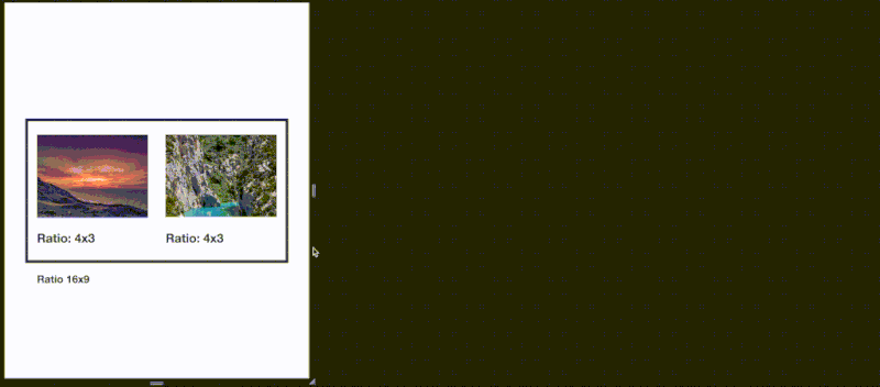
This component made for retaining the aspect ratio of a domElement. It does this by listening for a few event listeners (see ./internal/events.js for more info). Which updates the height of the domElement, based on it's width. It does this when the document is loaded or whenever the screen gets resized. See the example.html to get a preview of it's function. This is often desired when you have images according a specific aspect ratio. Which in practice makes it useful when you add the ratio attribute the container of the image you want to have a certain aspect ratio. So it functions both as a placeholder (for when the image is not loaded yet) and then just set the image within the container to a width to 100%;
A small talk about the value of the ratio attribute. You can set this to whatever you want it to be. As long as you define it as 2 numbers, seperated by an 'x'. The first number represents the width, the second represents the height of the element. An aspect ratio of 16x9 means that the height will be set to 56.25% of the width. For more information about aspect ratio's I would like to refer you to wikipedia page https://en.wikipedia.org/wiki/Aspect_ratio_(image)