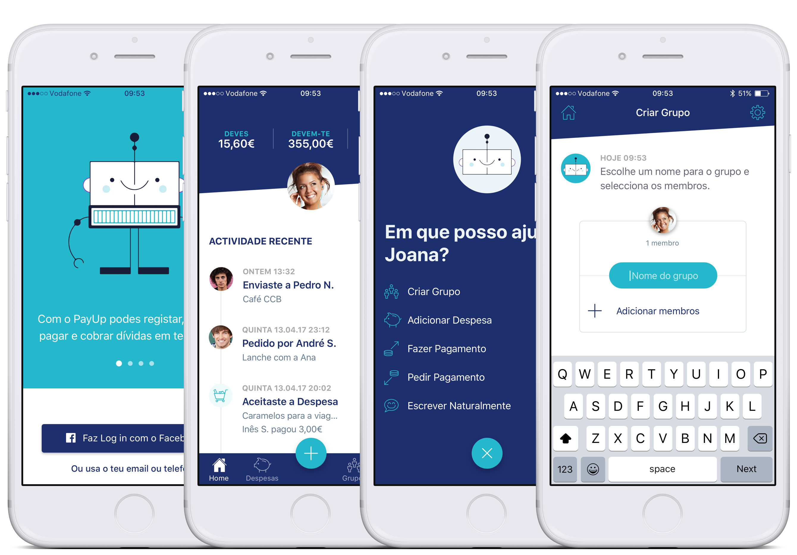
 Some PayUp screens. From left to right: Onboarding, Home, Unfolded menu, Bot (Walkthrough to create an expense sharing group).
📖 Estimated reading time: 26 minutes (6566 words)
Table of Contents
- Project Summary
- Context and Challenge (Ideation)
- Methodology
- Research and Strategy
- Interaction Design
- Visual Design
- Prototyping
- Presentation
- Conclusion
Project developed with Lília Correia and Marta Casal, under a Postgraduate Diploma in Digital Experience Design, which consisted in designing an interactive or semi-functional prototype of a digital product or service, following a user-centred approach.
We designed PayUp; a mobile app to manage shared expenses, receive and pay debts, without the need to expose banking information. All you need is a mobile phone number.
To tackle this challenge we mapped out the following strategy:
- Ideation and Problem Definition
- Elevator Pitch
- Business Model Canvas
- Value Proposition Canvas
- Research and Strategy
- Bibliographical Research
- Technical Documentation Analysis
- Expert Interview
- Benchmarking
- Online Surveys
- Interviews (with potential end users)
- Personas
- User and Job Stories
- Interaction Design
- Functional Requirements Analysis
- Information Architecture
- Wireflows
- User Feedback Rounds 🔁
- Visual Design
- Branding
- Mockups
- User Feedback Rounds 🔁
- Prototyping
- Product Requirements Document
- Prototype (MVP)
- User Feedback Rounds 🔁
- Presentation
- Pitch Deck and Live Demo
- Project Report
Even though all team members were involved in all project phases, we each chose a main user flow to work on. I was responsible for designing the flow to create a group to share expenses and add an expense to that group.
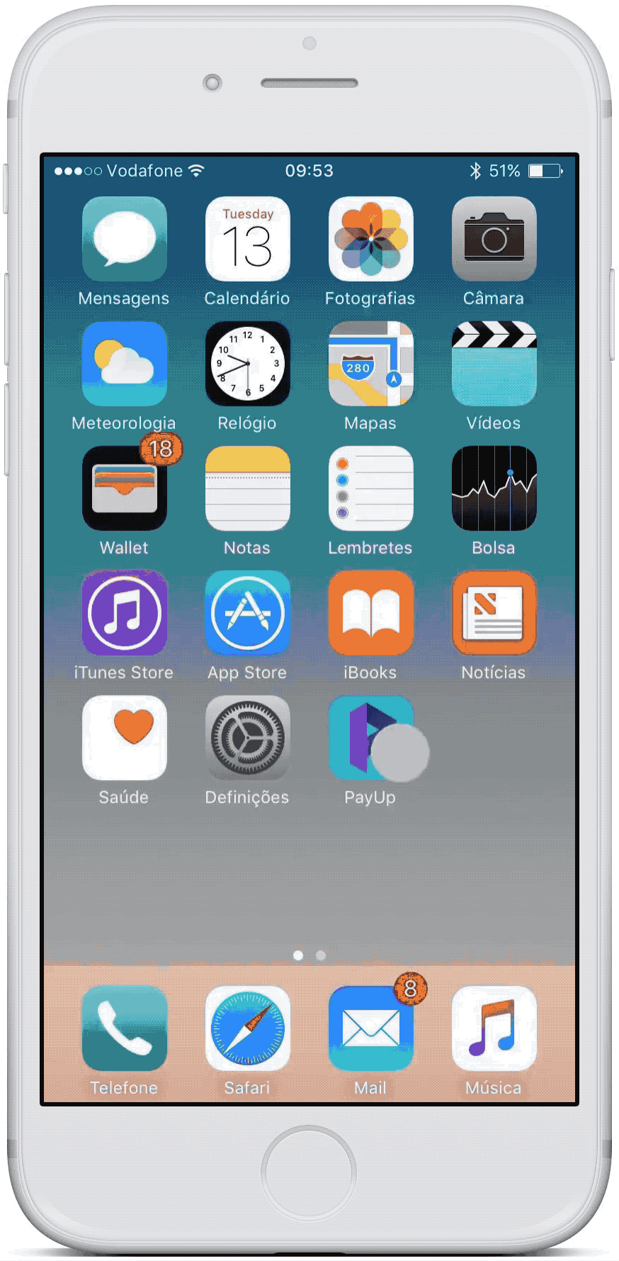
👉 PayUp App InVision Prototype — https://filipago.github.io/payup-app-prototype (all the screens I designed, including extras)
Create a Group and Add an Expense User Flows:
1. Bot Walkthrough Mode (conversational)
- Login with email and password;
- Access Bot (actions menu ➝ create a group — “Criar Grupo”);
- Follow the steps to create a group to share expenses with Ana Sousa and Catarina Maia (select Ana Sousa from the contacts’ list and search for Catarina Maia);
- Follow the steps to add an expense to that group;
- Go back to the home screen.
2. Power User mode (chatbot)
- Login with email and password;
- Access Bot (actions menu ➝ write naturally — “Escrever Naturalmente”);
- Write what you want to do;
- Fill in the information asked by the bot to create a group to share expenses with Ana Sousa and Catarina Maia;
- Go back to the home screen.
Lília tackled the flow for creating an account for a new user and Marta worked on sending money to a friend (making a payment).
With the increasing digitalization of our society, consumers’ habits and expectations have been rapidly changing. The trend of instant access to goods and services, mainly through mobile phones, has driven the growth of real-time payments, fast (instant) and simple.
Customers make increasingly use of these online and mobile channels to buy goods and services at any time and anywhere. These developments contribute to the expectation for a faster (or real-time) finality and/or confirmation of the payment. (EPC Report to the ERPB — Euro Retail Payments Board — on Instant Payments)
Millennials are busy bees and have very active social lives. They need a more efficient way to manage shared expenses and pay their friends without worrying about doing the math or knowing IBAN numbers.
PayUp is a mobile app that allows them to split and keep track of shared expenses, pay and collect debts among friends, easily, swiftly and safely, without the need to expose banking information.
PayUp is readily available, anywhere, all the time, to quickly and effortlessly manage splitting costs without estimates, avoid lack of change, having the right amount, or having to know the recipient’s banking data to make a payment. All that is needed is a mobile phone number or an email address.
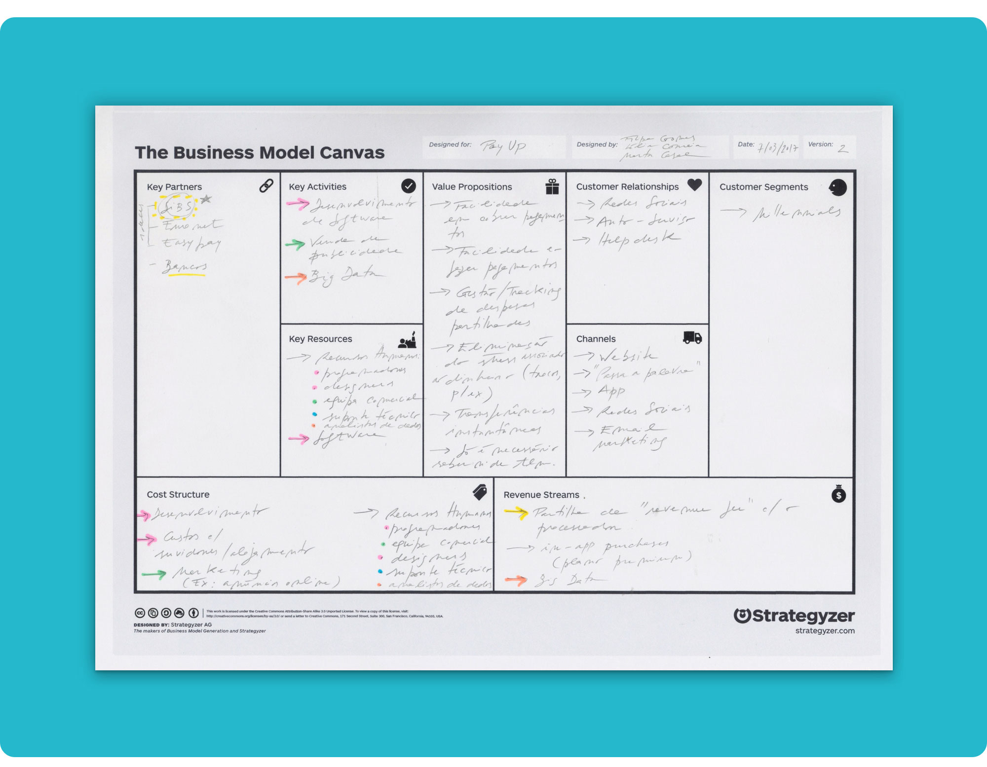 Our Business Model Canvas…
The entry into force in 2018 of the new European Payment Services Directive (PSD2) creates the ideal operating conditions for the development of a product like PayUp, operated by a non-banking Fintech (PISP - Payment Initiation Service Provider).
By promoting the entry of new players in the business, simplifying the processing of digital payments in the European Union, improving its efficiency, reducing the costs of digital payments, forcing banks to make open APIs available and increasing the security of payments with strong customer authentication (2-factor authentication), PSD2 enables this type of system.
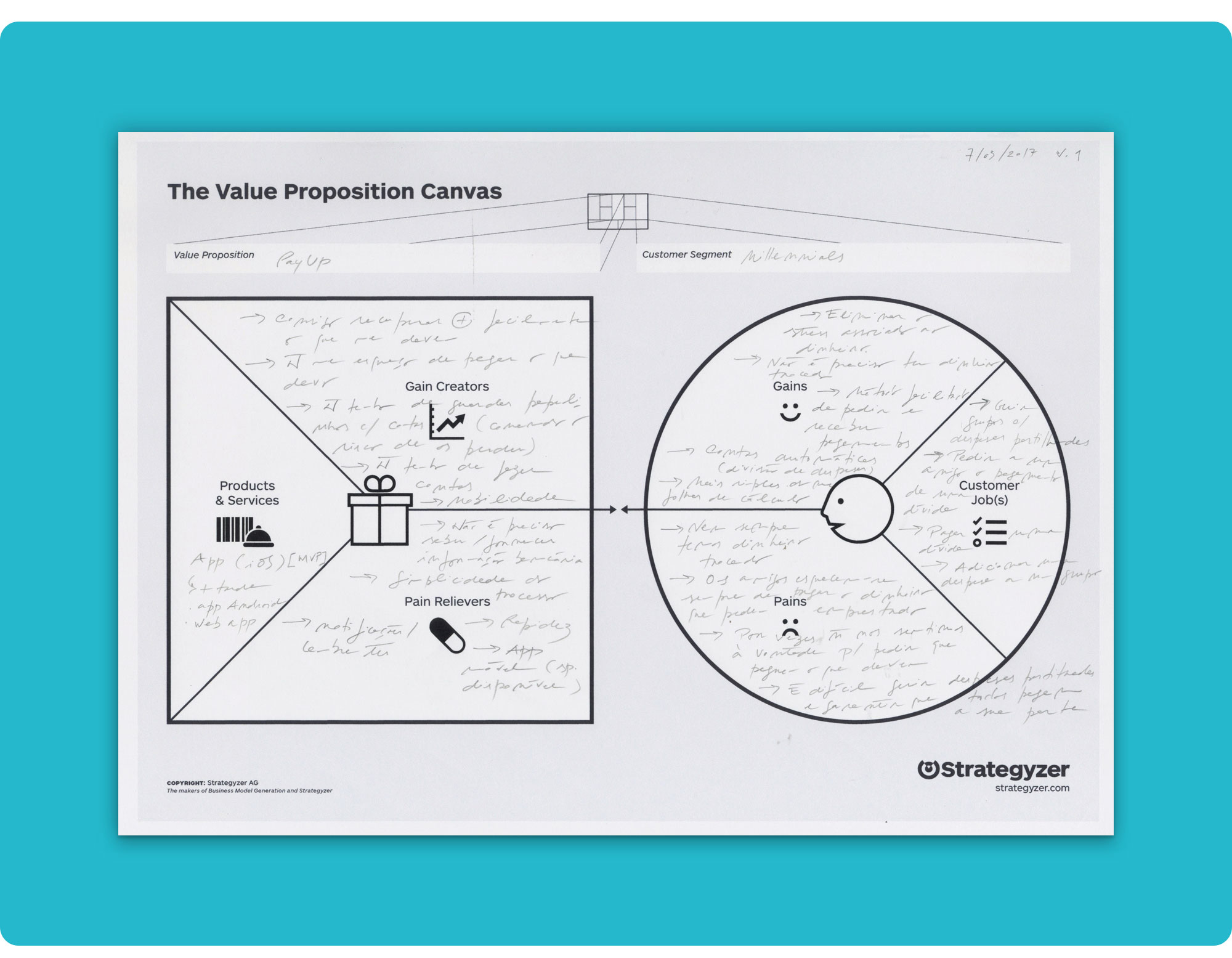 Our Value Proposition...
So our elevator pitch went something like this:
Our goal in creating PayUp is to help Millennials solve problems with splitting and tracking shared expenses, collecting and paying off debts among friends, by developing a mobile app that is better than MB WAY, Verse and Splitwise because it integrates into a single product the possibility to send and receive instant payments at any time, in a fast and easy way, without the need to disclose banking information, as well as track shared expenses.
We followed a LEAN methodology throughout this project. Our primary focus was always, first and foremost, on the perception of our potential users’ needs, testing the solutions that emerged and constantly iterating to improve the previously encountered solutions’ hypothesis... Iterate until Awesome!
Whenever possible, everything was tested with real users; mostly colleagues, trainers and friends. Their feedback was essential to the evolution of the design.
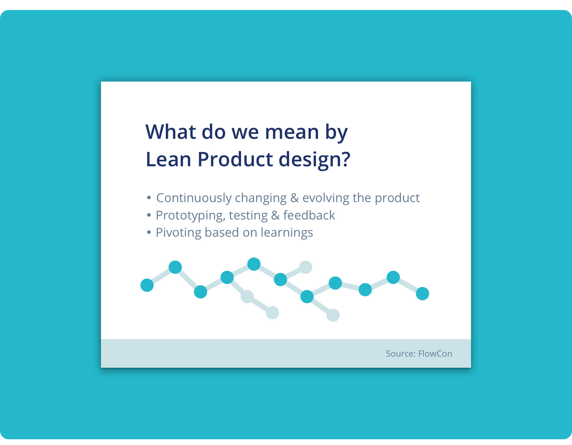 Lean Methodology by FlowCon.
The development of the project went through 3 major phases:
1. Research and Strategy
We wanted to make sure that splitting and managing shared expenses, as well as collecting/sending payments, were real problems of our presumed target audience. We tried to find data that could enlighten us on the business area we were working on and help shape the features and requirements that were necessary for the adoption of our solution.
- Bibliographical Research
- Technical Documentation Analysis
- Expert Interview
- Benchmarking
- Online Surveys
- Interviews (with potential end users)
- Personas
- User and Job Stories
2. Interaction Design
We defined the user flows of the different personas, the information architecture and the wireframes of the platforms that make up our product (mobile app and landing page).
- Functional Requirements Analysis
- Information Architecture
- Wireflows
- User Feedback Rounds 🔁
3. Visual Design and Prototyping
We designed all visual aspects concerning the product, from branding to high-fidelity mockups and prototypes.
- Branding
- Mockups
- User Feedback Rounds 🔁
- Product Requirements Document
- Prototypes (MVP)
- User Feedback Rounds 🔁
Our research plan was kick-started by five central questions:
1. What are the most important technical and legal requirements and constraints when developing an instant payment/transfer service?
2. Who are our competitors? What are the market trends?
3. How does our target audience split expenses?
4. Which factors influence them the most when choosing a payment/transfer service?
5. Which pain points are they facing and how can we fix them?
Answering these questions was pivotal to assure we were building a true user-centric product that would effectively solve a real problem.
To answer our research questions we used the following research methods:
| # | Research Questions | Research Methods |
|---|---|---|
| 1 | What are the most important technical and legal requirements and constraints when developing an instant payment/transfer service? | - Bibliographical research; - Technical documentation analysis (Directives, Rulebooks, Regulations); - Interviews with banking experts. |
| 2 | Who are our competitors? What are the market trends? | - Analysis on previous sector reports / Market research (Ex: SIBS Market Report 2016); - Benchmarking (researching our direct and indirect competitors in order to analyze its’ strengths, weaknesses and possible improvements). |
| 3 | How does our target audience split expenses? | - Online surveys; - Interviews with potential end users. |
| 4 | Which factors influence them the most when choosing a payment/transfer service? | - Online surveys; - Interviews with potential end users. |
| 5 | Which pain points are they facing and how can we fix them? | - Online surveys; - Interviews with potential end users. |
Researching and studying the documentation on instant payments and the PSD2 European Directive was of utter importance, as we weren’t very familiar with all the norms, requirements and constraints that rule electronic payments in the Single Euro Payments Area (SEPA).
You can download our bibliography here if you want to read some of the documents we studied but... Friendly reminder 😬 … If I were you, I’d stick with just scanning through our findings 💤
The new European Payment Services Directive (PSD2), which becomes applicable on January 13th 2018, is what enables the rising of a product like PayUp.
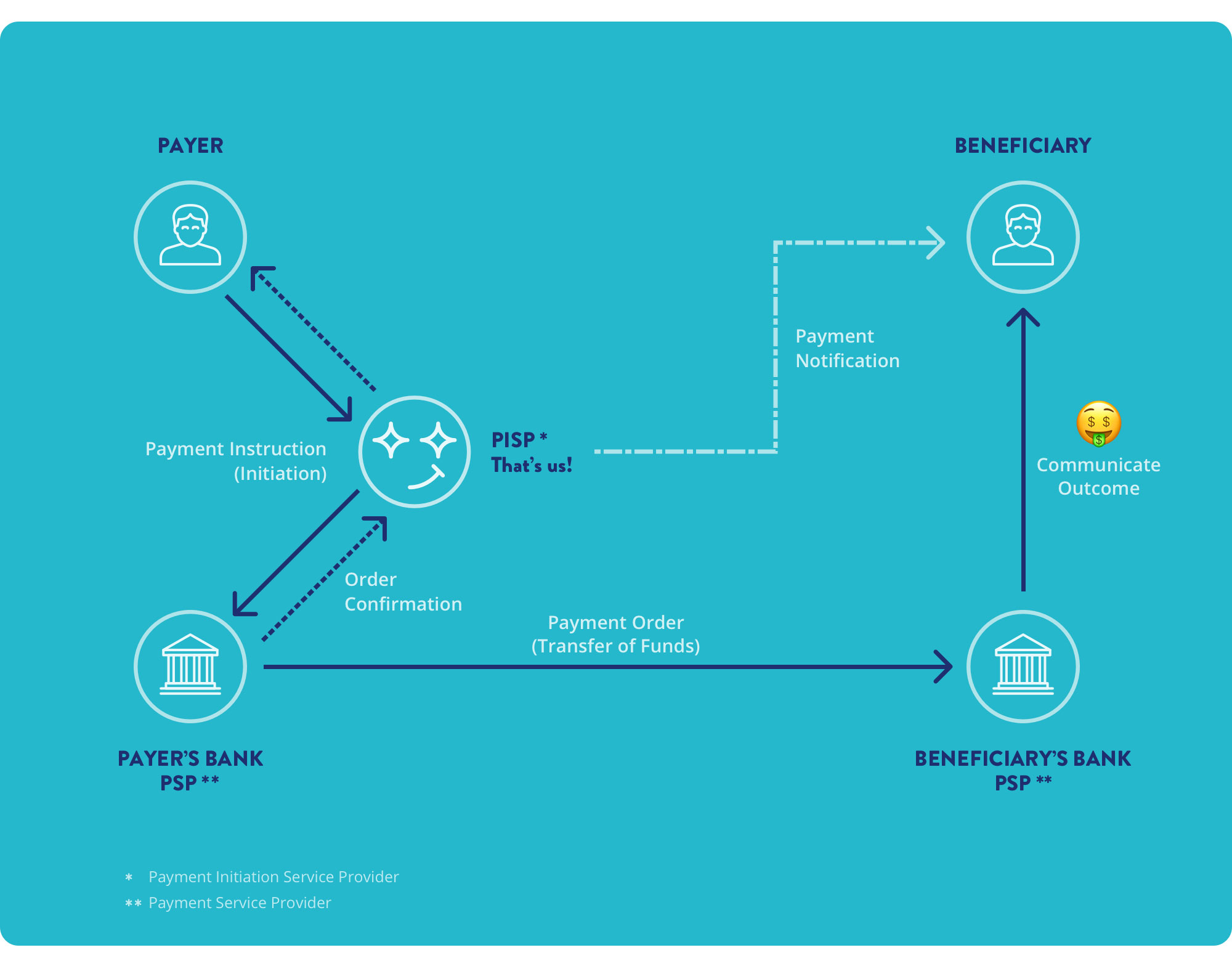
All EU banks are obliged to comply with this directive by September 2019, and make open APIs available to any Payment Initiation Service Provider (PISP) — that’s us! 💪
At the core of PSD2 is the need for Banks (= Account Servicing Payment Service Providers or AS PSPs) to grant AISP and PISP (= Third-party Providers or TPPs) access to their online account/payment services (...) This includes an “Access to Accounts” (XS2A) rule, which will force Banks/ PSPs to facilitate secure access through API to their customer accounts and provide account information to third-party apps if the account holder wishes to do so. (PSD2, Open API and Real-time Breakthrough in Payments: the Retailers’ Perspective)
A PISP is a Service Provider that initiates a payment order (transfer), at the request of the user, relative to an account that is held by another Payment Services Provider (like a bank or SIBS, in Portugal).
Being a PISP, we must comply with a set of obligations:
- We may not, at any time, hold the payer's funds;
- We must ensure that the user's custom security credentials are not accessible by other parts;
- We cannot change the amount, the payer or any other element of the transaction.
Analyzing the documentation led us to quite a few findings that would have implications for the development of our product:
-
Electronic payments/transfers are now subject to strong customer authentication (2-factor authentication). As such, the users’ identity must be verified with 2 personalized credentials.
-
Transfers of less than € 30 and whose cumulative amount of transactions since the last transaction that was made with strong authentication does not exceed 100 to 500 euros (depending on the level of fraud observed in the Payments Service Provider — PSP) do not require the strong authentication mechanism.
-
Strong authentication is mandatory except for low-value transactions (< € 30) or when transferring money to pre-parameterized beneficiaries.
If there are any, the national transfer fees are settled by the payer, however, the SEPA CT scheme allows that fees may be shared between the payer and the beneficiary.
Just to make it perfectly clear... the payer is the person who sends the money and the beneficiary is the one who receives it. 🤓
The following data is required to initiate a payment/transfer transaction:
- Beneficiary Name
- Beneficiary IBAN (International Bank Account Number) — this number can be obtained through a debit card, as it is always attached to a bank account
- Transfer Amount
- Transaction Reference (140 characters max.)
- Currency (EUR)
The PISP has to send the payer and the beneficiary the following information, immediately after initiating a transaction:
- Confirmation that the initiation of the transfer with the PSP that manages the payer's account was successful;
- Transaction Unique Identifier (a long number that enables identifying the transaction in the future);
- Transfer amount and currency (EUR);
- PISP Fees (if any);
- Transaction date.
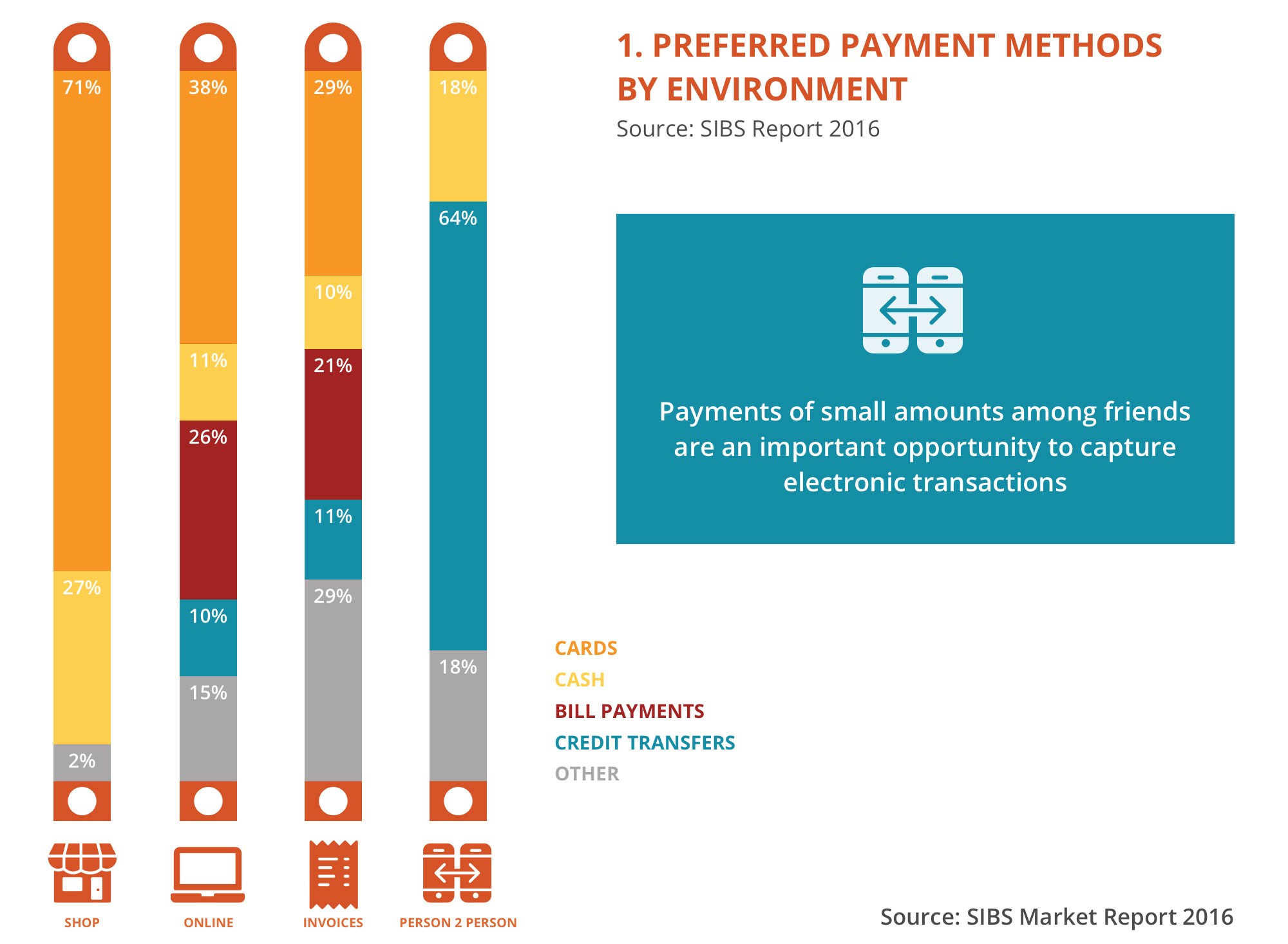
SIBS carried out a study with the goal of understanding how the Portuguese use different payment methods, find out which ones are the most common and how they are used by consumers with different profiles and in different environments. With this analysis, SIBS also tried to identify trends in the adoption of new and emerging payment methods, as well as any barriers to its adoption.
The market study shows that most Portuguese internet users prefer making purchases with electronic payment methods, both online and in physical stores. The same holds true when making payments to friends and family or paying invoices.
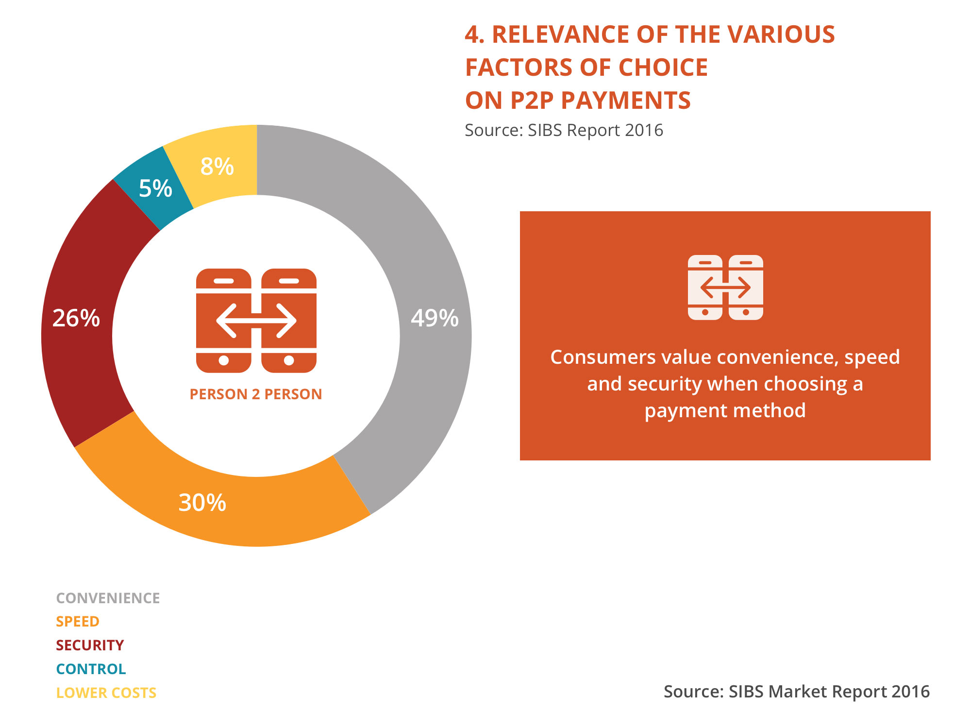
In this report, SIBS anticipates a rapid migration from cash to electronic payments, as consumers become more and more familiar with the technology and because people mostly value convenience and speed when choosing a payment method for P2P transactions.
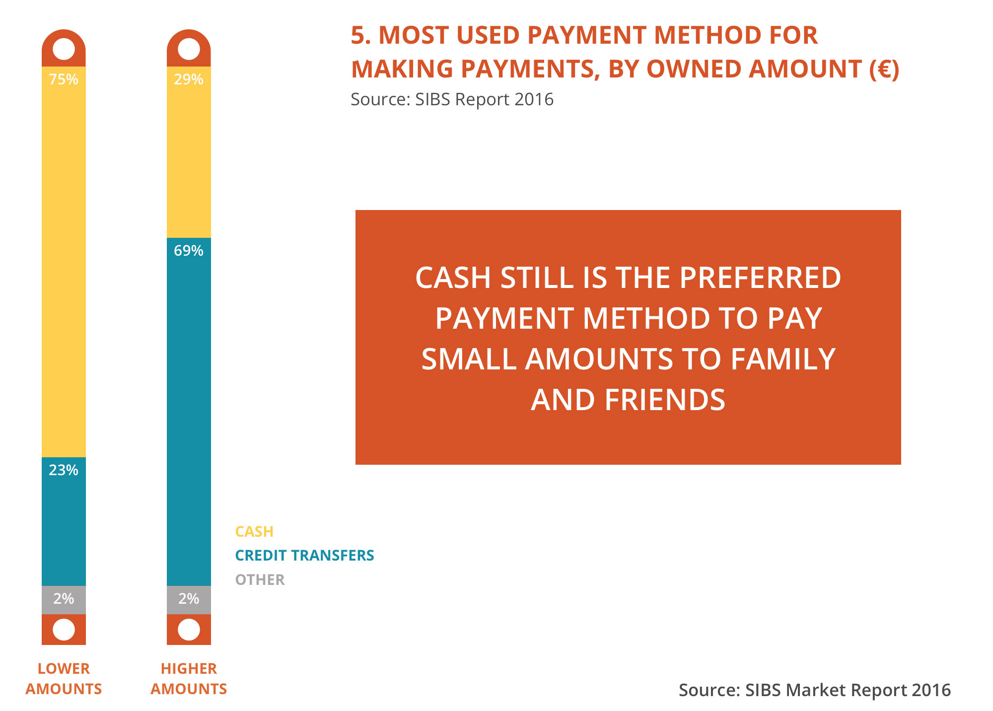
Cash is still the most used payment method when paying for small amounts.
As PayUp facilitates making payments to family and friends, allowing the user to make an instant interbank transfer to a mobile phone number (no need for IBAN), its simplicity and speed can make it a very convenient alternative to cash, even for smaller payments.
Payments of small amounts among friends are an important opportunity to capture new electronic transactions.
 Expert Interview's details.
We managed to interview an expert in order to cement the knowledge we gained from the analysis of the documentation on electronic payments in the EU.
If you want to check out the whole interview, download the pdf here.
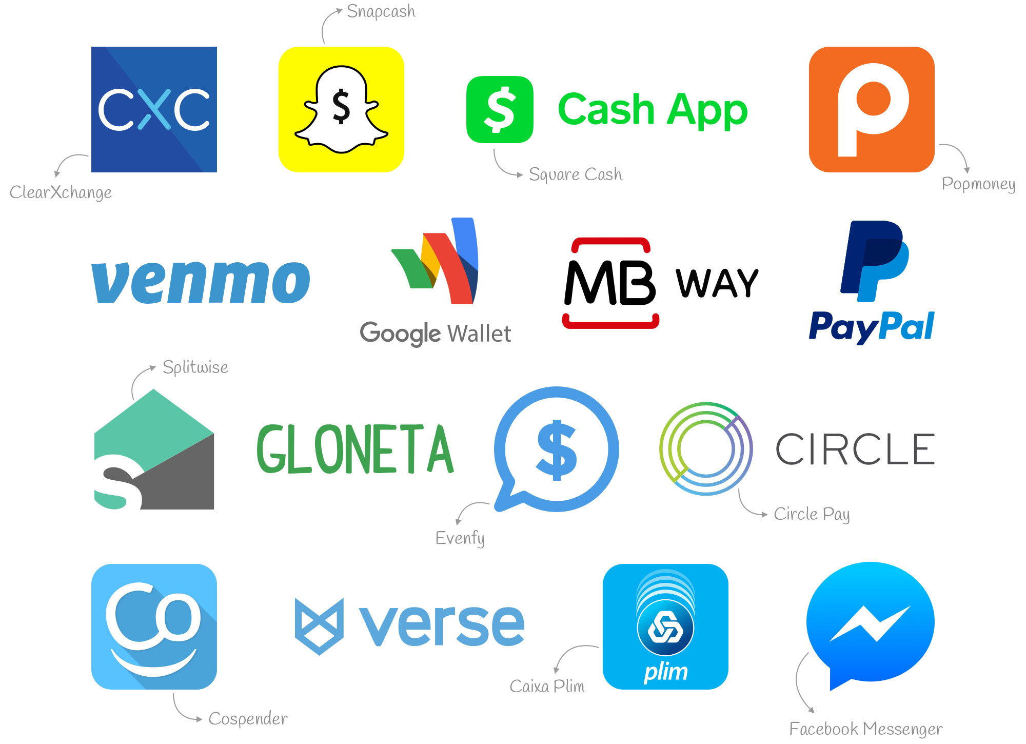
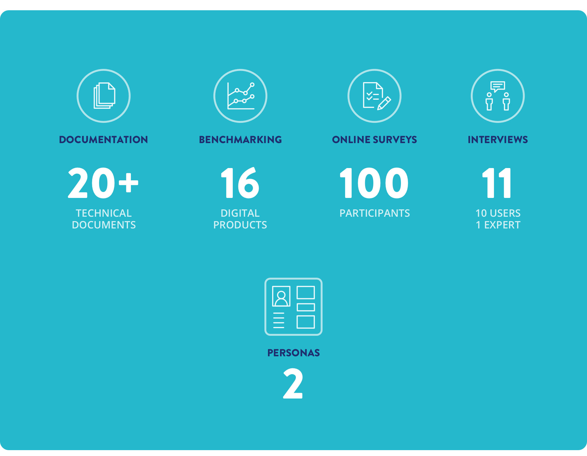
We analyzed 16 products that allow sending transfers/payments to contacts, request the payment of a debt and/or organize joint expenses, using a mobile phone number and/or an email.
Our goals were:
- Knowing the scope of the competing products on the market;
- Analyzing their primary features and infer which are most common;
- Testing their usability;
- Knowing what financial costs these products have for the users;
- Determining their main revenue sources;
- Understanding PayUp’s market placement.
Only 9 out of 16 products are available in Portugal and of these, 2 are only available in Portugal.
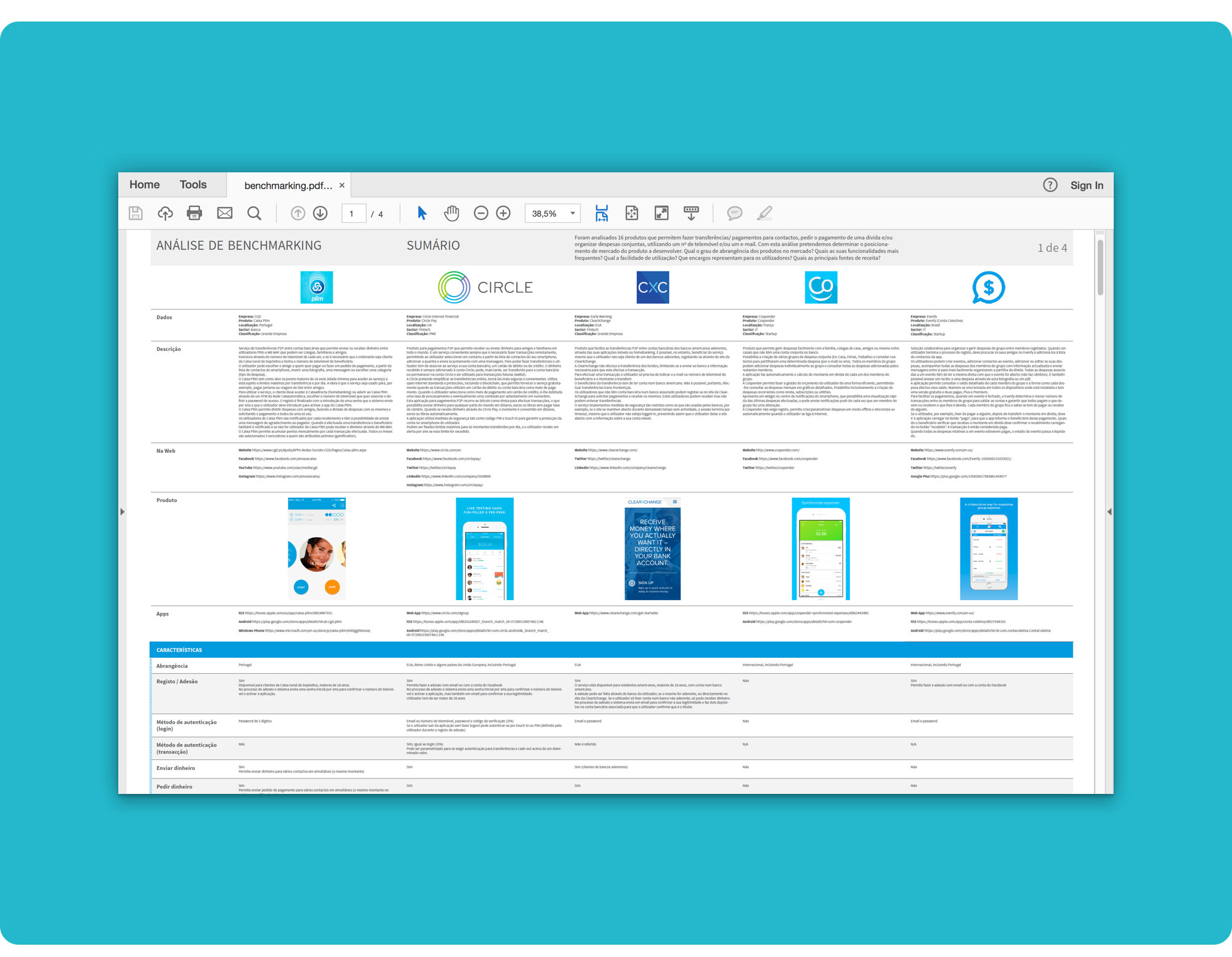 Benchmarking Table detail. You can download the Benchmarking Analysis here and our Findings there.
The Benchmarking analysis allowed us to infer some of PayUp’s competitive advantages.
Most products usually target a single functional area: payments (P2P transfers) or splitting expenses — PayUp targets both.
6 out of 9 products available in Portugal allow the user to make payments. 3 out of 9 products only allow the user to manage splitting expenses and creating groups or events to add expenses.
Only 2 out of 9 allow the user to request the payment of expenses and share them, albeit to a limited extent.
Some companies' business models point to significant costs for the user in at least some specific circumstances — PayUp will downsize these costs to a minimum.
Transfers made between wallet accounts are always free, however, cash-in transactions for the wallet account may have significant costs for the user.
Transfers made from the bank account associated with the debit card, even if not charged by the product being used, may incur costs for the user, depending on their bank.
In the vast majority of cases, most transfers made from the credit card are charged.
At this stage, all Verse transactions are free of charge and Venmo makes free transfers from the bank account associated with the debit card or from another bank account, stating that it supports the costs that may be charged by the user's bank.
In the vast majority of cases, cash-out operations are free although there are circumstances where immediate cash-out is charged.
The sources of income of these products are quite varied, standing out among them the revenues coming from:
- Advertising;
- Trading commissions charged to merchants and customers;
- Foreign exchange conversions;
- Income from the financial investment of the wallet accounts' balance;
- Premium versions with added features;
- In-app purchases.
Splitwise's business model does not imply the generation of revenue from users. According to the organization, the company's revenues will come in the future from a potential agreement with Paypal to be compensated for the traffic redirected to this company. Splitwise is currently funded by business angels.
A significant number of the apps we checked are geographically limited, some of which operate exclusively in the USA — PayUp's MVP covers the national territory (Portugal), but in a second phase it will expand to Europe and in a third one, it will cover low banking territories.
 PayUp’s sectoral competitors.
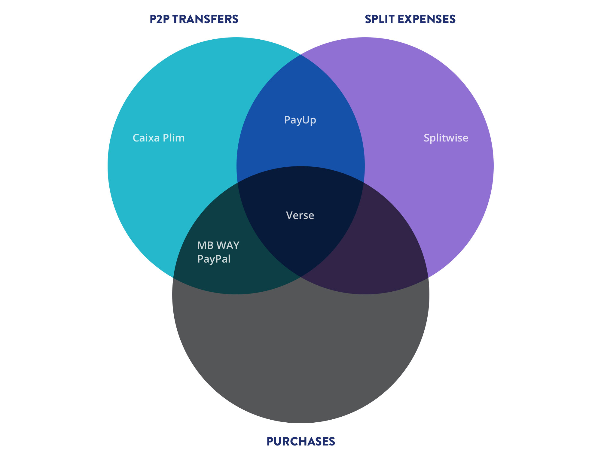
With the previous assumptions set forth and taking into account that PayUp intends to cover the entire value chain, we identified the following primary sectoral competitors:
In the area of the division of expenses — Splitwise
This application is partial; it allows the users to split expenses but doesn't let them make payments inside the app. It can be easily supplanted by PayUp if the quality of the implemented functionality is at least equivalent to Splitwises'.
In the area of payments (P2P Transfers) — MB WAY and Verse
MB Way doesn't allow the user to split expenses or request the payment of a debt. It's most significant strength is its' transfer facilities.
Currently, Verse has a great competitive advantage, as it is completely free of charge, but we already know that this will change in the future.
Caixa Plim is only available to Caixa Geral de Depositos' bank clients...
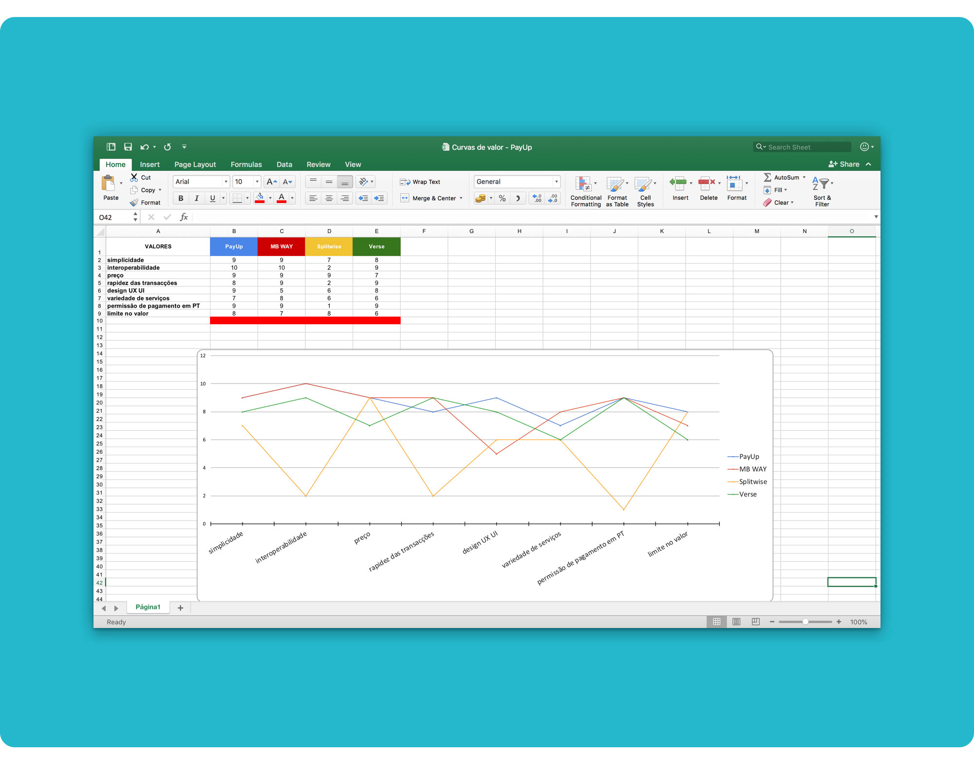 Value Curves.
PayUp's great advantage will be the integration of both functional areas, allowing the user to split expenses, settle the bills and pay for them.
Although Venmo could have the potential to be a major competitor, we are not considering it as it operates exclusively in the US market.
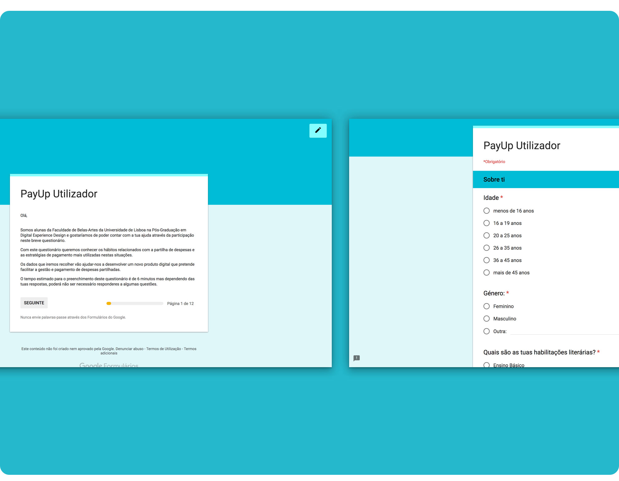 Our Google Form (details).
We used accidental sampling (selection by convenience or opportunity) on our surveys, which is a type of nonprobability sampling that involves the sample being drawn from a part of the population which is close to hand. That is, the sample was selected because it was readily available and convenient.
Our criteria for selecting elements was based on assumptions regarding the population of interest, therefore, we could not make generalizations about the total population from this sample because it wasn’t representative enough.
But even though the sample wasn’t fully representative of our segment and didn’t allow us to draw real conclusions, it did allow us to generate hypotheses and insights as well as test the questions to be asked during the interviews.
We wanted to know:
- Who are the people who share expenses and what are their habits?
- How much do they usually split?
- On which occasions?
- How frequently?
- With whom?
- How do they keep track of shared expenses?
- How do they pay for their share?
- What pain points are they experiencing? (…)
 Our Online Survey Script. You can download the full script here.
To generate insights into these, we started out by designing a script that could be readily available online.
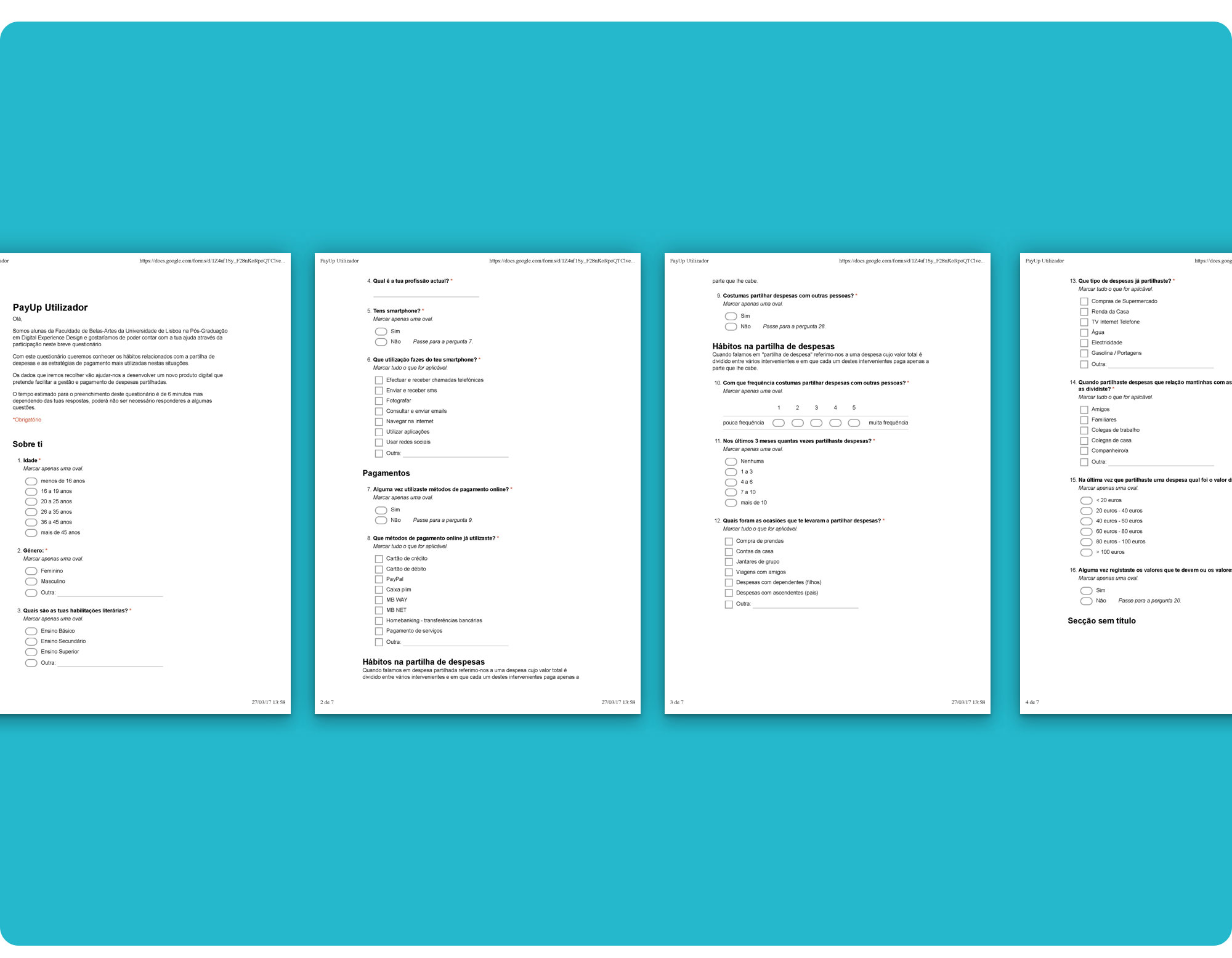
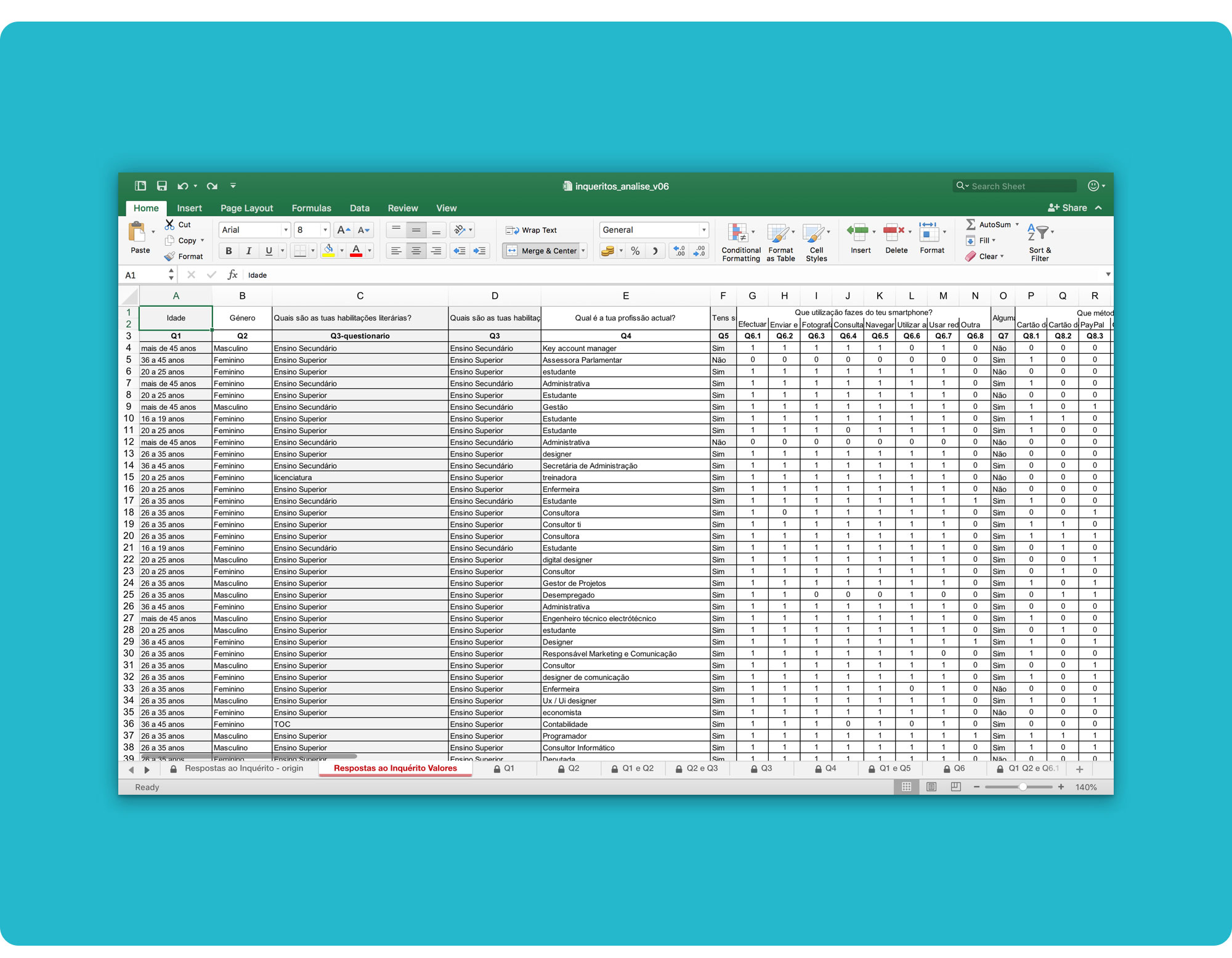 Survey Data Analysis detail. You can download the full analysis here.
We managed to get a sample of 100 people over 4 days, who kindly accepted to help us out.
62% of respondents were female and 38% male. 78% of respondents were aged between 20 and 45 and 70% had a college education.
91% of respondents had a smartphone. The majority felt comfortable using it and 88% also used mobile apps on a regular basis.
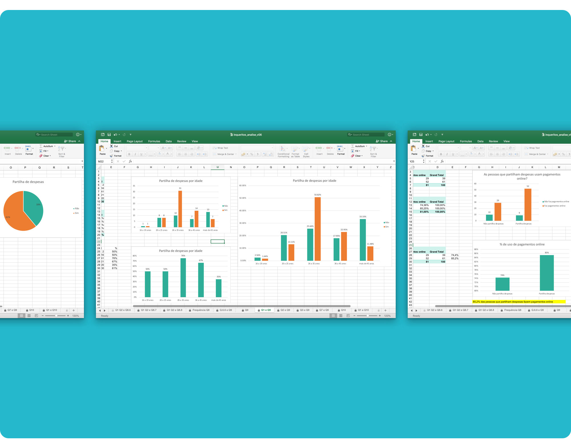 61% of respondents share expenses. Of those, 85% use online payments.
The key findings from the online surveys were:
- The majority of respondents who share expenses, are aged between 26 and 35 and have a college education;
- They use smartphones, mobile apps and digital payment methods;
- They mainly share expenses when going to group dinners, paying household bills and when purchasing gifts;
- They mostly share supermarket purchases, gasoline and tolls;
- They usually share expenses with friends and boyfriends/girlfriends;
- Most pay less than € 40 for their share;
- They split expenses with a medium to medium-high frequency;
- They mainly use money and bank transfers to pay, but prefer bank transfers;
- Bank transfers are used mainly to pay for rent (higher amounts);
- Convenience and ease are the factors that most influence their choice of payment;
- Splitting bills (who pays for what), the immediacy of payment and forgetfulness are the problems that were most often identified when sharing expenses;
- Most respondents usually register expenses on paper and is satisfied using this method.
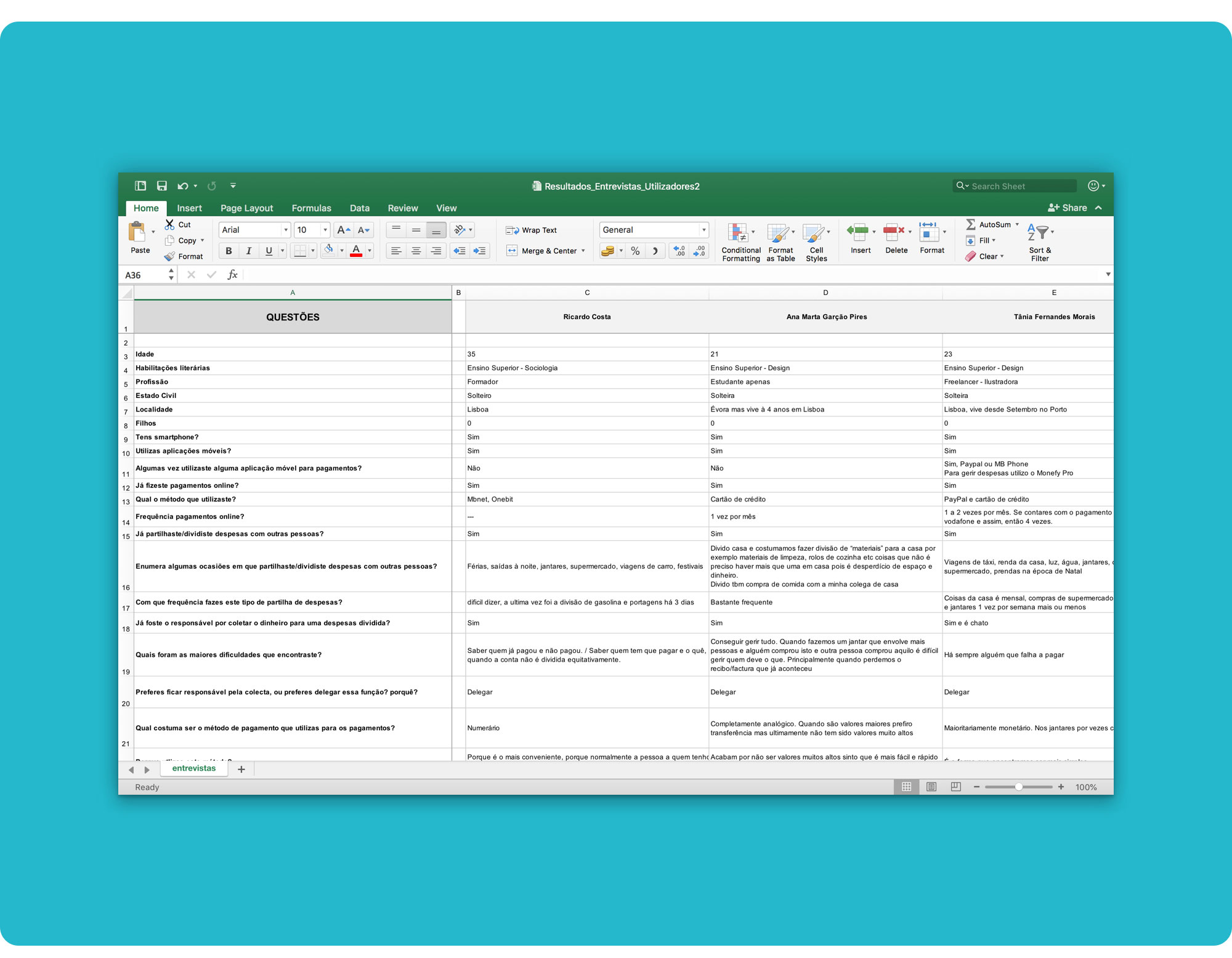 Potential End Users' Interviews' notes. You can download the notes here.
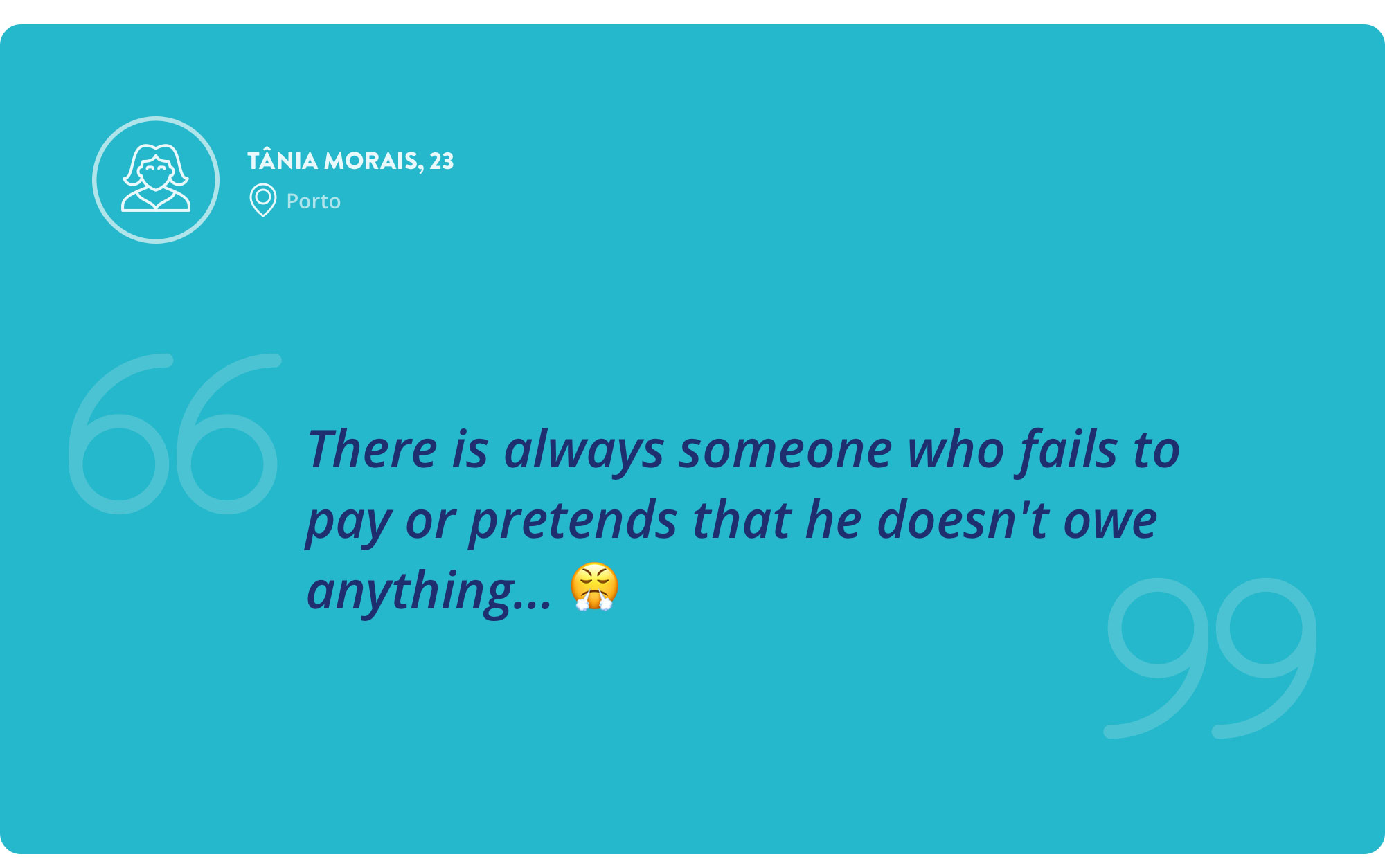
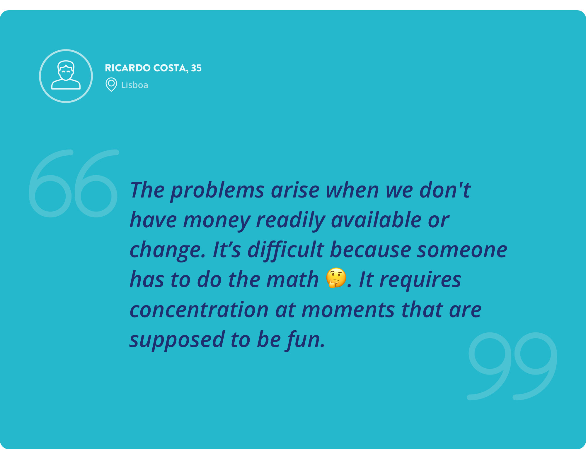
We conducted 10 interviews in order to understand the behaviour of people who frequently share expenses and therefore are potential end users of our product.
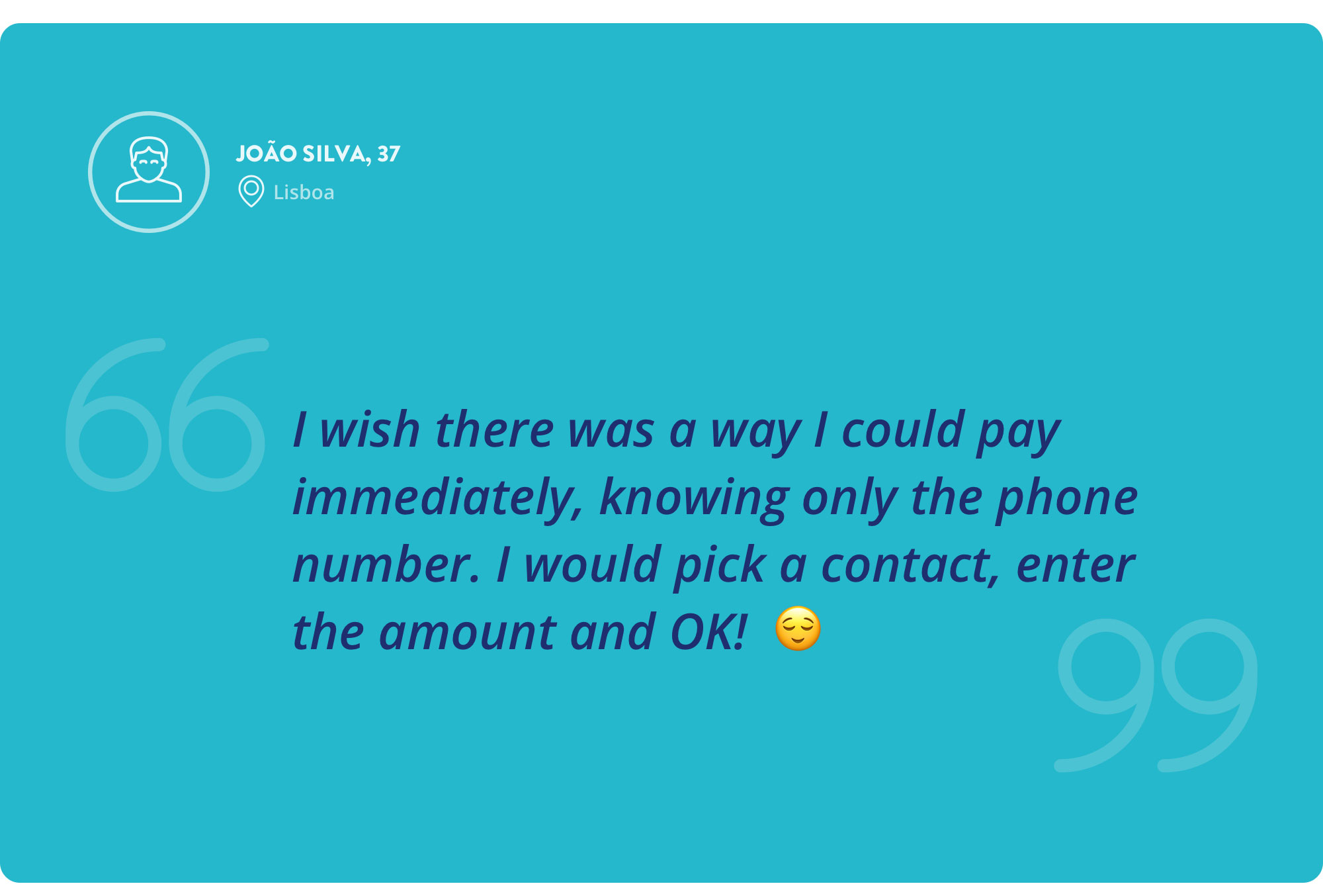
Respondents said that when they decide to pay with cash, it is not because they think it is the best method, it's because they are with the people to whom they have to pay (opportunity). But the lack of having the right amount and change can complicate the process a lot.
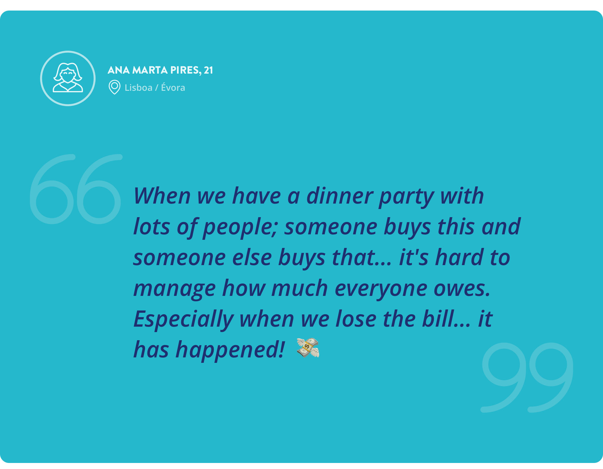
Most problems that arise from splitting expenses happen when people have to pay for different things with different values, making it hard to manage how much each one owes. In addition, it was mentioned that there are people who forget that they owe money and that having to remind them several times can be annoying and embarrassing.
Two respondents use PayPal and enjoy the app, but they said they never used it to make transfers; only for online purchases.
One of the interviewees mentioned that he doesn't use PayPal for transfers because he doesn't know which of his friends subscribed to the service. He also thinks that in order to make transfers, he has to know his friends' usernames.

The main pain points identified over the interviews were:
- Forgetfulness/neglect (to pay);
- Lack of change/lack of money (right amount);
- Managing multiple expenses simultaneously;
- Checking who has already paid / who has to pay;
- Remind/communicate with those who have to pay;
- Lack of banking details to make a payment.
The main needs perceived over the interviews were:
- Making payments easily;
- Creating groups to share expenses;
- Inviting friends;
- Setting values and payment deadlines;
- Managing expenses;
- Receiving and sending notifications/reminders;
- Automated calculation;
- Not needing much data to make payments;
Research helped us confirm that our target audience is the Millennials — young people aged between 18 and 37, with a medium to higher education, single, residing in large urban centres and who are very familiar with the new technologies (tech-savvy). They are the generation of sharing and usually live with their parents or share a house with friends.

There are about 2 321 806 Millennials in Portugal (that's our initial market size!). Source: Pordata
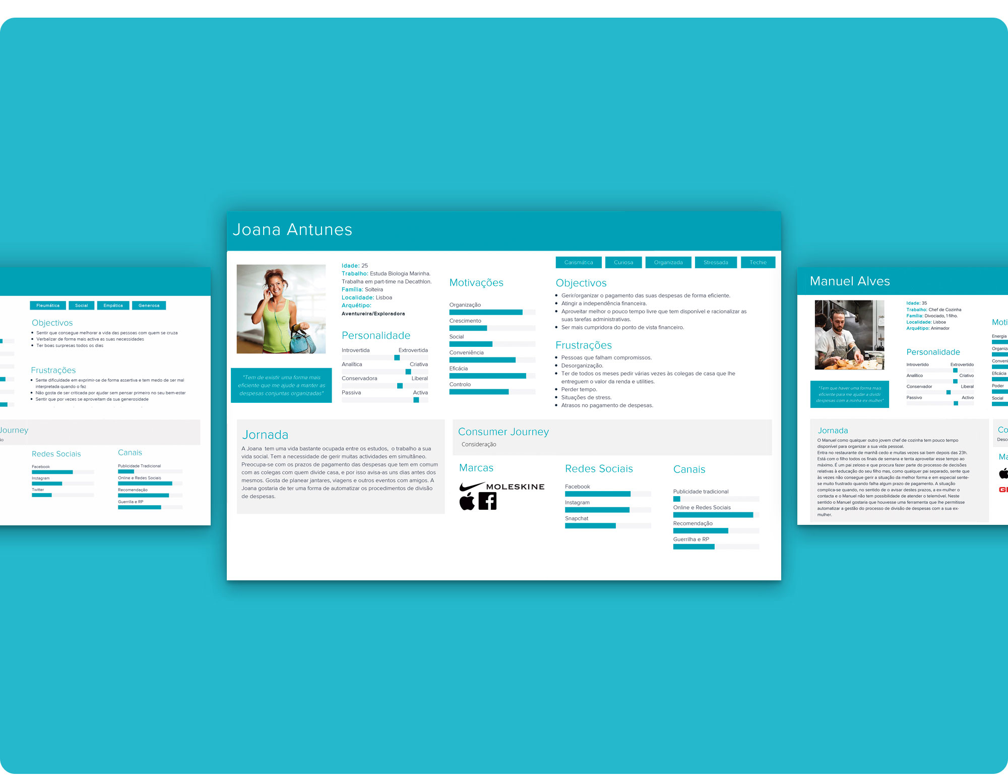 Full-size personas can be seen here.
From our documental research, survey analysis and interviews with potential users, we defined 4 personas. 2 main personas were used for the user flows (Joana and Maria Leonor... Personally, I stuck with Joana).
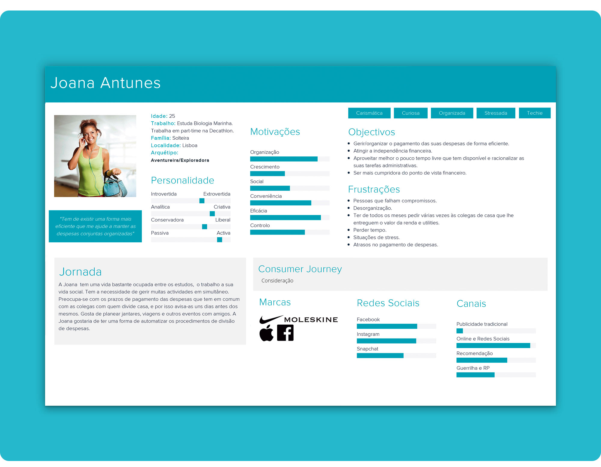 Meet Joana...
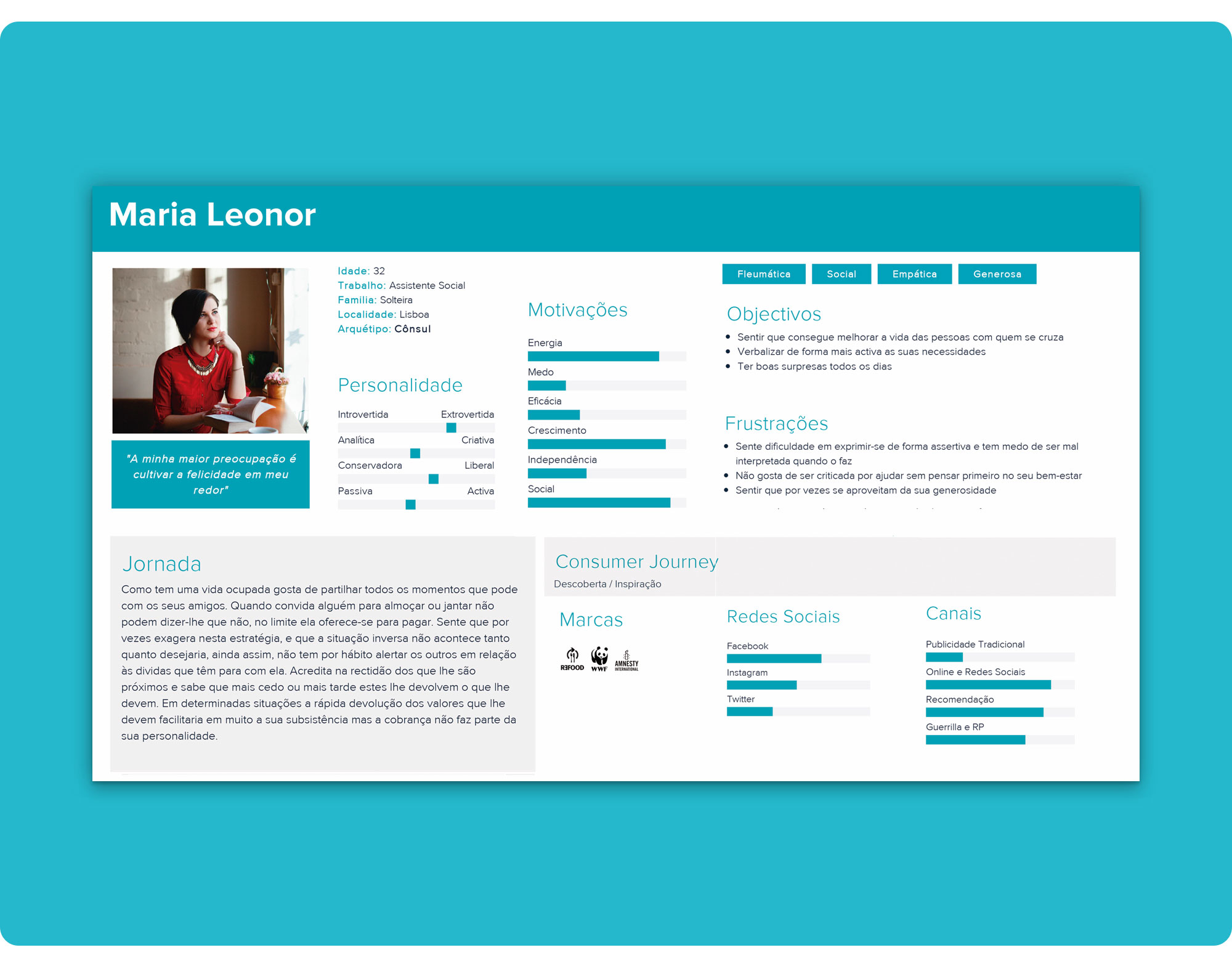 And Maria Leonor!
To attend to our users' needs, our product should focus on registering and calculating shared expenses, and on the payment and collection of debts.
We linked our user and job stories to our personas in order to frame our users and understand what they are trying to accomplish. Our goal was to empathize with them and hopefully design useful and purposeful solutions.
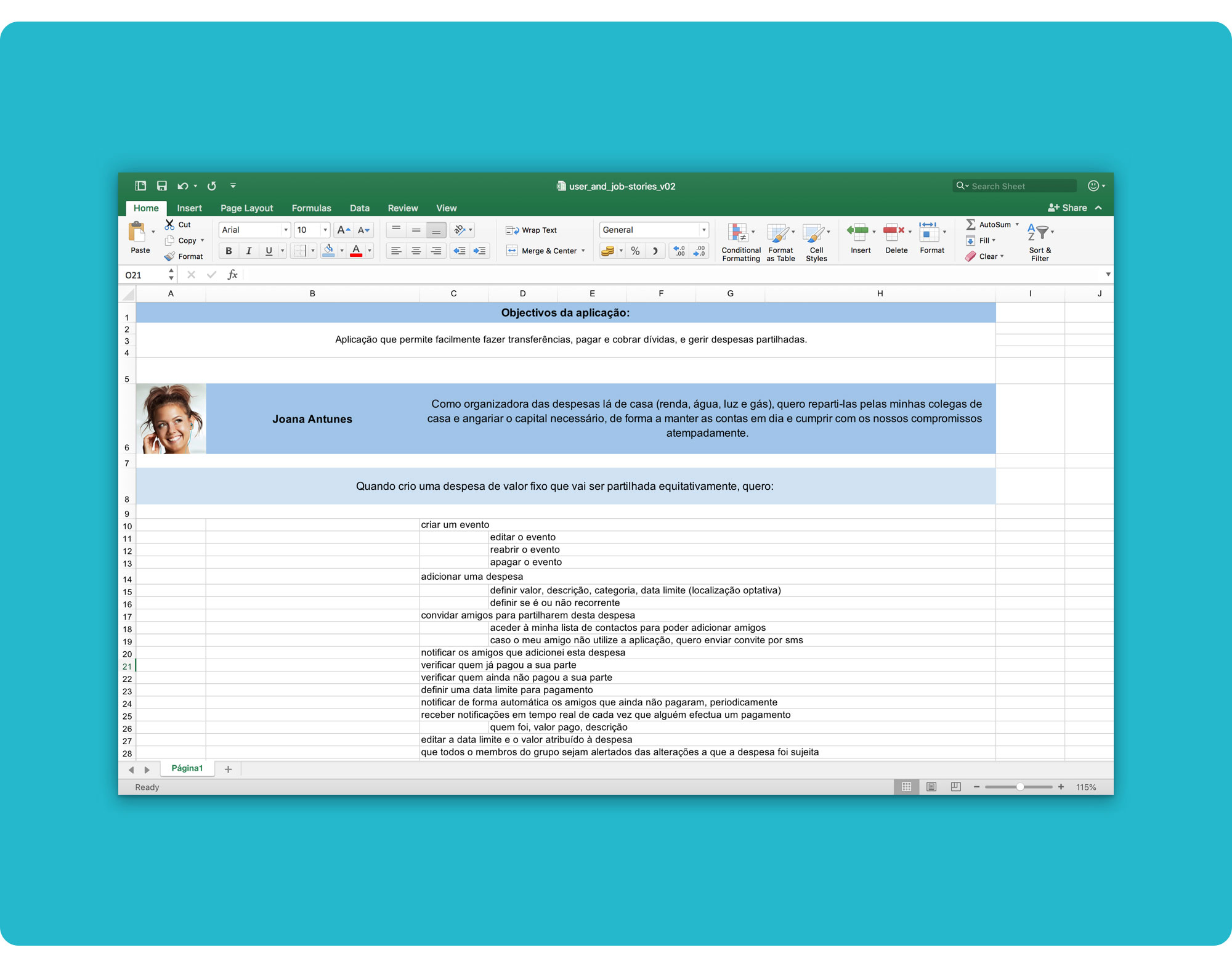 You can download the stories here.
This structure was a useful tool to boost our creativity, communicate our users’ motivations and desired outcomes more easily, and shape our product to fulfil the users' needs.
Our central goal at this stage was achieving a clear and intuitive interface.
Using all the information gathered during research, we kick-started the Interaction Design phase by listing all the functional requirements we thought were important for our product.
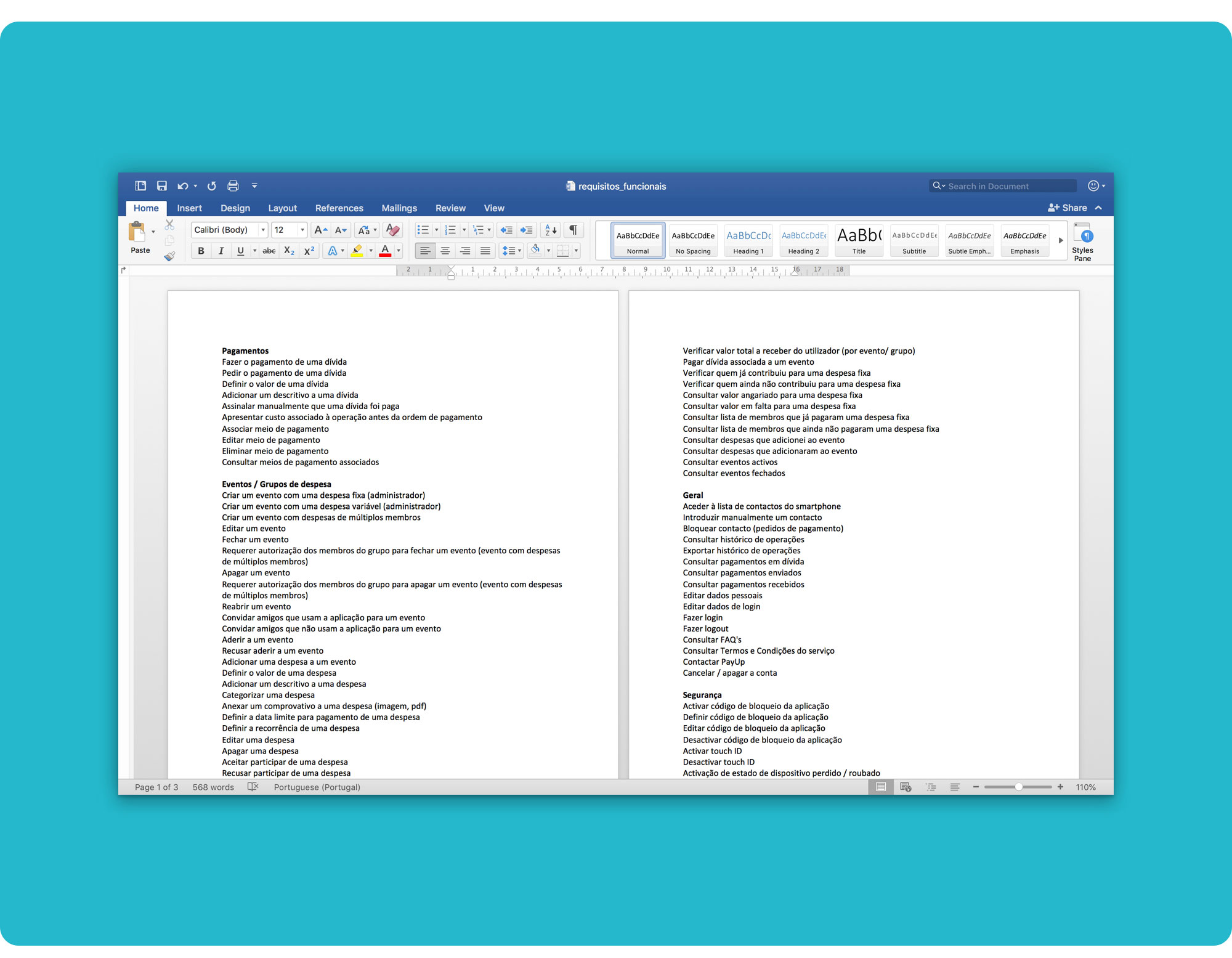 You can download the full analysis here.
Also, the list would be most helpful when designing the information architecture and the wireflows.
 You can download the full information architecture spreadsheet here.
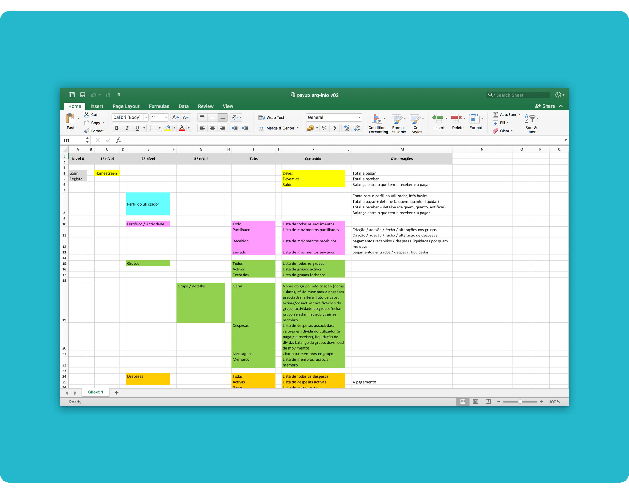
Up until now we only had an imprecise idea on how the app would function. Mapping its base architecture forced us to start figuring out each step the users would take throughout the product.
We first mapped the structure using a spreadsheet and then rendered it in a diagram.
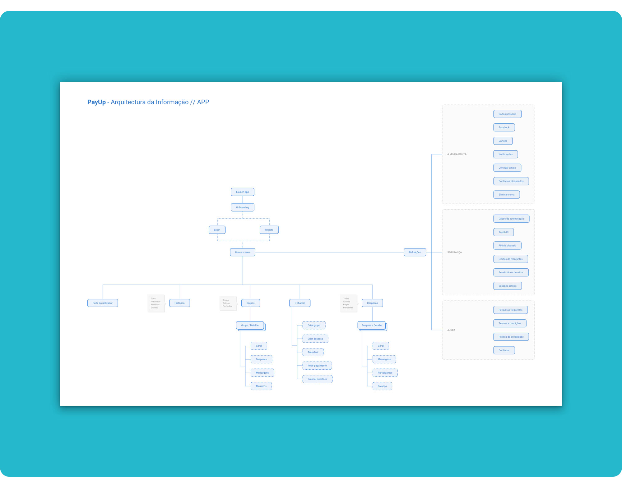 You can download the diagram here.
This was the first step to help us outline the app's high-level structure in a logical and intuitive way, as well as visually conceptualise it.
To better communicate our design ideas, we developed wireflows for the two main personas. Combining wireframes and user flows let us outline the workflow and screen designs more clearly.
Joana Antunes :
- Login; (Me ✅)
- Create a group to share expenses and add an expense to that group; (Me ✅)
- Send a payment; (Marta)
Maria Leonor:
- Onboard a new user; (Lília)
- Add a bank card. (Lília)
Using screen designs instead of abstract flowchart symbols kept us focused on the product, making it easier to design how the users interact with the app when performing common tasks.
The wireflows enabled us to quickly test ideas without diving too much into the details.
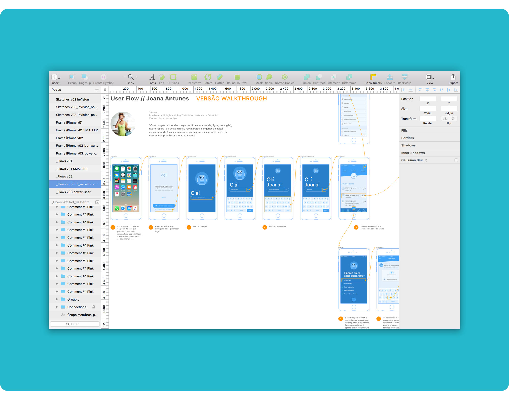 Part of Joana’s user flow when logging in and accessing the actions’ menu to create a group to share expenses.
There are 3 important assumptions underlying these wireflow proposals:
The increasing popularity of messaging apps among millennials using digital products makes us think that conversational, dialogue-based interfaces are the future, as they are intuitive, fast and familiar.
“Digital personal assistants” with artificial intelligence, semantic search capability, and natural language processing are rapidly evolving and are already available in different stages of development and sophistication, across a wide range of platforms. For example Siri, Google Now, Cortana, Amazon Alexa and, on another level, applications based on IBM's Watson cognitive platform.
Interacting with an unknown interface can be frustrating and complex. A chatbot is simpler, more personal, more human.
 Some screens from the first version of Joana’s user flow to create a group to share expenses.
My wireframes went through 3 major iterations (revisions) to simplify and optimize the user’s task flow. I also refined the bot’s dialogues, personality and tone of voice, and fine-tuned the visual hierarchy and components of the main screens.
The user flow’s first version turned out too tiresome and long. It required the user to enter every detail that could be set up when creating a group and adding an expense. It was all built around the idea of a messaging app.
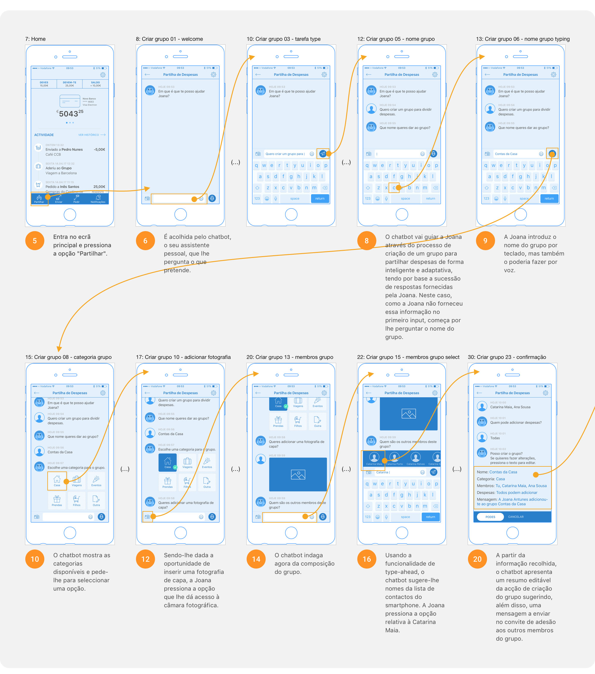
 Some screens from the third version (walkthrough mode).
The last wireflows’ version has a completely redesigned main navigation and a quick action menu that the user can access through a floating action button. This FAB allows him to choose one of the 4 common tasks that can be accomplished with PayUp (create a group, add an expense, send money and request money), thus following a pre-determined path presented in a conversational way (walkthrough mode), as well as enter a power user mode that enables him to write quick instructions for the task he wants to complete.
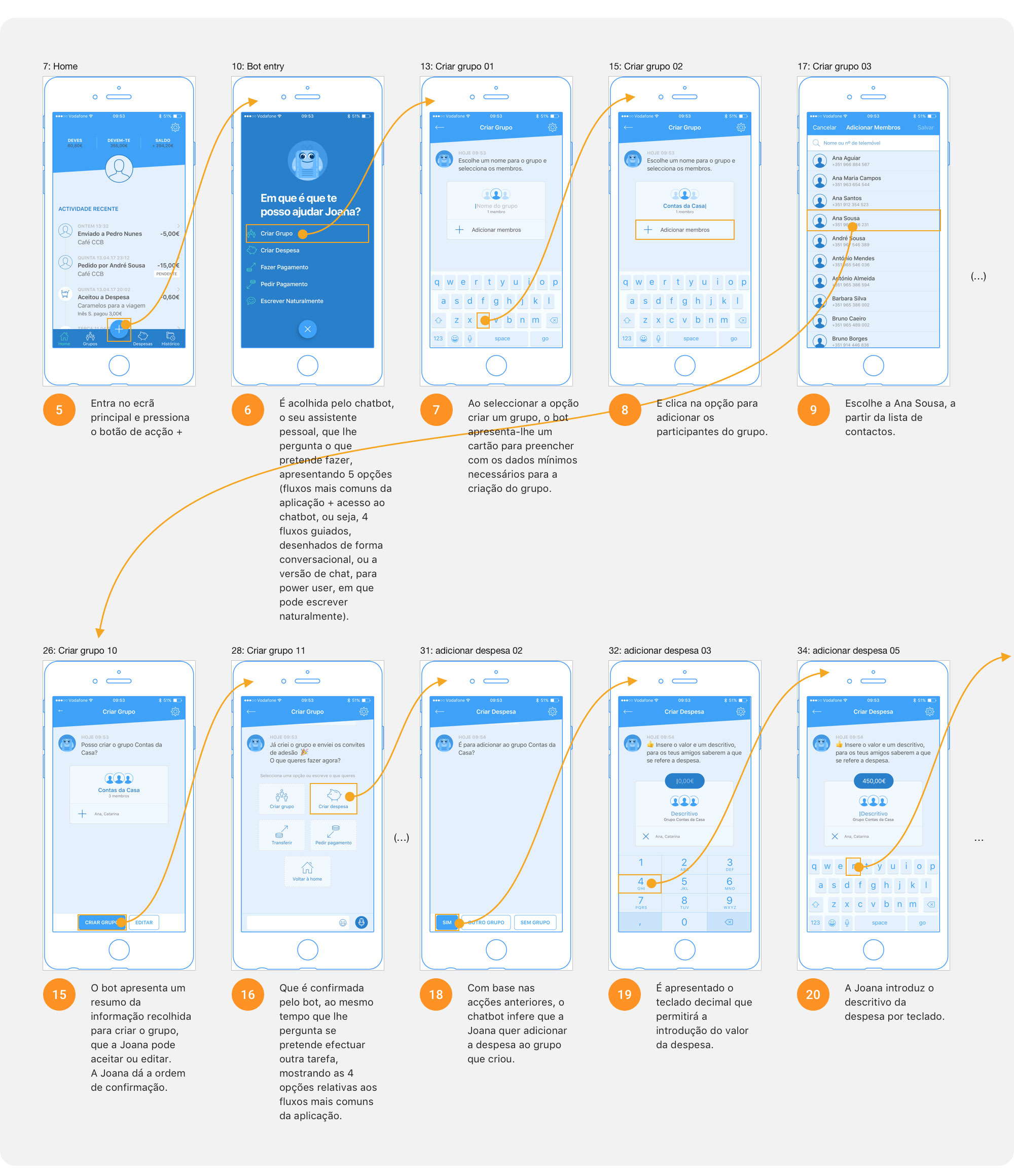
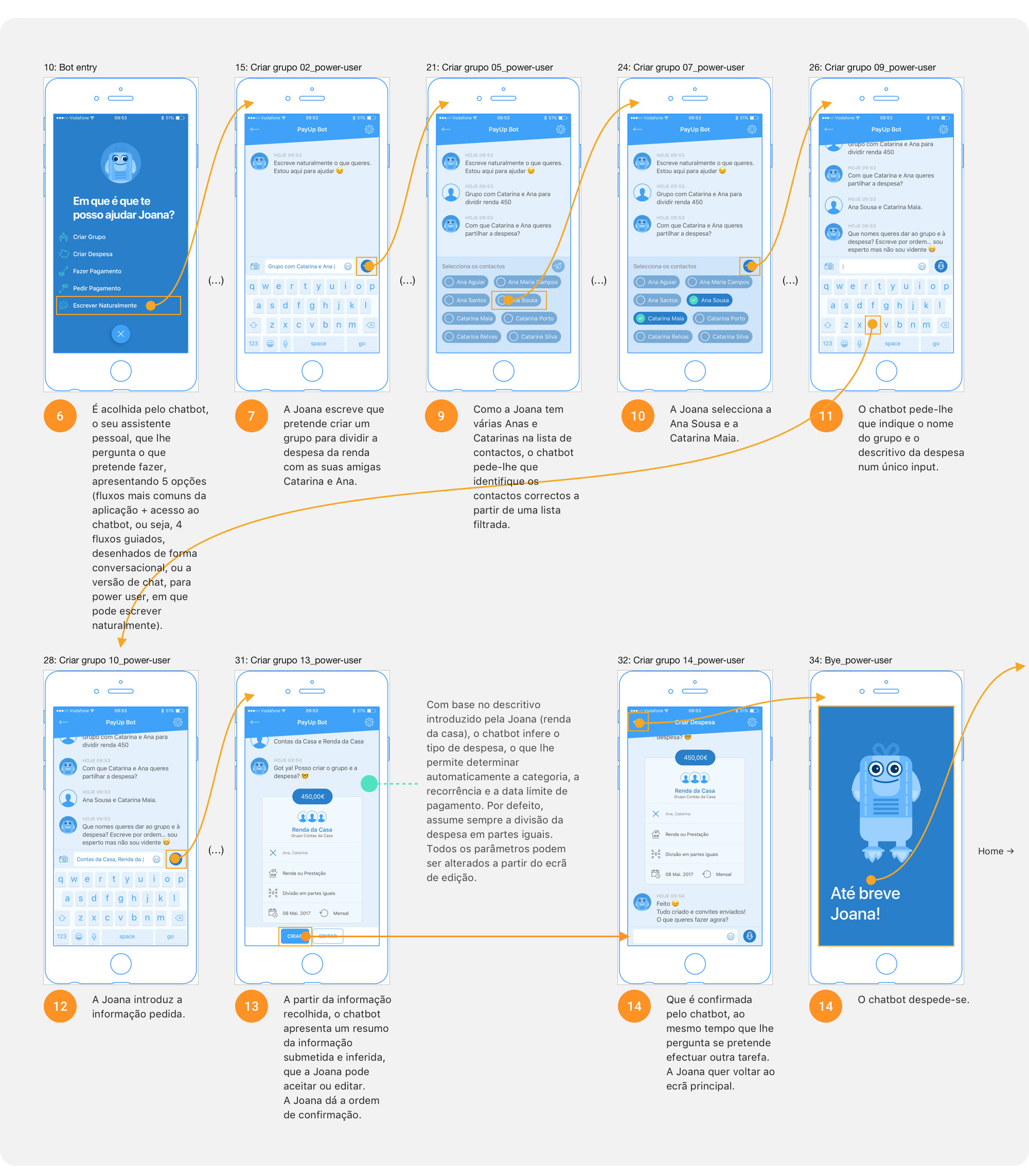 Some screens from the third version (power user mode).
In power user mode, the bot only asks for the missing information that is strictly necessary to perform the task successfully. In this case, creating a group and adding an expense to that group.
I shortened the information requested by the bot to complete each task to a minimum, in both modes (walkthrough and power user). Optionally, the user can add more details at the last step, through the edit screens.
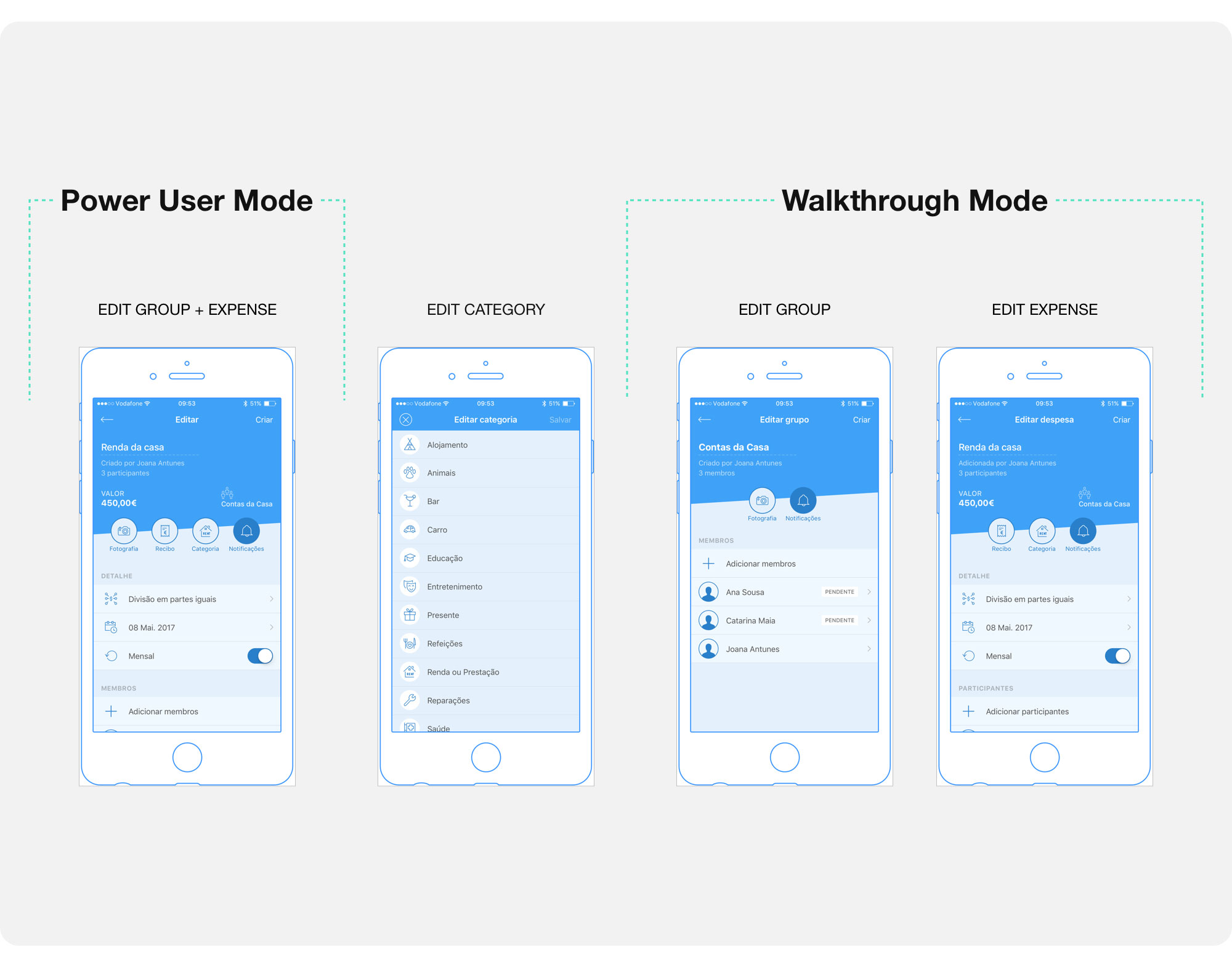 The edit screens allow the user to change any data that has been filled incorrectly and add more information like a photo or a receipt.
Given time constraints, designing the full app was out of scope for this project.
My main focus was designing the user flow for creating a group, but I also worked on some extra screens to help us convey the full product plan.
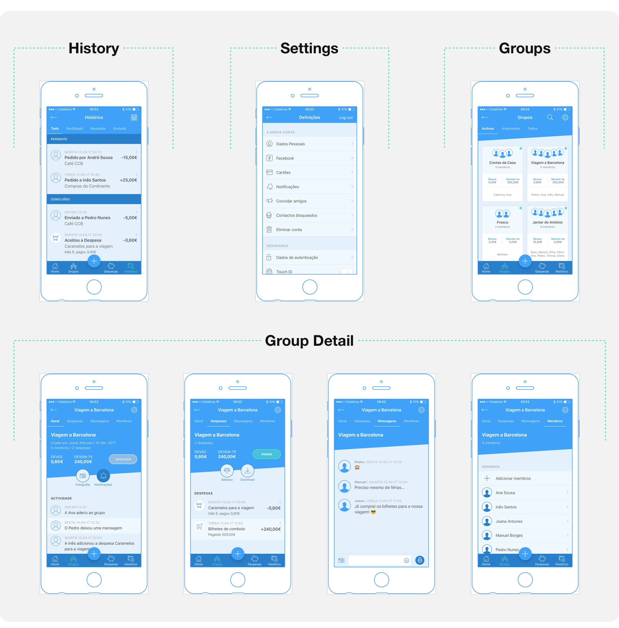 I worked on the group screens, history and settings.
You can take a closer look at the wireflows I worked on here. They can be downloaded.
We worked on developing a modern and friendly visual identity, that fit our target.
We settled a base colour palette with two shades of blue and purple, trying to harmonize the app and the website's look and feel — you can check the website here and it's case study there. Additionally, we used grey for the text and plenty of light tones to keep the interface clean.
Being the colour associated with technology, Blue represents trust, wisdom, confidence and stability. It has positive effects on the mind and body and can cause it to produce chemicals that radiate calm and tranquillity.
We went for a darker blue and a brighter blue on the app. A corporate darker blue that exudes stability, honesty and trustworthiness, balances out the brighter blue's engaging and dynamic hue.
![]()
We based the logo design on 3 concepts that were primary in this project:
- sharing
- friendship/closeness
- uprightness
The logo was vaguely inspired by the symbol we currently use for sharing. It plays with straight lines and plans that intersect and form shared points of contact.
It inverts, entangles and expands the original symbol, creating a recognizable uppercase P.
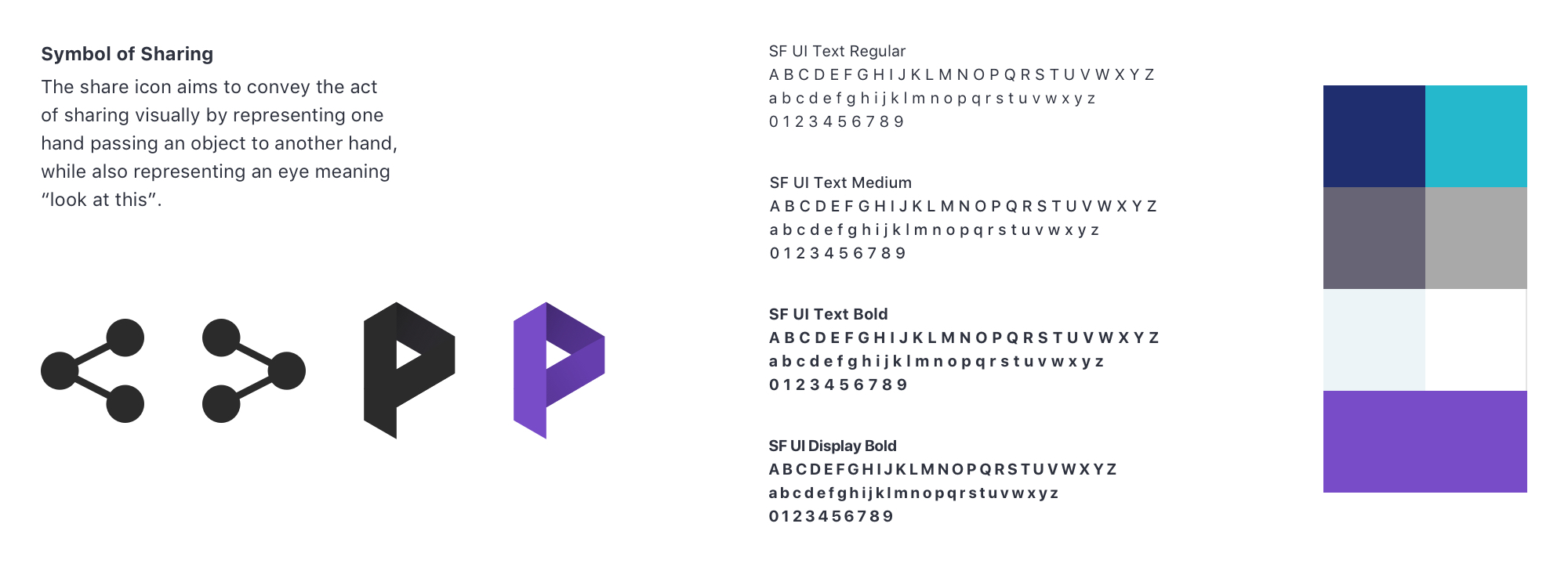
We used purple on the logo because it embodies transformation, and PayUp can definitely change the way we share and split expenses.
We designed high-fidelity mockups to communicate in a more realistic way the look and feel of our MVP for iOS.
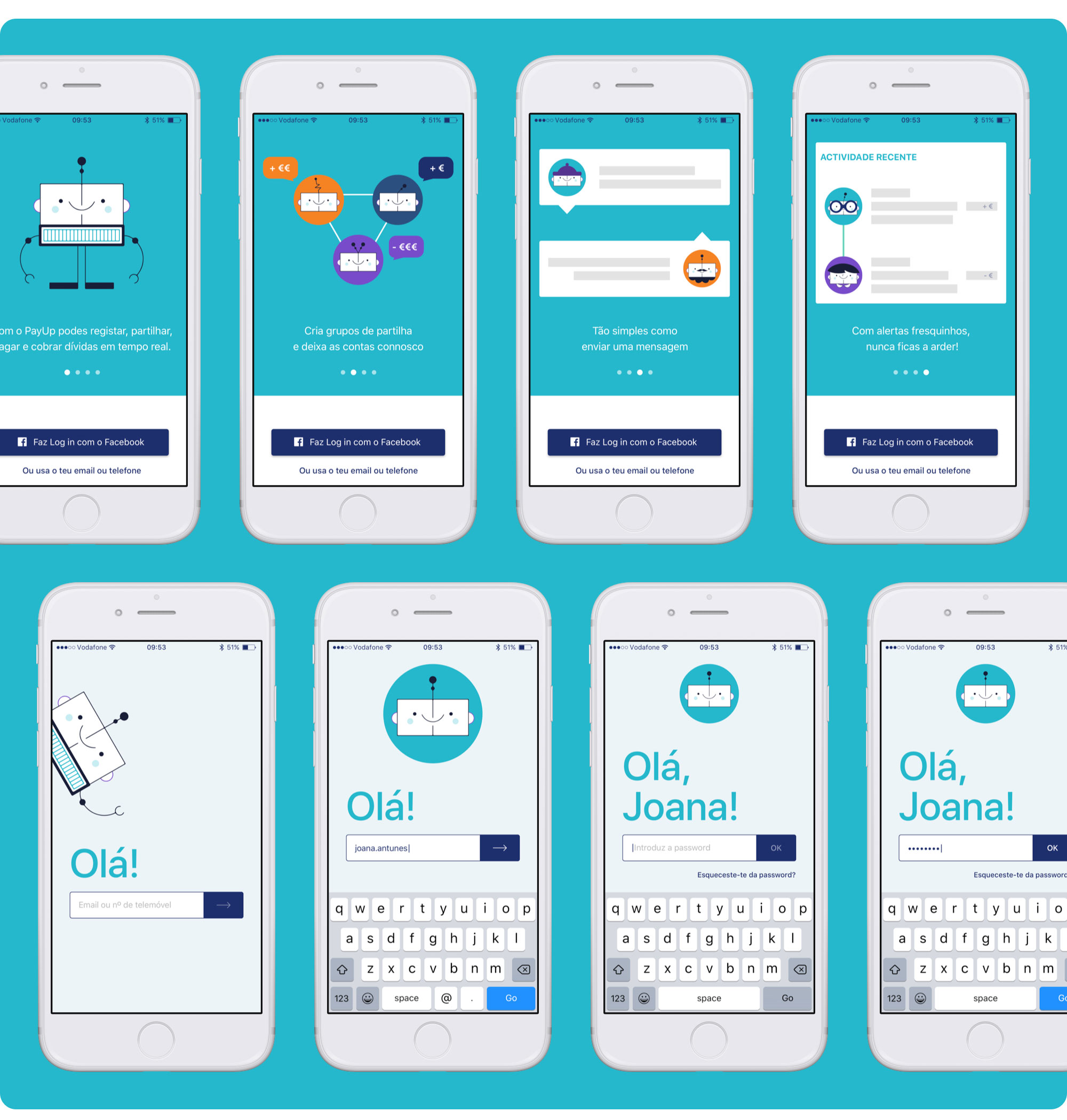 PayUp's intro screens and login.
I tweaked and polished all the screens needed for the user flow I was working on, both in walkthrough and power user mode, as well as the login, groups, history and settings.
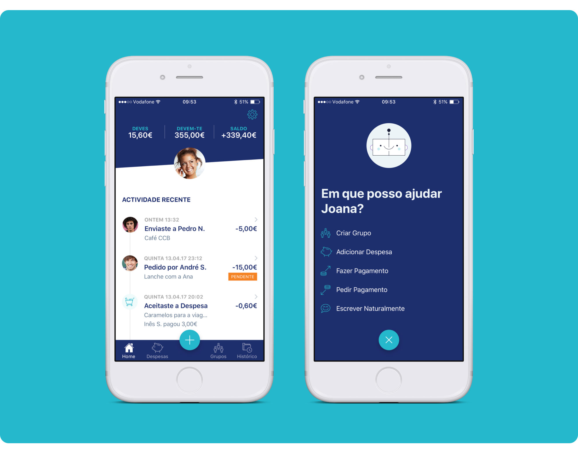 PayUp's Home screen and action's menu.
The Home screen shows an overview of the user's recent activity, how much he owes, how much he is own, and the current balance.
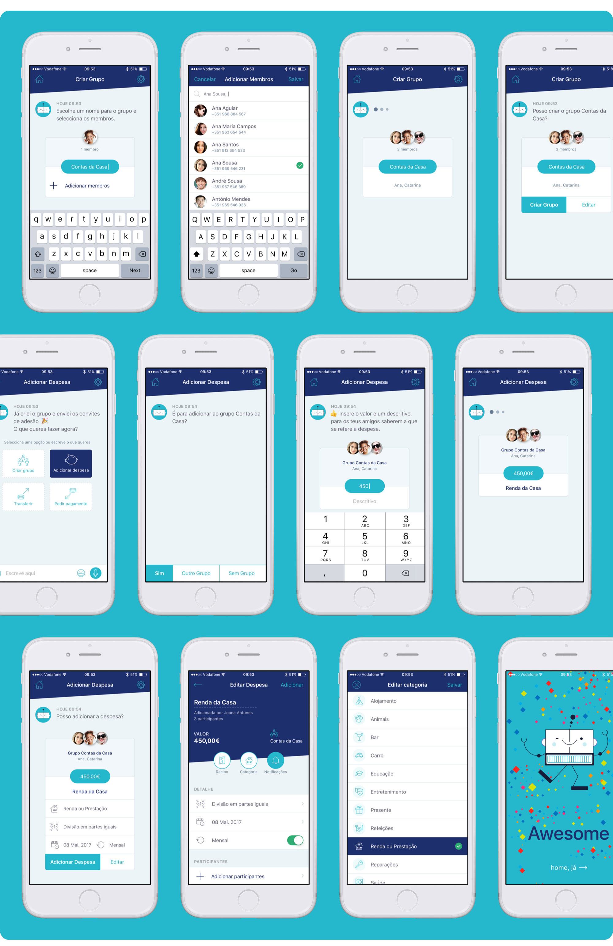 Some PayUp screens showing details from the flow to create a group and add an expense (walkthrough mode).
I was fairly pleased with how the wireflows had turned out. In the mockups phase, I mainly focused on making minor changes to some interface elements, working on the illustrations and further improving the copy. Highly important in an app like PayUp!
In walkthrough mode, the user can achieve his goal in 4 easy steps:
- Enter group name;
- Choose participants;
- Enter expense amount;
- Add a description.
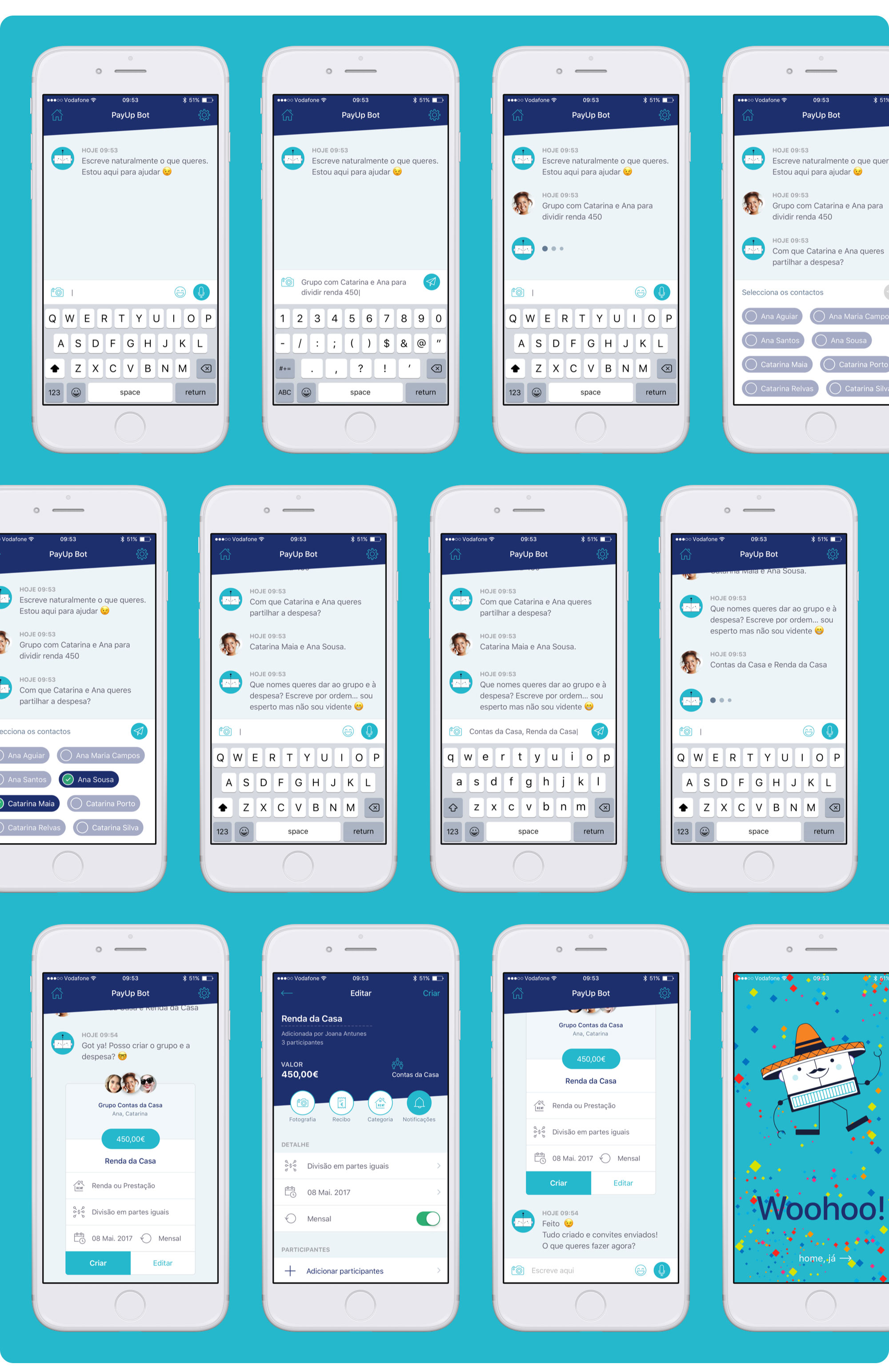 Some PayUp screens showing the flow to create a group and add an expense (power user mode).
In power user mode, the number of steps will vary according to how much information the user provides at first. The chatbot asks the questions needed to fill in the information gaps.
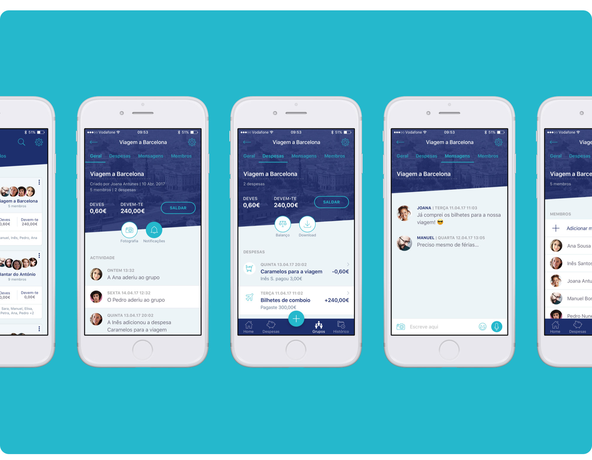 PayUp groups' screens.
The main groups' screen gives the user access to a listing of all the groups he belongs to. It can be filtered by all groups, only active groups, or only archived groups.
By default, and in any case, the groups' list sorting should take into account the activity of each group (from the most active to the least active groups).
The most relevant information of each group is on the first level and visible on the listing page (group name, debts and members).
The group detail screen features a tabular navigation that allows the user to check in and edit the detailed information about the group and the expenses associated with it, as well as settle his group debts.
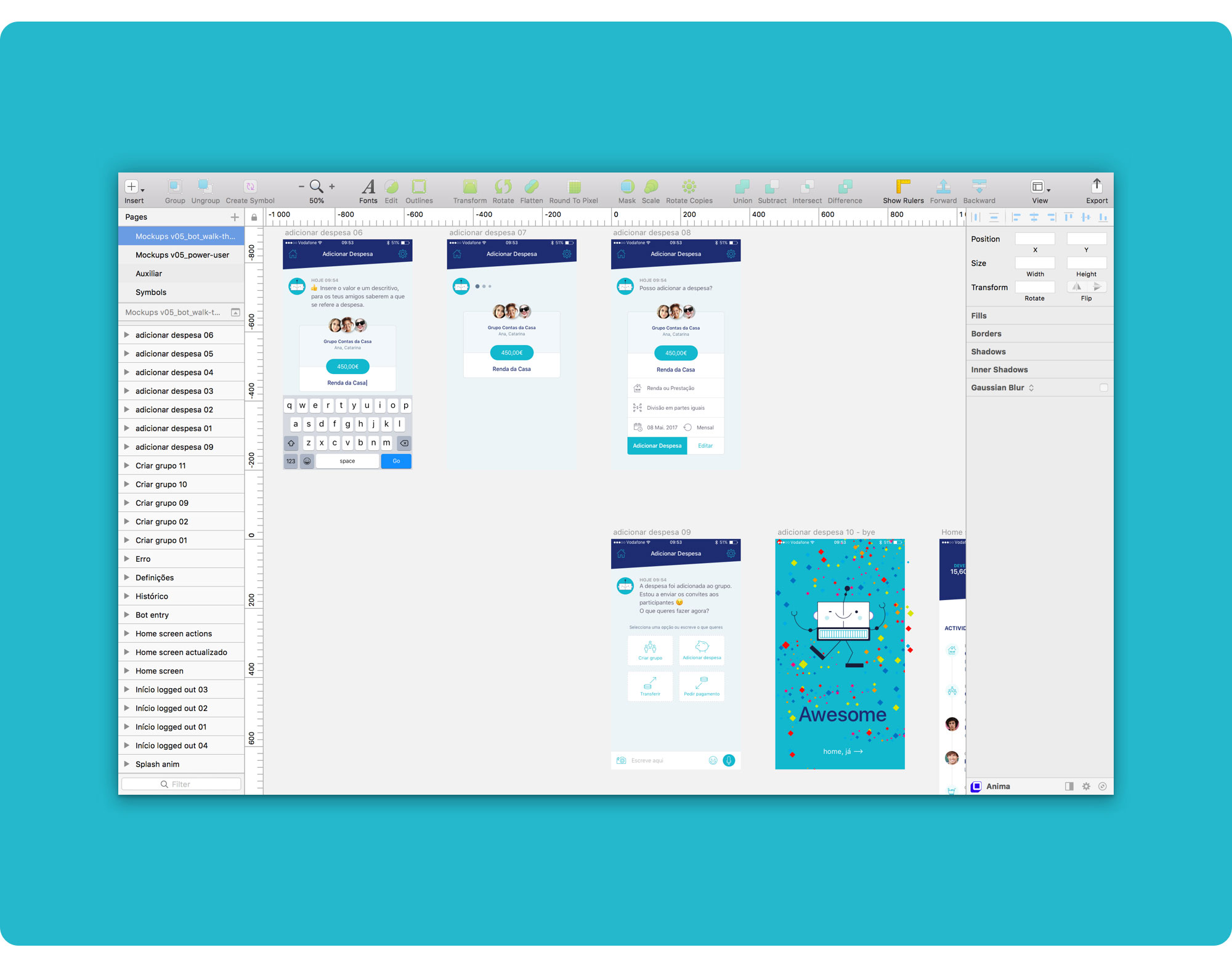
I used InVision to connect the flow of all the screens I designed, show the functioning of the product and do some testing.
Here's the link to my InVision prototype, both in walkthrough and power user mode (create a group and add an expense user flows, plus the extra screens I designed, like groups):
👉 https://filipago.github.io/payup-app-prototype
Create a Group and Add an Expense User Flows:
1. Bot Walkthrough Mode (conversational)
- Login with email and password;
- Access Bot (actions menu ➝ create a group — “Criar Grupo”);
- Follow the steps to create a group to share expenses with Ana Sousa and Catarina Maia (select Ana Sousa from the contacts’ list and search for Catarina Maia);
- Follow the steps to add an expense to that group;
- Go back to the home screen.
2. Power User mode (chatbot)
- Login with email and password;
- Access Bot (actions menu ➝ write naturally — “Escrever Naturalmente”);
- Write what you want to do;
- Fill in the information asked by the bot to create a group to share expenses with Ana Sousa and Catarina Maia;
- Go back to the home screen.
I used Principle to emulate the micro-interactions in a more organic way and explore how motion could be implemented. This helped me grasp the app's flow, functionality and behaviour on a deeper level.
Given time constraints, I wasn't able to prototype all the screens with Principle, namely the power user's flow. But you can check the walkthrough mode!
If you'd like to interact with the Principle prototype, go to this link 👉 https://github.com/FilipaGo/payup-app-prototype-principle and follow the README instructions on how to install.
This prototype can only run on your Mac or iOS device.
We ran out of time for extensive user testing but we did manage to run some tests with the same people we interviewed during research.
The feedback was quite positive and all users were able to quickly perform the tasks we asked them to.
I can see the app targets a young audience. It solves many issues that are part of our daily life; from splitting travelling costs to tracking meal expenses. It solves a problem that is genuine and real. (Mariana Pisa, 22, Lisbon)
All users highlighted that the app is very intuitive and simple to use.
The final presentation of the project was all about describing the problem we tried to solve and our solution, demonstrating and explaining our approach.
We provided evidence, from real testimonies, that our product solves a real issue. We described the segment we are targeting, our estimated market size in Portugal, and what sets us apart from the competition. We also discussed our launching strategy and prospective revenue sources.
In short, we tried to convey the efficiency, high availability and ease of use of our product.
To know more about this project, download our Keynote Pitch Deck.
Designing PayUp was a challenging ride. It was clear from the onset that our major challenges would be getting to know the business fast, learning to work as a cohesive team in a short period of time, and finding a value proposition that could make young millennials ditch cash for electronic payments.
We studied the documentation and researched our competition. We understood our users' needs and pain points through the surveys and interviews. Finally, we faced the challenge of creating an engaging product that could give a great experience to our users and was also visually appealing.
There were things we could have done better (there always are). But overall, given time constraints, we managed to deliver a polished MVP.
- Finish up the MVP’s screens;
- Design the Android version;
- Full GDPR compliance (General Data Protection Regulation);
- In-depth user research;
- Extensive usability testing;
- Improve the user flows;
- Work on a profitable business model.
A digital product is never final. We just worked on a preliminary MVP draft that could be ready to test and launch for early adopters.
The following is our roadmap, with the phased launch of new features and product expansion. The time period between each launch should be of approximately 1 semester.
Release 1 (MVP):
- Sending a payment (instant P2P transfers);
- Creating groups to share expenses;
- Registering shared expenses;
- Automatic calculation of debts and receivable amounts (“you owe”, “you are owed”);
- Requesting a payment (“you are owed”);
- Paying off debts (“you owe”);
- Automatic notifications, alerts and payment reminders.
Release 2:
- Paying for purchases (merchants);
- Developing a web app (making the MVP functionalities available in a web app environment).
Release 3:
- Making international transfers to accounts based in SEPA countries (Single Euro Payments Area);
- Raising funds for future expenditure from discretionary amounts donated by participants (micro crowdfunding among friends).
Release 4:
- Making international transfers to accounts based in foreign countries outside SEPA, with a special focus on low banking countries.
Using products like PayUp seems to make more sense every day since there are more and more motivations that justify it.
From an economic perspective, the growing trend towards the dematerialization of payment methods seems unavoidable. We are increasingly seeing a decline in the use of “paper money” in favour of payment methods such as credit/debit cards and bank transfers.
Nowadays, the transactions targeted by PayUp are typically settled with “cash”. PayUp can be an incentive for making these adjustments online, without using currency. This is beneficial for the user, because of its simplicity, speed and control, but also for financial entities, since it promotes the use of electronic transactions to the detriment of cash circulation. Electronic transactions entail much lower costs for Banks than their equivalent in cash.
The promotion of our product, by interested entities of the financial system, will have an obvious side effect to their benefit. PayUp encourages users to a “more consistent” use of electronic payment methods and can induce them to adopt these with more regularity even outside our app. Leading people to a more systematic recurrence to home banking platforms will have positive effects on their respective financial entities. Not only by the direct increase of the revenue generated by these transactions but also by discouraging the direct attendance at the branches of the institutions, which have much higher costs for equivalent transactions.
From a technological perspective, PayUp resorts to the latest evolutions in user interaction with an evolved “chatbot” that simplifies these interplays. PayUp uses “Natural Language” to minimize the effort required to accomplish a task, making use of advanced technological resources in “Cognitive Processing”.
If you didn't check the prototypes yet, here are the links:
👉 PayUp App InVision Prototype — https://filipago.github.io/payup-app-prototype (all the screens I designed, including extras, like groups)
Create a Group and Add an Expense User Flows:
1. Bot Walkthrough Mode (conversational)
- Login with email and password;
- Access Bot (actions menu ➝ create a group — “Criar Grupo”);
- Follow the steps to create a group to share expenses with Ana Sousa and Catarina Maia (select Ana Sousa from the contacts’ list and search for Catarina Maia);
- Follow the steps to add an expense to that group;
- Go back to the home screen.
2. Power User mode (chatbot)
- Login with email and password;
- Access Bot (actions menu ➝ write naturally — “Escrever Naturalmente”);
- Write what you want to do;
- Fill in the information asked by the bot to create a group to share expenses with Ana Sousa and Catarina Maia;
- Go back to the home screen.
👉 PayUp App Principle Prototype — https://github.com/FilipaGo/payup-app-prototype-principle (follow the README instructions to install the prototype. It only runs on Mac and iOS)

Thanks for taking the time to read the case study.
A special thank you to my team, Lília Correia and Marta Casal, and our classmates and teachers for their invaluable feedback and support.