
This example displays Up and Down buttons within the linear scale. The Up button increases the scale value. The Down button decreases the scale value.
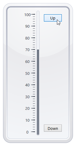
Create a ScaleCustomElement object with a custom UI element and add the object to the Scale.CustomElements collection to display custom content within a scale. This example creates two ScaleCustomElement objects with Up and Down buttons:
<dxga:LinearScale >
    <dxga:LinearScale.CustomElements>
        <dxga:ScaleCustomElement VerticalAlignment="Top" HorizontalAlignment="Right">
            <Button Name="button1" Content="Up" Width="59"  Click="button1_Click" />
        </dxga:ScaleCustomElement>
        <dxga:ScaleCustomElement VerticalAlignment="Bottom" HorizontalAlignment="Right">
            <Button Name="button2" Content="Down" Width="59" Click="button2_Click" />
        </dxga:ScaleCustomElement>
    </dxga:LinearScale.CustomElements>
</dxga:LinearScale>
The Click event of each button is handled to allow users to change the scale value:
private void button1_Click(object sender, RoutedEventArgs e) {
    if (bar.Value < 100)
        bar.Value += 10;
}
private void button2_Click(object sender, RoutedEventArgs e) {
    if (bar.Value > 0)
        bar.Value -= 10;
}