

npm install --save react-markdown-plus
import React, { Component } from 'react';

import source from './source.md';
import Markdown from 'react-markdown-plus';

class App extends Component {
  render() {
    return (
      <Markdown text={source} style={{maxWidth: 1000}} />
    );
  };
};

export default App;
Where source is a string and style is an object. The default
style is {margin: '50px auto', maxWidth: 512}.
After Render:

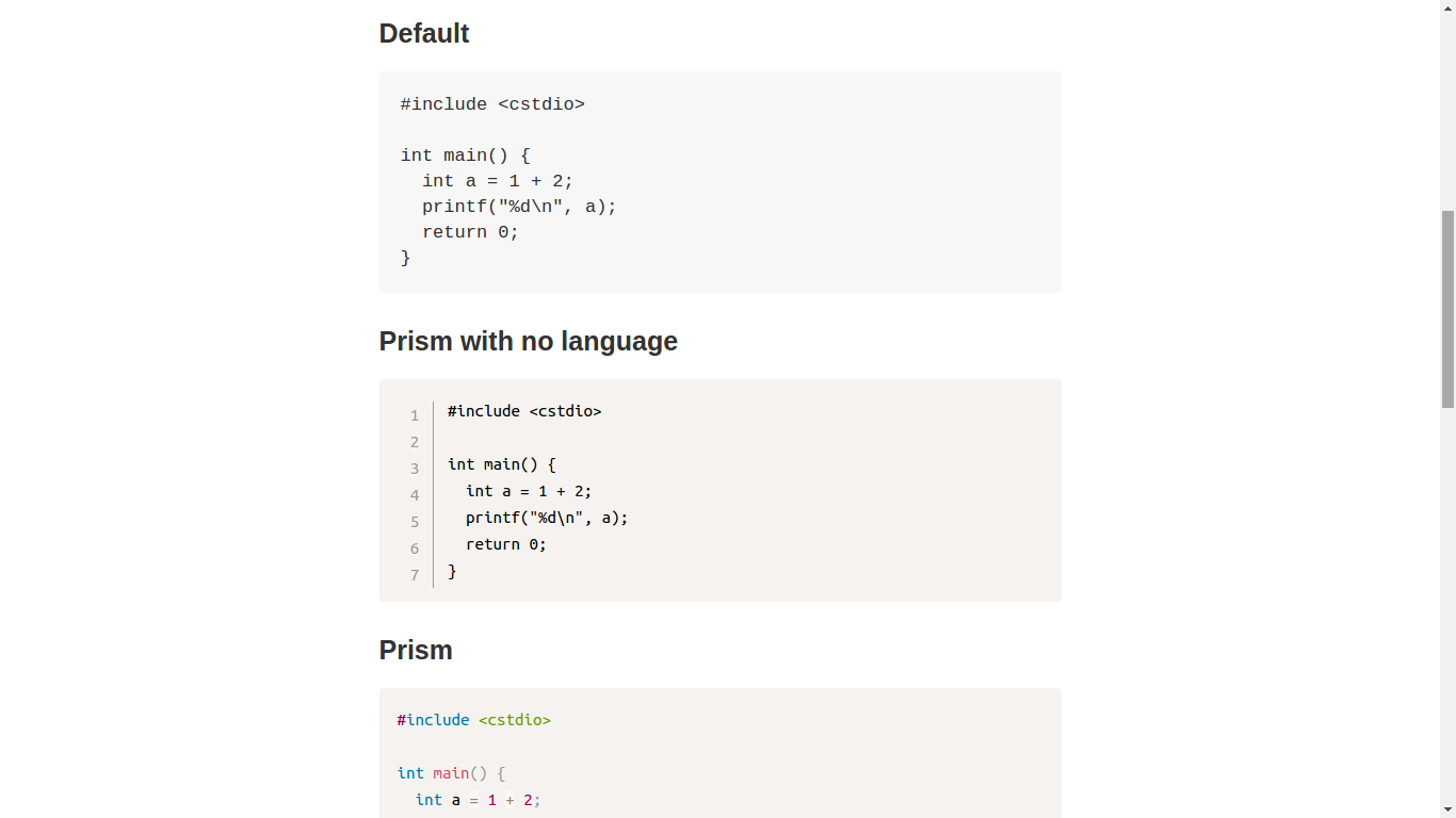


- use markdown-it to render markdown
- use prism.js for code highlight
- stand-alone themes and plugins
- alias language names
- work 1: Line Highlight, Line Numbers, Show Invisibles, File Highlight
- work 2: Toolbar, Show Language, Copy to Clipboard Button
- work 3: Previewer
- work 4: Keep Markup, Command Line
- KaTeX
- convert asciimath to TeX
- import KaTeX css
- diagrams
- custom container
- definition list
- Charts
- footnote