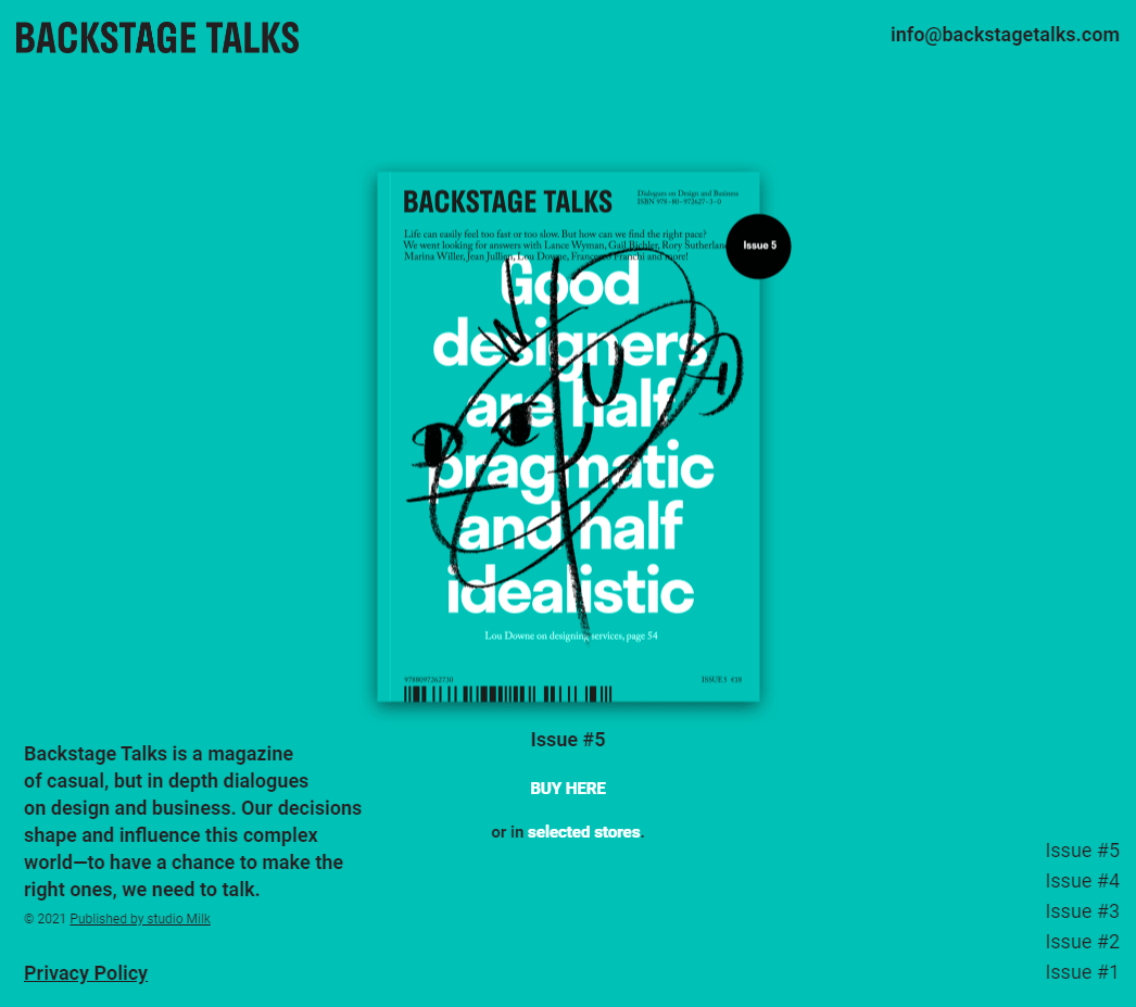
This is a solution to the Backstage Talks(Magazine archive) challenge on Frontend Practice.
Code a pixel perfect replication of the Backstage Talks (Magazine archive) site created by studio Milk
-
View the optimal layout for the interface depending on their device's screen size
- Mobile @
375px- BONUS: implement Scroll Snapping to optimize mobile user experience
- Tablet/Desktop @
900px- HTML bookmark navigation links
- Mobile @
-
See animations for all animated elements on the page
Solution URL: here | Live Site URL:
- Next.js
- Animations
- Basic API routes example
- Next.js Data Fetching, Dynamic Routes & Metadata | Nextjs 13 - Very helpful Youtube Video about Dynamic Routing and Data Fetching .
- 📜 Next.js Documentation - learn about Next.js features and API.
- Learn Next.js - an interactive Next.js tutorial.
- 🔖HTML Links - Create Bookmarks - Bookmarks can be useful if a web page is very long. To create a bookmark - first create the bookmark, then add a link to it. When the link is clicked, the page will scroll down or up to the location with the bookmark.
- position: fixed - An element with
position: fixed;is positionedrelativeto the viewport, which means it always stays in the same place even if the page is scrolled. The top, right, bottom, and left properties are used to position the element. A fixed element does not leave a gap in the page where it would normally have been located. - Basic concepts of CSS Scroll Snap - The CSS Scroll Snap feature provides a way to snap the scrolling to certain points as the user scrolls through a document. This can be helpful in creating a more app-like experience on mobile or even on the desktop for some types of applications.
- Practical CSS Scroll Snapping - CSS scroll snapping allows you to lock the viewport to certain elements or locations after a user has finished scrolling.
- How to fade in content as it scrolls into view - make content fade in as you scroll into the view.
- Revisiting prefers-reduced-motion, the reduced motion media query - The article provided some background about
prefers-reduced-motion, a media query introduced to help people with vestibular and seizure disorders use the web to avoid creating disability-triggering visual effects.
- Website - Chanda Abdul
- Frontend Mentor - @Chanda-Abdul
- GitHub - github.com/Chanda-Abdul

