The text on the application interface is difficult to read #335
Labels
bug
Something isn't working
Comments
|
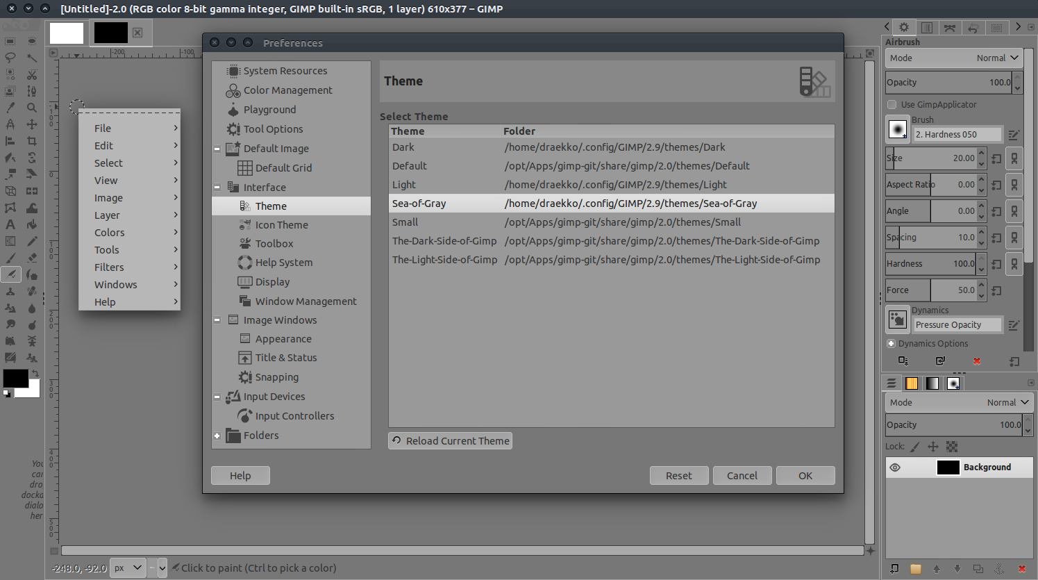
Same on Linux Mint, contrast is very low for both light and dark mode but the effect is worse for the dark theme. You really need to use white/slightly dimmed white instead of low-key colors and tones.
|
Sign up for free
to join this conversation on GitHub.
Already have an account?
Sign in to comment
Problem description
The text on the application interface is difficult to read. Could you please increase the contrast between the text and the background, and also adjust the brightness to make it clearer?
Steps to reproduce
Operating system
windows 11
App version
v2
The text was updated successfully, but these errors were encountered: